Descriptive Statistics: The Art and Math of Data Summarization
Descriptive Statistics for Data Science: The Art and Math of Data Summarization.
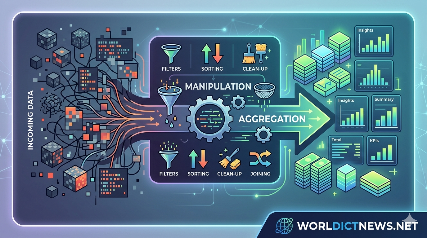
In an era where organizations capture billions of data points daily, raw data is paradoxically both a massive asset and an unmanageable burden. A database filled with millions of customer transactions, sensor readings, or website clicks is functionally useless to a human analyst in its raw, unaggregated form. Before you can deploy complex predictive algorithms or train neural networks, you must first understand the fundamental shape, center, and spread of your data.
This is the exact domain of Descriptive Statistics.
Descriptive statistics is the branch of mathematics dedicated to objectively summarizing, organizing, and describing the structural features of a specific dataset. Unlike inferential statistics—which uses sample data to make probabilistic guesses about an unmeasured, larger population—descriptive statistics deals strictly with the data you have in hand. It forms the core engine of Exploratory Data Analysis (EDA), providing the essential metrics and visualizations that prevent data scientists from building models on top of flawed, misunderstood, or heavily biased information.
The Structural Framework of Descriptive Data Analysis
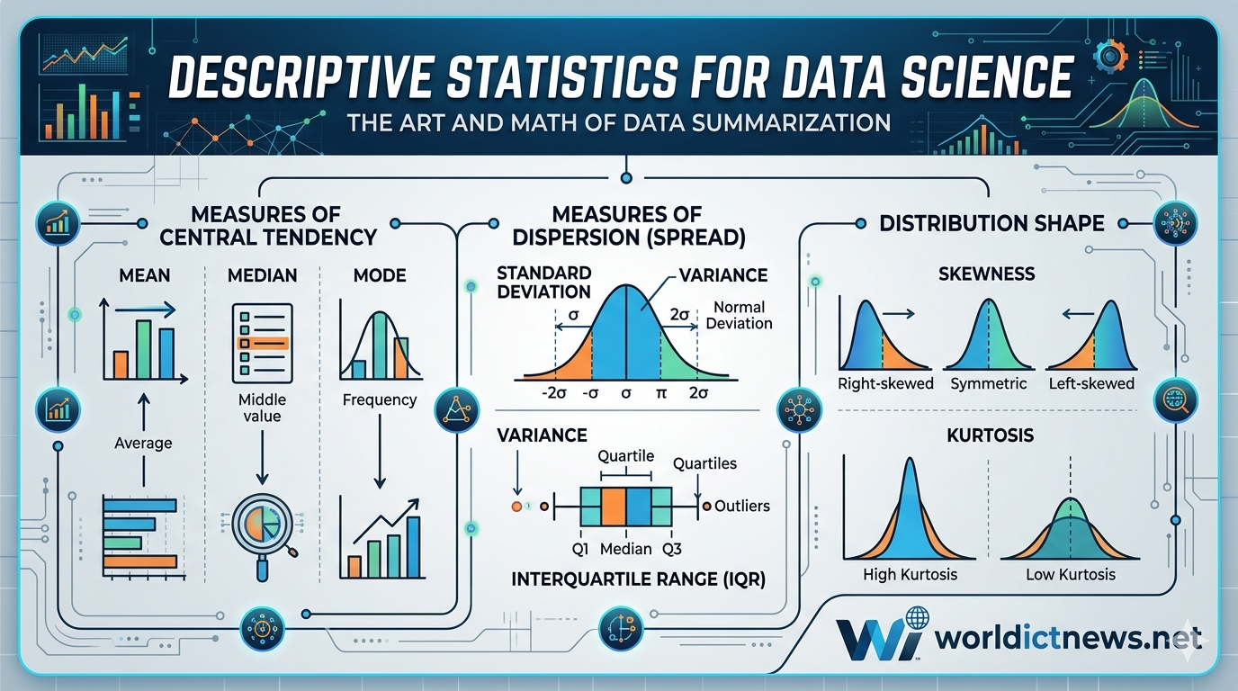
To comprehensively describe a dataset, data scientists view information through three distinct mechanical lenses: where the data centers itself, how far it scatters from that center, and the structural shape it takes when plotted.
┌──┐
│ DESCRIPTIVE STATISTICS │
└──┘
│
┌──┼──┐
▼ ▼ ▼
┌────┐ ┌───┐ ┌───┐
│ CENTRAL TENDENCY │ │ DISPERSION │ │ SHAPE & DISTRIBUTION│
├──┤ ├─┤ ├─┤
│ • Mean (μ) │ │ • Range │ │ • Normal / Skewed│
│ • Median │ │ • Variance (σ²) │ │ • Skewness │
│ • Mode │ │ • Std Dev (σ) │ │ • Kurtosis │
│ │ │ • IQR │ │ │
└──┘ └───┘ └───┘
Part I: Measures of Central Tendency (Finding the Core)
Measures of central tendency provide a single, representative value that aims to identify the "center" or the typical anchor point of a data distribution.
1. The Arithmetic Mean
The mean is the most common metric used to describe an average. It is computed by summing every individual value in a feature column and dividing that sum by the total number of data points (\(n\)).
\(\text{Population\ Mean\ }(\mu )=\frac{\sum {i=1}^{N}X{i}}{N}\)
Data Science Application: Calculating the average order value (AOV) on an e-commerce platform or the average response latency of an API server.
The Vulnerability: The mean is highly sensitive to extreme values (outliers). For instance, if nine people earning $30,000 sit in a room with one billionaire, the mean income of the room spikes to $100 million. This metric tells an inaccurate story about the "typical" person in that dataset.
2. The Median
The median represents the exact physical midpoint of a dataset when the values are sorted in ascending or descending order. If the dataset has an odd number of observations, the median is the middle number. If it has an even number, it is the average of the two middle numbers.
Data Science Application: Analyzing real estate prices or household income.
The Strength: The median is highly robust against outliers. In the billionaire example above, the median income remains exactly $30,000, perfectly reflecting the reality of the room's majority.
3. The Mode
The mode is the value that appears with the highest frequency in a dataset. A distribution can have one mode (unimodal), two modes (bimodal), or multiple modes (multimodal).
Data Science Application: The mode is primarily used for categorical or non-numerical data where calculating a mean or median is mathematically impossible. For example, finding the most popular clothing item size sold, or identifying the most common error code flagged in server logs.
Part II: Measures of Dispersion (Quantifying the Spread)
Knowing the center of your data only provides half the picture. Two separate groups of users can have an average screen time of exactly 4 hours per day. However, Group A might consistently use the app for 3.5 to 4.5 hours, while Group B might include users who drop off after 5 minutes alongside power users who stay active for 18 hours. Measures of dispersion quantify this variability.
Low Variance Distribution High Variance Distribution
_|_ ___|___
. | . . | .
. | . . | .
___________.___.___.___________ ___________.___.___.___________
Spread Spread
1. Range
The simplest measure of spread, calculated by subtracting the minimum value from the maximum value in a dataset. While quick to calculate, it relies entirely on two data points, making it highly unstable if those points happen to be anomalies.
2. Variance (\(\sigma ^{2}\))
Variance measures the average squared distance of each data point from the dataset's mean. By squaring the differences, variance ensures that negative and positive deviations do not cancel each other out, while simultaneously penalizing larger deviations.
\(\text{Sample\ Variance\ }(s^{2})=\frac{\sum {i=1}^{n}(X{i}-\={X})^{2}}{n-1}\)
3. Standard Deviation (\(\sigma \))
Because variance squashes numbers into squared units (e.g., "squared dollars" or "squared kilometers"), it can be highly unintuitive to interpret. Taking the square root of the variance yields the Standard Deviation, converting the metric back into the data's original unit of measurement.
Data Science Application: Setting threshold baselines for anomaly detection. If a metric scales past three standard deviations from the historical mean, a data pipeline can flag it automatically as an abnormal system event.
4. Interquartile Range (IQR) and Percentiles
Percentiles divide a sorted dataset into 100 equal parts. The 25th percentile is the First Quartile (\(Q_{1}\)), the 50th percentile is the Median (\(Q_{2}\)), and the 75th percentile is the Third Quartile (\(Q_{3}\)).
The Interquartile Range is calculated as:
\(\text{IQR}=Q_{3}-Q_{1}\)
The IQR encapsulates the middle 50% of your data. Data scientists use the IQR to systematically prune datasets of noise via the 1.5 \(\times \) IQR Rule. Any data point that sits below \(Q_1 - 1.5(\text{IQR})\) or above \(Q_3 + 1.5(\text{IQR})\) is statistically defined as an outlier and isolated for closer inspection.
Part III: Measures of Distribution Shape
Once central tendency and dispersion are mapped, a data scientist must look at the overall morphology of the distribution curve.
┌───┐
│ DISTRIBUTION MORPHOLOGY │
├───┬───┬───┤
│ LEFT (NEGATIVE) SKEW │ SYMMETRIC (NORMAL) │ RIGHT (POSITIVE) │
├──┼──┼───┤
│ • Tail extends left │ • Perfectly balanced │ • Tail extends │
│ • Mean < Median < Mode │ • Mean = Median = Mode │ • Mode < Median < │
└───┴────┴──┘
1. Skewness
Skewness quantifies the asymmetry of a data distribution around its mean.
Right (Positive) Skew: The distribution tail extends further toward higher values on the right side. The mean is pulled out by these high values, resulting in a mathematical relationship where \(\text{Mode} < \text{Median} < \text{Mean}\). (e.g., Wealth distribution, app download counts).
Left (Negative) Skew: The tail extends further toward lower values on the left side. Here, the mean is pulled down, creating a pattern where \(\text{Mean} < \text{Median} < \text{Mode}\). (e.g., Age of retirement, student test scores on an easy exam).
2. Kurtosis
Kurtosis measures the "tailedness" of a distribution, indicating how much of the dataset's variance is driven by extreme, infrequent outliers versus routine data points.
Leptokurtic (High Kurtosis): A sharp, skinny peak with fat tails. This indicates a high concentration of data around the center, but an increased likelihood of extreme outlier anomalies.
Platykurtic (Low Kurtosis): A flat, broad peak with thin tails. This indicates that values are distributed more uniformly across the range with fewer sudden spikes.
The Visual Translators of Descriptive Statistics
Raw metrics gain clear, actionable business context when paired with exploratory data visualization assets. Data science pipelines rely heavily on three specific plot archetypes to communicate descriptive statistics:
Histograms: Continuous data columns are split into discrete "bins" along the X-axis, with the height of each bar representing the density or count of data points. Histograms instantly reveal the skewness and modality of a dataset.
Box Plots (Whisker Plots): A visual representation of the five-number summary: Minimum, \(Q_{1}\), Median, \(Q_{3}\), and Maximum. Box plots highlight the exact boundaries of the IQR and place visual dots beyond the "whiskers" to explicitly mark outliers.
Scatter Plots: Used when comparing two distinct numerical fields simultaneously. By mapping one variable to the X-axis and another to the Y-axis, scatter plots map the correlation direction, density clusters, and relational strength between variables.
Why Machine Learning Fails Without Descriptive Statistics
Skipping descriptive statistical analysis during the early stages of a project often introduces silent, systemic errors into machine learning pipelines.
1. The Hazard of Data Leakage and Missing Values
If a column contains missing data points (NaN), many algorithms will crash or ignore the entire row. Data scientists handle this through an engineering phase called Imputation, where missing blocks are filled with statistical substitutes. If the distribution of that column is perfectly symmetric, you can safely impute missing boxes with the Mean. However, if the distribution has a heavy right-hand skew, imputing with the mean will introduce an artificial upward bias into the data. In that scenario, the Median must be used instead.
2. Feature Scaling Requirements
Algorithms like Support Vector Machines (SVM), K-Means Clustering, and Principal Component Analysis (PCA) rely on calculating spatial distances between coordinates. If one feature column tracks passenger age (ranging from 1 to 80) and another tracks annual income (ranging from $20,000 to $5,000,000), the income column’s massive variance will completely overwhelm the model.
[Raw Features: Age (1-80), Income (20k-5M)] ──► [Descriptive Summary (μ, σ)] ──► [Z-Score Standardization] ──► [Balanced Model Training]
By computing the descriptive mean (\(\mu \)) and standard deviation (\(\sigma \)) of each feature during EDA, engineers can execute Z-Score Standardization:
\(Z=\frac{X-\mu }{\sigma }\)
This mathematical transformation rescales every variable onto a standardized scale centered at 0 with a standard deviation of 1, allowing the model to weigh both features with equal algorithmic importance.
Conclusion: The Base of the Analytical Pyramid
Descriptive statistics is far more than a collection of elementary math formulas; it is the vital translator that converts confusing raw inputs into a clean, logical narrative structure. By mapping central tendency, evaluating the dispersion of values, and visualizing distribution vectors, data scientists can identify recording anomalies, clean messy features, and validate structural assumptions.
Mastering the metrics of descriptive summarization ensures your data products are built on a clear, mathematically sound foundation before moving toward advanced predictive modeling.
Did you find this ICT insight helpful?