The Ultimate Step-by-Step Guide to Tailwind CSS and Its Syntax
The Ultimate Step-by-Step Guide to Tailwind CSS and Its Syntax.
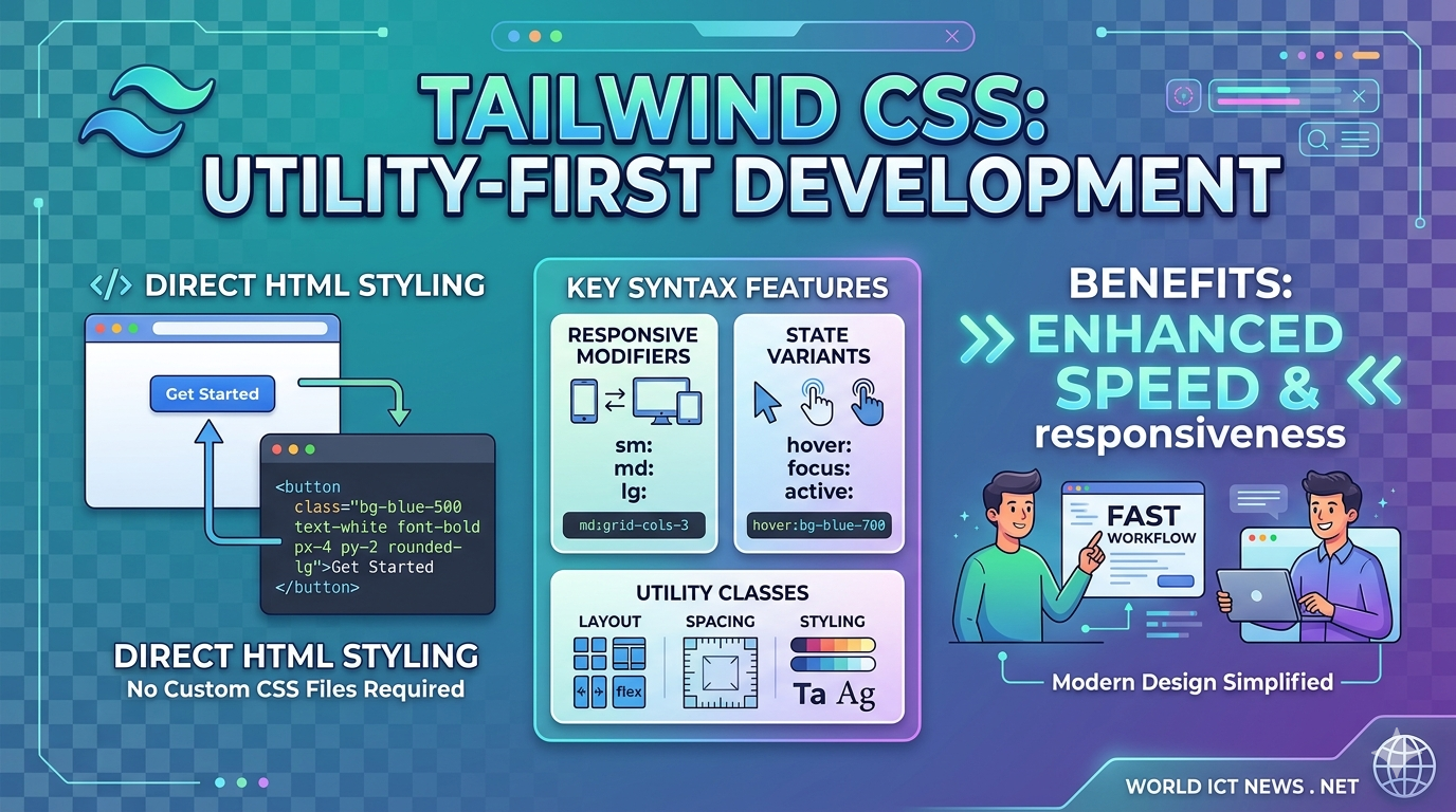
For years, styling web applications followed a predictable pattern: write HTML, create an external CSS stylesheet, invent semantic class names like .card-profile-container, and jump back and forth between files.
Tailwind CSS fundamentally shifted this workflow. As a utility-first CSS framework, Tailwind provides low-level utility classes that you apply directly within your HTML or JSX markup. Instead of writing custom CSS properties, you construct designs by stacking pre-defined classes.
This comprehensive guide will take you from a complete beginner to confidently writing and understanding Tailwind CSS syntax.
1. Understanding the Utility-First Concept
To appreciate Tailwind's syntax, you must first understand what "utility-first" means.
The Traditional Approach
In traditional CSS, you write a component class and define multiple properties inside it:
css
/* Traditional CSS */
.btn-primary {
background-color: #3b82f6;
color: #ffffff;
padding: 0.5rem 1rem;
border-radius: 0.25rem;
font-weight: 600;
}
Use code with caution.
html
<!-- Traditional HTML -->
<button class="btn-primary">Click me</button>
Use code with caution.
The Tailwind Approach
With Tailwind, you do not write the CSS stylesheet. You apply single-purpose utility classes directly to the element:
html
<!-- Tailwind CSS -->
<button class="bg-blue-500 text-white px-4 py-2 rounded font-semibold">
Click me
</button>
Use code with caution.
Why Use This Design Framework?
No Class Name Anxiety: You no longer have to invent arbitrary names like
.wrapper-inner-final.Smaller CSS Bundles: Since classes are reused across your project, your production CSS file remains incredibly small.
Fearless Maintainability: Changes are local to the HTML element. Modifying an element’s style will never accidentally break a completely different page.
2. Setting Up Tailwind CSS
To follow along with the syntax examples, you need to set up Tailwind. While you can use a CDN script tag for quick prototyping, the official, production-ready method uses the Tailwind CLI via Node.js.
Step 1: Initialize Your Project
Open your terminal, create a new directory, and initialize an npm project:
bash
mkdir tailwind-guide
cd tailwind-guide
npm init -y
Use code with caution.
Step 2: Install Tailwind CSS
Install Tailwind and its peer dependencies via npm:
bash
npm install -D tailwindcss postcss autoprefixer
Use code with caution.
Step 3: Create the Configuration File
Generate the tailwind.config.js file by running the initialization command:
bash
npx tailwindcss init
Use code with caution.
Step 4: Configure Template Paths
Open the newly created tailwind.config.js file. Add the paths to all of your template files so Tailwind can scan them for class names:
javascript
/** @type {import('tailwindcss').Config} */
module.exports = {
content: ["./src/**/*.{html,js}"],
theme: {
extend: {},
},
plugins: [],
}
Use code with caution.
Step 5: Add Tailwind Directives to Your Main CSS
Create a source CSS file at ./src/input.css and add the @tailwind directives for each of Tailwind’s layers:
css
@tailwind base;
@tailwind components;
@tailwind utilities;
Use code with caution.
Step 6: Run the Build Process
Start the Tailwind CLI build process to scan your template files and compile your final CSS file:
bash
npx tailwindcss -i ./src/input.css -o ./src/output.css --watch
Use code with caution.
Step 7: Link Compiled CSS in HTML
Create your ./src/index.html file and link the compiled output.css sheet:
html
<!DOCTYPE html>
<html lang="en">
<head>
<meta charset="UTF-8">
<meta name="viewport" content="width=device-width, initial-scale=1.0">
<link href="./output.css" rel="stylesheet">
<title>Tailwind Guide</title>
</head>
<body class="bg-gray-100 p-8">
<h1 class="text-3xl font-bold text-blue-600">Tailwind works!</h1>
</body>
</html>
Use code with caution.
3. Core Syntax Rules and Conventions
Tailwind’s naming convention is highly intuitive once you grasp its systematic formula. Most classes follow a property-modifier or property-direction-modifier structure.
[ Utility Class Anatomy ]
bg - blue - 500 / 50
│ │ │ │
Property Color Weight Opacity
Spacing and Sizes (The Tailwind Scale)
Tailwind uses a numeric scale for spacing (margins, padding, gaps, widths, and heights). By default, 1 unit equals 0.25rem (which is 4px in standard browsers).
p-4meanspadding: 1rem;(16px)mt-2meansmargin-top: 0.5rem;(8px)w-64meanswidth: 16rem;(256px)
Directions and Axes
When applying directional styles (like margin or padding), Tailwind uses directional letters:
t: Top (e.g.,pt-4for padding-top)b: Bottom (e.g.,mb-2for margin-bottom)l: Left (e.g.,pl-3for padding-left)r: Right (e.g.,pr-1for padding-right)x: Horizontal axis (combines left and right, e.g.,mx-auto)y: Vertical axis (combines top and bottom, e.g.,py-6)
Color Syntax
Colors follow a three-part structure: [context]-[colorName]-[weight].
Contexts include
bg-(background),text-(typography),border-(borders), andaccent-(form inputs).Weights range from
50(lightest) to950(darkest), typically changing in increments of 100.Example:
bg-red-500provides a standard red background, whiletext-slate-900provides a very dark gray text color.
4. Deep Dive: Common Utility Categories
To build functional user interfaces, you must familiarize yourself with Tailwind's core utility categories.
Typography
Tailwind replaces native font sizing and weights with simple shorthand classes:
Size:
text-xs(12px),text-base(16px),text-xl(20px),text-4xl(36px), up totext-9xl.Weight:
font-light,font-normal,font-semibold,font-bold,font-black.Alignment & Style:
text-center,text-justify,italic,underline,uppercase.Line Height:
leading-tight,leading-normal,leading-loose.
Layout (Flexbox and Grid)
Tailwind shines brightest when building modern CSS layouts. It eliminates layout boilerplate entirely.
Flexbox Container Example:
html
<div class="flex flex-row justify-between items-center gap-4">
<div>Item 1</div>
<div>Item 2</div>
</div>
Use code with caution.
flexinitializes the Flexbox layout context.flex-rowsetsflex-direction: row;.justify-betweendistributes items evenly along the main axis.items-centercenters items along the cross-axis.gap-4injects a 16px space specifically between the child items.
CSS Grid Container Example:
html
<div class="grid grid-cols-3 gap-6">
<div class="col-span-2 bg-white">Main Content (Spans 2 columns)</div>
<div class="bg-gray-200">Sidebar (Spans 1 column)</div>
</div>
Use code with caution.
grid-cols-3creates a grid with 3 explicit, equal-width columns.col-span-2forces a child element to span across two column tracks.
Borders and Effects
Borders:
borderapplies a 1px border. Scale it up withborder-2,border-4, orborder-8. Style it usingborder-solidorborder-dashed.Border Radius: Control corner roundness using
rounded-sm,rounded(4px),rounded-lg(8px), orrounded-full(creates circles or capsules).Box Shadows: Add depth using
shadow-sm,shadow,shadow-md,shadow-xl, orshadow-inner.
5. Advanced Syntax: Pseudo-classes, Responsiveness, and Custom Values
Once you master basic utilities, you can unlock Tailwind's power modifiers. These modifiers allow you to handle user interactions, responsive breakpoints, and dark mode without leaving your markup.
State Modifiers (Hover, Focus, and Active)
To apply styles conditionally on user interaction, prefix your utility class with the state name followed by a colon (:).
html
<button class="bg-blue-500 hover:bg-blue-600 focus:outline-none focus:ring-2 focus:ring-blue-300 active:bg-blue-700 text-white p-2">
Interactive Button
</button>
Use code with caution.
hover:bg-blue-600alters the background color only when the cursor hovers over the button.focus:ring-2applies a focus ring outline when a keyboard user tabs onto the element.
Responsive Modifiers (Mobile-First Philosophy)
Tailwind uses an intuitive, mobile-first responsive design system. Unprefixed classes apply to all screen sizes (starting from mobile devices). Breakpoint prefixes apply rules at that screen size and larger.
Tailwind includes five built-in responsive breakpoints:
sm:640px(Tablets)md:768px(Small laptops)lg:1024px(Large laptops)xl:1280px(Desktops)2xl:1536px(Large monitors)
Example of a responsive card grid:
html
<div class="grid grid-cols-1 sm:grid-cols-2 lg:grid-cols-4 gap-4">
<!-- This layout displays 1 column on mobile, 2 on tablets, and 4 on desktop screens -->
</div>
Use code with caution.
Dark Mode Toggle
Tailwind natively supports theme switching using the dark: prefix.
html
<div class="bg-white text-black dark:bg-gray-900 dark:text-white">
<p>This container adapts automatically to the user's OS color scheme preferences.</p>
</div>
Use code with caution.
Arbitrary Values (The Escape Hatch)
What happens if you need an explicit pixel measurement that does not exist on Tailwind's numeric scale, like a width of exactly 317px or a custom brand hex color?
Tailwind provides Arbitrary Values using square brackets [...]. This allows you to generate safe, on-the-fly custom utilities without modifying your global configuration file.
html
<div class="w-[317px] bg-[#1da1f2] top-[12px]">
Custom Arbitrary Box
</div>
Use code with caution.
6. Real-World Practical Example: Building a Profile Card Component
Let's combine everything we have learned so far to build a modern, clean, fully responsive profile card component from scratch using Tailwind's syntax.
html
<div class="max-w-sm mx-auto bg-white rounded-xl shadow-md overflow-hidden md:max-w-2xl my-8 border border-gray-100">
<div class="md:flex">
<!-- Image Section -->
<div class="md:shrink-0">
<img class="h-48 w-full object-cover md:h-full md:w-48" src="https://unsplash.com" alt="User avatar">
</div>
<!-- Content Section -->
<div class="p-8">
<div class="uppercase tracking-wide text-xs text-indigo-500 font-semibold">
Growth Marketing
</div>
<a href="#" class="block mt-1 text-lg leading-tight font-medium text-black hover:underline">
Sarah Jenkins
</a>
<p class="mt-2 text-slate-500 text-sm">
Specializing in data-driven user acquisition strategies, SEO growth loops, and scalable digital product architecture for fast-growing technology startups.
</p>
<!-- Action Badges -->
<div class="mt-4 flex flex-wrap gap-2">
<span class="px-2.5 py-0.5 rounded-full text-xs font-medium bg-blue-100 text-blue-800">
#Marketing
</span>
<span class="px-2.5 py-0.5 rounded-full text-xs font-medium bg-purple-100 text-purple-800">
#SEO
</span>
<span class="px-2.5 py-0.5 rounded-full text-xs font-medium bg-green-100 text-green-800">
#Remote
</span>
</div>
</div>
</div>
</div>
Use code with caution.
Syntax breakdown of this component:
max-w-sm mx-auto: Caps the component width on mobile displays and horizontally centers it via margins (margin-left: auto; margin-right: auto;).overflow-hidden: Ensures the profile image respects the container’s rounded corners (rounded-xl).md:flex: Converts the design from a stacked vertical layout on mobile screens to a side-by-side Flexbox layout on tablet/desktop devices.object-cover: Maintains the image's aspect ratio without stretching or distorting it when resized.tracking-wide: Broadens theletter-spacingvalue of the subheader to create an elegant, professional editorial aesthetic.
7. Best Practices for Writing Clean Tailwind CSS
As your project grows, your HTML files can quickly become cluttered with long strings of utility classes. Follow these essential architectural strategies to keep your codebase pristine.
1. Maintain a Consistent Class Order
Always group your classes logically so your team can read them quickly. A great sequence to follow is:
Layout & Positioning (
absolute,flex,grid,top-0,z-10)Box Model (
w-full,h-32,p-4,m-2)Typography (
text-lg,font-bold,text-center)Visuals (
bg-blue-500,rounded-md,shadow-lg,border)Interactive states & Interactivity (
hover:bg-blue-600,transition-all)Responsive modifiers (
md:flex-row,lg:text-xl)
Tip: You can automate this entirely by installing the official Prettier Plugin for Tailwind CSS (prettier-plugin-tailwindcss), which automatically sorts your classes every time you save your file.
2. Don't Abuse the @apply Directive
Tailwind allows you to bundle utility classes into custom CSS component classes using @apply:
css
/* Avoid doing this excessively */
.my-custom-input {
@apply w-full p-2 border border-gray-300 rounded bg-white text-gray-900 focus:ring-2;
}
Use code with caution.
While this looks cleaner in your HTML file, it recreates traditional CSS problems. You lose the ability to quickly scan classes locally, your final production bundle sizes increase, and you have to continuously invent custom class names again. Use @apply sparingly, or restrict it to global typography defaults.
3. Lean on Component Frameworks
If you want clean markup without class bloat, break down your interface into reusable structural templates using component-based frameworks like React, Vue, Svelte, Astro, or simple backend partials (like Blade or Django templates).
Instead of maintaining a long class string across ten different buttons, create a singular <Button /> component once and reuse it across your application:
jsx
// A reusable React Button Component utilizing Tailwind
export function Button({ children, variant = 'primary' }) {
const baseStyles = "px-4 py-2 rounded-lg font-medium transition-colors focus:ring-2 focus:ring-offset-2";
const variants = {
primary: "bg-blue-600 text-white hover:bg-blue-700 focus:ring-blue-500",
secondary: "bg-gray-200 text-gray-800 hover:bg-gray-300 focus:ring-gray-500"
};
return (
<button class={`${baseStyles} ${variants[variant]}`}>
{children}
</button>
);
}
Use code with caution.
8. Conclusion
Tailwind CSS radically accelerates modern web development timelines by removing the friction of writing custom CSS styles. By understanding its foundational layout mechanics, mastering its semantic numeric scaling rules, and utilizing interactive state prefixes, you can confidently craft production-grade web layouts directly inside your markup.
As a next step, try refactoring an existing static page using the Tailwind CLI setup or experiment instantly within your browser using the official interactive sandbox at tailwindcss.com.
Did you find this ICT insight helpful?