Introduction to CSS and Modern CSS Properties
Introduction to CSS and Modern CSS Properties.
In the early days of the World Wide Web, web pages were flat, text-heavy documents. HTML was designed strictly to structure content—to denote headings, paragraphs, and lists. However, as the web grew, the demand for visual presentation, layout control, and aesthetic customization skyrocketed.
To separate content from presentation, the World Wide Web Consortium (W3C) introduced Cascading Style Sheets (CSS). Today, CSS is a core cornerstone of web development. It transforms raw HTML skeletons into highly engaging, beautiful, responsive, and interactive user interfaces.
As the web continues to mature, CSS has evolved from a simple styling syntax into a powerful programmatic layout engine. This article provides a comprehensive introduction to foundational CSS concepts, explores core mechanics like the Box Model and Specificity, and dives deep into the modern layout modules and properties changing web design today.
What is CSS? Understanding the Core Syntax
CSS is a rules-based stylesheet language used to describe the presentation of a document written in HTML or XML. It instructs the browser exactly how to render HTML elements on screen, paper, or other media.
The Rule Set Anatomy
A CSS style sheet consists of a collection of rule sets. Each rule set targets specific HTML elements and applies styles to them.
css
selector {
    property: value;
    property: value;
}
Use code with caution.
Selector: Points to the HTML element you want to style (e.g.,
h1,.card,#submit-btn).Declaration Block: Enclosed in curly braces
{}and contains one or more declarations separated by semicolons.Property: The aesthetic feature you want to change (e.g.,
color,font-size,margin).Value: The specific setting assigned to the property (e.g.,
red,16px,2rem).
Methods of Applying CSS
You can add CSS to an HTML document using three distinct methods:
Inline CSS: Applied directly to an HTML element using the
styleattribute. Avoid this for large projects as it breaks content/style separation.Internal/Embedded CSS: Defined within a
<style>tag inside the HTML<head>section. Useful for single-page applications or quick testing.External CSS: Written in a separate
.cssfile and linked in the HTML document using the<link>tag. This is the industry gold standard for maintainability and caching performance.
Foundational Concepts: The Box Model, Cascade, and Specificity
To write clean, predictable CSS, you must master the fundamental mechanics governing how browsers compute styles and layouts.
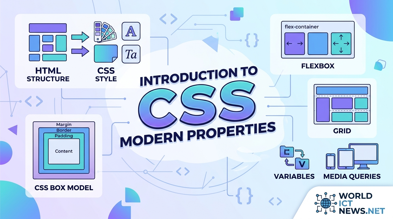
1. The CSS Box Model
In CSS, absolutely everything is a box. Every HTML element is represented as a rectangular box consisting of four concentric layers.
┌──────┐
│ MARGIN │
│ ┌───┐ │
│ │ BORDER │ │
│ │ ┌───┐ │ │
│ │ │ PADDING │ │ │
│ │ │ ┌──┐ │ │ │
│ │ │ │ CONTENT │ │ │ │
│ │ │ └──┘ │ │ │
│ │ └────┘ │ │
│ └─────┘ │
└──────┘
Content: The core area where text, images, or child elements reside.
Padding: The invisible space directly surrounding the content, located inside the border. It cushions the text against its boundaries.
Border: The line wrapping around the padding and content.
Margin: The outermost clearance space separating the element box from neighboring elements on the page.
The box-sizing Breakthrough
By default, an element's total width is calculated as: width + padding + border. This behavior often breaks layouts when padding is added. Modern web developers bypass this issue by applying the following global rule, forcing the browser to include padding and borders within the specified width:
css
* {
    box-sizing: border-box;
}
Use code with caution.
2. The Cascade and Specificity
The "C" in CSS stands for Cascading. When multiple conflicting rules target the same element, the browser applies a cascading algorithm to determine which rule wins. It judges rules based on three criteria:
Source Order: Rules written lower down in a stylesheet override rules written above them.
Importance: Rules marked with
!importantbypass normal cascading flow. (Use sparingly, as it damages long-term codebase scaling).Specificity: A mathematical weight calculation based on selector types.
The Specificity Hierarchy
Browsers calculate a score using four value registers (Inline, ID, Class/Attribute, Element):
Inline styles: Highest weight
(1, 0, 0, 0)ID Selectors (
#header): High weight(0, 1, 0, 0)Class, Attribute, and Pseudo-classes (
.card,[type="text"],:hover): Medium weight(0, 0, 1, 0)Element Selectors (
div,p,h1): Lowest weight(0, 0, 0, 1)
A class selector (.btn) will always override an element selector (button), regardless of where they are written in the file.
Modern Structural Layouts: Flexbox and Grid
For over a decade, layout construction in CSS relied on hacks using tables, absolute positioning, or float properties. Modern CSS introduced native layout systems that make complex, responsive design incredibly straightforward.
1. CSS Flexible Box Layout (Flexbox)
Flexbox is a one-dimensional layout system designed to align items smoothly along a single row or single column. It excels at component-level distributions, navigation bars, and aligning elements center-mass.
css
.flex-container {
display: flex;
flex-direction: row; /* Layout direction: row or column */
justify-content: space-between; /* Horizontal alignment along main axis */
align-items: center; /* Vertical alignment along cross axis */
gap: 1.5rem; /* Native space spacing between items */
}
Use code with caution.
2. CSS Grid Layout
While Flexbox deals with one dimension, CSS Grid is a powerful two-dimensional layout system. It handles columns and rows simultaneously, allowing you to build complex layout structures directly in CSS without relying on wrapper elements.
css
.grid-container {
display: grid;
grid-template-columns: repeat(3, 1fr); /* 3 equal-width columns */
grid-template-rows: auto;
gap: 20px;
}
Use code with caution.
The 1fr unit stands for Fractional Unit, a modern layout concept that dynamically calculates and allocates slices of available browser space.
Deep Dive: Modern CSS Properties Changing Web Development
Modern CSS minimizes our reliance on JavaScript code, external libraries, and image editing software. Here are the cutting-edge properties powering modern user interfaces.
1. CSS Custom Properties (Variables)
Native CSS variables make it easy to manage color themes, typography scales, and global spacing values from a centralized root catalog.
css
:root {
--primary-color: #0f172a;
--accent-color: #38bdf8;
--base-padding: 1rem;
}
.card {
background-color: var(--primary-color);
padding: var(--base-padding);
border-bottom: 3px solid var(--accent-color);
}
Use code with caution.
Unlike preprocessor variables (like SASS or LESS), native CSS variables operate live in the browser DOM. They can be updated in real-time using JavaScript or changed on-the-fly inside media queries.
2. Clamp, Min, and Max (Fluid Responsive Typography)
Traditional responsive typography relies on rigid @media breakpoints to adjust text sizes between desktop and mobile devices. The clamp() function provides fluid typography in a single line of code.
css
h1 {
font-size: clamp(1.5rem, 5vw, 3rem);
}
Use code with caution.
The clamp() property accepts three parameters: a minimum boundary, a preferred fluid calculation value, and a maximum limit. In this example, the heading shrinks dynamically relative to the viewport (5vw), but never drops below 1.5rem or expands past 3rem.
3. Aspect Ratio Control (aspect-ratio)
Before this property was introduced, preventing layout shifts while responsive images or video embeds loaded required complex padding-bottom calculations. The native aspect-ratio property fixes this cleanly.
css
.video-embed {
width: 100%;
aspect-ratio: 16 / 9;
object-fit: cover;
}
Use code with caution.
4. Background and Backdrop Filter Effects (backdrop-filter)
The frosted-glass visual effect popular in modern user interfaces used to be incredibly difficult to build. Now, developers can use the backdrop-filter property to apply graphical blurs directly behind transparent components.
css
.glass-modal {
background-color: rgba(255, 255, 255, 0.1);
backdrop-filter: blur(12px);
border: 1px solid rgba(255, 255, 255, 0.2);
}
Use code with caution.
5. Scroll-Driven Animations and Subgrid
CSS features continue to expand at a rapid pace:
Subgrid (
grid-template-columns: subgrid): Allows nested child elements to inherit and align perfectly with columns defined on a parent container.Scroll-Driven Animations: Enables scroll position tracking natively within CSS rules to trigger timeline animations without writing a single line of heavy JavaScript event listeners.
Conclusion
CSS has evolved far beyond a basic decoration script. It is a robust, performant layout language that gives developers precise control over the visual presentation of web applications. By mastering foundational pillars like the Box Model and cascading specificity, and embracing modern features like Flexbox, Grid, CSS Variables, and fluid logical sizing, you can build production-ready layouts that are resilient, maintainable, and remarkably clean.
Did you find this ICT insight helpful?