The Latest in

ICT Articles & Tutorials

World ICT News is a professional platform dedicated to Artificial Intelligence, Cloud Computing, DevOps, and Cybersecurity. Empowering the next generation of ICT specialists. Our exclusive tutorials and articles are designed to serve as a stepping stone for you into the world of ICT industry...

Git Basic Operations to Advanced Version Control workflows
Jul 19, 2026
11 min read

Git Basic Operations to Advanced Version Control workflows

Mastering Git: From Basic Operations to Advanced Version Control workflows. In modern software engineering, source control is not merely an administrative task; it is the backbone of collaboration, code quality, and continuous deployment. At the heart of this ecosystem is Git, a distributed version control system designed to handle everything from small projects to massive enterprise codebases with speed and efficiency.Understanding Git requires moving past memorizing commands to grasping its internal architecture. Git operates through a series of conceptual states—the working directory, the staging area (index), the local repository, and remote repositories.This comprehensive guide transitions from foundational concepts to advanced, high-utility operations that will elevate your version control workflows.1. Groundwork: The Core Concepts of GitTo understand Git commands, you must first understand the three local areas of a Git project:+-------------------+ git add +------------------+| | ---------------> | || Working Directory | | Staging Area || | <--------------- | (Index) |+-------------------+ git restore +------------------+ | | | | git commit | v | git checkout / switch +------------------+ +----------------------------- | | | Local Repository | | (.git) | +------------------+The Working Directory: The actual files you see, modify, and delete on your computer's filesystem.The Staging Area (Index): A preparation phase. It is a single file inside your .git directory that lists exactly what changes will go into your next commit snapshot.The Local Repository: The permanent history database of your project, saved securely in the hidden .git/ directory.2. Foundational Commands: Building Your HistoryThese foundational primitives are necessary for configuring and interacting with a local codebase.Project Initialization and ConfigurationEvery Git journey begins with identity assignment. Without global configuration, collaborative environments cannot parse code authorship.bash# Set global identity configurationgit config --global user.name "Your Name"git config --global user.email "your.email@example.com"# Initialize a brand-new local repositorygit initUse code with caution.Application Detail: git init creates the hidden .git folder. This subfolder tracks all metadata, object databases, and ref pointers. Never modify this folder manually unless executing precise, manual recovery operations.Tracking and Committing ChangesThe cycle of tracking changes moves snapshot assets from the temporary workspace into immutable version records.bash# Check status of untracked, modified, or staged filesgit status# Stage a specific file for committinggit add main.py# Stage all changes in the current directory and subdirectoriesgit add .# Snapshot the staged changes into local repository historygit commit -m "feat: implement customer behavior data ingestion pipeline"Use code with caution.Best Practice: Craft commits atomically. A commit should encapsulate a single functional logical change. Avoid "mega-commits" that mix bug fixes, style adjustments, and feature development, as they complicate code rollbacks.Investigating Repository Statebash# View chronological commit logsgit log# View a compacted, highly visual graph structure of your project historygit log --oneline --graph --allUse code with caution.3. Intermediate Operations: Branching, Merging, and CollaborationBranching is Git's defining strength. Unlike legacy centralized version control systems where branching involves duplicating heavy physical directories, Git branches are simply lightweight pointers to specific commit hashes. A --- B --- C (main) \ D --- E (feature-xyz)Navigating Branches SafelyModern Git ecosystems split the traditional git checkout command into explicit, dedicated modules: git switch and git restore. This split protects developers from accidentally modifying files when they intended to navigate history.bash# Create and move instantly into a new branchgit switch -c feature-analytics# View all local and remote tracking branchesgit branch -a# Switch back to the primary integration branchgit switch mainUse code with caution.Merging and Conflict ResolutionWhen integration tasks finish, developers merge changes back into primary channels.bash# Run from 'main' to pull changes from 'feature-analytics' into 'main'git merge feature-analyticsUse code with caution.Handling Merge ConflictsConflicts happen when two separate developers modify the identical block of code within a file across differing branches. Git pauses execution, injects clear marker notations into the conflicted assets, and waits for a human developer to resolve the structural impasse.markdown<<<<<<< HEADprint("Welcome to the advanced analytics engine running on desktop environment.")=======print("Welcome to mobile-first analytics services dashboard.")>>>>>>> feature-analyticsUse code with caution.Resolution Pattern: Open the conflicting document, inspect the functional merits of both incoming and current lines, remove the synthetic <<<<<<<, =======, and >>>>>>> tokens, save your cleaned file, and execute:bashgit add main.pygit commit -m "merge: resolve interface conflict between desktop and mobile features"Use code with caution.Synching with Remote Hostsbash# Associate a local repository with a remote cloud server hosting layoutgit remote add origin https://github.com# Share local commit updates upstream securelygit push -u origin main# Update local indices with knowledge of remote updates without modifying active working code filesgit fetch origin# Fetch updates and instantly perform a merge behind the scenes into active branch filesgit pull origin mainUse code with caution.4. Advanced Commands: Surgical Precision and History ManipulationAdvanced Git operators allow you to actively rewrite repository timelines, recover deleted branches, and debug code issues methodically.Rebase vs. Merge: The Linear Architecture DebateWhile git merge links historical development paths via a dedicated, chronological merge commit, git rebase rewrites history by picking commits from your current branch and replaying them cleanly directly on top of another branch tip.Before Rebase: A --- B --- C (main) \ D --- E (feature)After Rebase (git switch feature; git rebase main): A --- B --- C (main) \ D' --- E' (feature)bash# Rebase active branch on top of main for a cleaner upstream merge integration processgit switch feature-analyticsgit rebase mainUse code with caution.The Golden Rule of Rebasing: Never rebase branches that have been pushed to a public, shared repository. Rebasing fundamentally alters commit IDs. If another developer has based their work on your original commits, altering those records destroys their historical context, resulting in painful manual reconciliation.Interactive Rebasing: Cleaning Up Before Code ReviewBefore submitting your changes for a formal code review via Pull Request, you can use interactive rebasing to clean up messy local commits (e.g., fixing typos, combining minor adjustments, or rephrasing commit messages).bash# Interactively evaluate the last 4 commits made locallygit rebase -i HEAD~4Use code with caution.Running this opens an interactive console text editor outlining your last four sequential operations:textpick a1b2c3d feat: add initial dataframe configuration profilepick e5f6g7h fix: repair variable tracking syntax bugpick i9j0k1l docs: update readme formatting structurepick m3n4o5p chore: tweak layout background display spacing# Rebase Commands:# p, pick = use commit# r, reword = use commit, but edit the commit message# s, squash = use commit, but meld into previous commit# d, drop = remove commit completelyUse code with caution.By switching the command text from pick to squash, you can compress multiple minor commits into a single, clean feature commit. This keeps your shared repository timeline organized and readable.Stashing: Saving Incomplete Work on the FlyImagine working on a complex feature when an urgent production bug requires your immediate attention. You are not ready to commit your unfinished code, but you must switch branches immediately. git stash acts as a temporary shelf to safely store your active work without committing it.bash# Save uncommitted edits cleanly to a temporary side shelfgit stash# Check your current shelf contentsgit stash list# Return to an empty branch state, fix the production bug, switch back, and pop the shelf datagit stash popUse code with caution.Advanced Tip: Use git stash save "WIP: customer behavior analytics plot script" to assign a clear descriptive label to your stashed state. This makes it much easier to identify if you have multiple items saved on your stash list.Cherry-Picking: Surgical Commit ExtractionSometimes, you need to bring a specific commit from an experimental branch into your stable production branch without merging the entire history of that experimental branch. X --- Y --- Z (experimental-feature) / A --- B --- C (main) \ Y' (main after cherry-pick of commit Y)bash# Apply a specific commit from anywhere in the history to your current branchgit cherry-pick e5f6g7hUse code with caution.Git Reflog: Your Ultimate Safety NetHave you ever accidentally deleted a branch, performed an incorrect hard reset, or lost a critical commit after a complex rebase? Do not panic. Git almost never deletes data immediately; it simply removes pointers to those files.git reflog tracks every single action you take locally—including switching branches, rebasing, and resetting. It serves as your local registry of commit interactions.bash# Print the definitive log history tracking all movement pointersgit reflogUse code with caution.Output breakdown:text7a2b3c4 HEAD@{0}: reset: moving to HEAD~18f9e1d2 HEAD@{1}: commit: feat: generate customer satisfaction visualization matrixUse code with caution.To undo an accidental reset and recover your lost work, simply locate the target commit hash right before the mistake occurred and point your repository back to it:bashgit reset --hard 8f9e1d2Use code with caution.5. Strategic Diagnosis and Recovery TacticsEven experienced developers encounter situations where production pipelines break or code histories become disorganized. Git provides built-in troubleshooting tools to help you identify, diagnose, and resolve these issues efficiently.Resetting Code Safely: Soft, Mixed, and HardWhen you need to undo changes, git reset lets you return your project state to a specific earlier commit. However, you must choose your reset type carefully based on how it impacts your working environment:bash# --soft: Moves the branch pointer back, but keeps all your modified files staged in the index.git reset --soft HEAD~1# --mixed (Default): Moves the branch pointer back and unstages your changes, but keeps your modified files safe in your working directory.git reset --mixed HEAD~1# --hard: Destroys ALL changes since that commit. This completely wipes out both your staging index and your working directory.git reset --hard HEAD~1Use code with caution.Finding Bugs with Binary SearchWhen a previously working feature suddenly breaks, but you don't know which of the dozens of recent commits caused the bug, hunting for the problem manually is incredibly time-consuming. git bisect automates this search using a binary search algorithm to quickly locate the exact commit that introduced the issue.bash# Start the binary search wizardgit bisect start# Inform Git that your current version is brokengit bisect bad# Provide a known historical commit hash where the application worked correctlygit bisect good a1b2c3dUse code with caution.Git will automatically check out a commit halfway between your good and bad reference points. Run your test suite or check the application, then report the result:bashgit bisect good # If this version works correctly# ORgit bisect bad # If this version is brokenUse code with caution.Git repeats this process, splitting the remaining commits in half each time, until it pinpoints the exact commit that broke your code. Once you have identified the problematic commit, exit the search wizard and return to your original branch state:bashgit bisect reset Use code with caution.6. Enterprise Workflows and Best PracticesTo succeed in a professional development environment, it is not enough to just know the commands. You must also understand how teams leverage these tools collectively to maintain clean, stable codebases.1. Protect Your Primary BranchesNever push code directly to main integration tracks like main or develop. Instead, configure your repository hosting platform (such as GitHub, GitLab, or Bitbucket) to enforce protected branch rules. This ensures that changes can only be merged through verified Pull Requests that pass automated build tests and receive peer approvals.2. Follow Clean Commit Message GuidelinesA messy commit log makes troubleshooting and maintaining a codebase difficult. Adopt clear commit formatting standards, such as the Conventional Commits specification:feat: add real-time customer behavior analytics dashboardfix: resolve missing values null pointer exception inside user profile importsdocs: update installation instructions in readme3. Keep Your Branching Strategy SimpleChoose a branching strategy that fits your team's release cadence:GitFlow: Ideal for enterprise environments with structured, scheduled release cycles. It uses distinct, dedicated branches for development, feature creation, release preparation, and emergency hotfixes.GitHub Flow: Perfect for agile, continuous-deployment teams. Developers create short-lived feature branches directly off of main, which are merged back immediately once they pass automated testing.Summary Command ReferenceCommandCategoryPractical Purposegit initBasicInitializes a brand-new local repository.git add .BasicStages all modified and new files for the next commit.git commit -m "msg"BasicCreates a permanent historical snapshot of your staged changes.git switch -c <name>IntermediateCreates a new branch and immediately switches your workspace to it.git merge <branch>IntermediateIntegrates the history of a target branch into your active branch.git rebase -i HEAD~XAdvancedInteractively clean up, combine, or rephrase your last X local commits.git stashAdvancedTemporarily shelves your uncommitted work to give you a clean branch state.git cherry-pick <hash>AdvancedApplies a single specific commit from another branch into your current branch.git reflogAdvancedLists every local repository action to help you recover lost data.git bisectAdvancedUses binary search to quickly locate the exact commit that introduced a bug.
The Ultimate Step-by-Step Guide to Tailwind CSS and Its Syntax
Jun 28, 2026
11 min read

The Ultimate Step-by-Step Guide to Tailwind CSS and Its Syntax

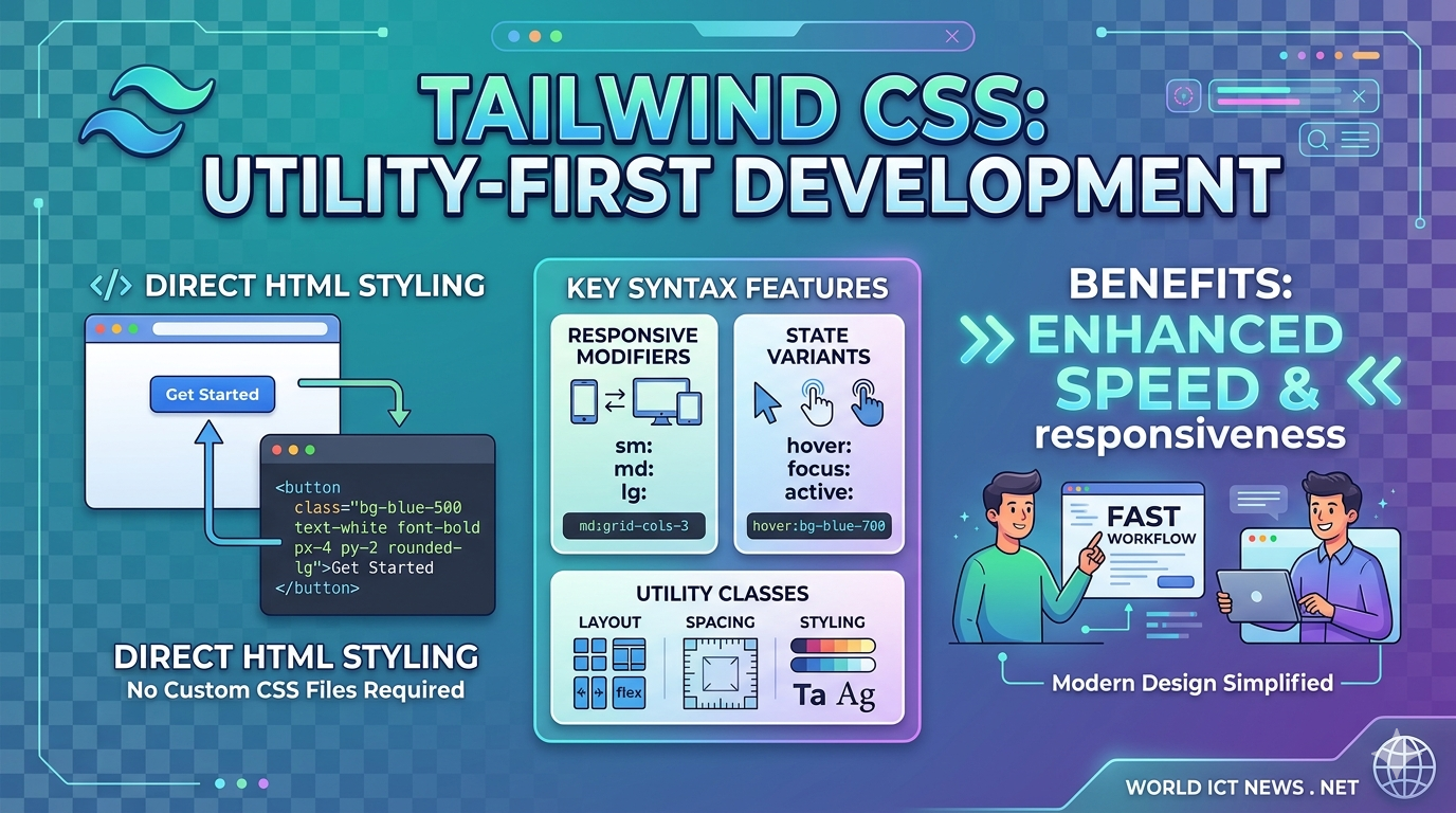
The Ultimate Step-by-Step Guide to Tailwind CSS and Its Syntax. For years, styling web applications followed a predictable pattern: write HTML, create an external CSS stylesheet, invent semantic class names like .card-profile-container, and jump back and forth between files.Tailwind CSS fundamentally shifted this workflow. As a utility-first CSS framework, Tailwind provides low-level utility classes that you apply directly within your HTML or JSX markup. Instead of writing custom CSS properties, you construct designs by stacking pre-defined classes.This comprehensive guide will take you from a complete beginner to confidently writing and understanding Tailwind CSS syntax.1. Understanding the Utility-First ConceptTo appreciate Tailwind's syntax, you must first understand what "utility-first" means.The Traditional ApproachIn traditional CSS, you write a component class and define multiple properties inside it:css/* Traditional CSS */.btn-primary { background-color: #3b82f6; color: #ffffff; padding: 0.5rem 1rem; border-radius: 0.25rem; font-weight: 600;}Use code with caution.html<!-- Traditional HTML --><button class="btn-primary">Click me</button>Use code with caution.The Tailwind ApproachWith Tailwind, you do not write the CSS stylesheet. You apply single-purpose utility classes directly to the element:html<!-- Tailwind CSS --><button class="bg-blue-500 text-white px-4 py-2 rounded font-semibold"> Click me</button>Use code with caution.Why Use This Design Framework?No Class Name Anxiety: You no longer have to invent arbitrary names like .wrapper-inner-final.Smaller CSS Bundles: Since classes are reused across your project, your production CSS file remains incredibly small.Fearless Maintainability: Changes are local to the HTML element. Modifying an element’s style will never accidentally break a completely different page.2. Setting Up Tailwind CSSTo follow along with the syntax examples, you need to set up Tailwind. While you can use a CDN script tag for quick prototyping, the official, production-ready method uses the Tailwind CLI via Node.js.Step 1: Initialize Your ProjectOpen your terminal, create a new directory, and initialize an npm project:bashmkdir tailwind-guide cd tailwind-guide npm init -y Use code with caution.Step 2: Install Tailwind CSSInstall Tailwind and its peer dependencies via npm:bashnpm install -D tailwindcss postcss autoprefixerUse code with caution.Step 3: Create the Configuration FileGenerate the tailwind.config.js file by running the initialization command:bashnpx tailwindcss init Use code with caution.Step 4: Configure Template PathsOpen the newly created tailwind.config.js file. Add the paths to all of your template files so Tailwind can scan them for class names:javascript/** @type {import('tailwindcss').Config} */module.exports = { content: ["./src/**/*.{html,js}"], theme: { extend: {}, }, plugins: [],}Use code with caution.Step 5: Add Tailwind Directives to Your Main CSSCreate a source CSS file at ./src/input.css and add the @tailwind directives for each of Tailwind’s layers:css@tailwind base; @tailwind components; @tailwind utilities; Use code with caution.Step 6: Run the Build ProcessStart the Tailwind CLI build process to scan your template files and compile your final CSS file:bashnpx tailwindcss -i ./src/input.css -o ./src/output.css --watchUse code with caution.Step 7: Link Compiled CSS in HTMLCreate your ./src/index.html file and link the compiled output.css sheet:html<!DOCTYPE html><html lang="en"><head> <meta charset="UTF-8"> <meta name="viewport" content="width=device-width, initial-scale=1.0"> <link href="./output.css" rel="stylesheet"> <title>Tailwind Guide</title></head><body class="bg-gray-100 p-8"> <h1 class="text-3xl font-bold text-blue-600">Tailwind works!</h1></body></html>Use code with caution.3. Core Syntax Rules and ConventionsTailwind’s naming convention is highly intuitive once you grasp its systematic formula. Most classes follow a property-modifier or property-direction-modifier structure. [ Utility Class Anatomy ] bg - blue - 500 / 50 │ │ │ │ Property Color Weight OpacitySpacing and Sizes (The Tailwind Scale)Tailwind uses a numeric scale for spacing (margins, padding, gaps, widths, and heights). By default, 1 unit equals 0.25rem (which is 4px in standard browsers).p-4 means padding: 1rem; (16px)mt-2 means margin-top: 0.5rem; (8px)w-64 means width: 16rem; (256px)Directions and AxesWhen applying directional styles (like margin or padding), Tailwind uses directional letters:t: Top (e.g., pt-4 for padding-top)b: Bottom (e.g., mb-2 for margin-bottom)l: Left (e.g., pl-3 for padding-left)r: Right (e.g., pr-1 for padding-right)x: Horizontal axis (combines left and right, e.g., mx-auto)y: Vertical axis (combines top and bottom, e.g., py-6)Color SyntaxColors follow a three-part structure: [context]-[colorName]-[weight].Contexts include bg- (background), text- (typography), border- (borders), and accent- (form inputs).Weights range from 50 (lightest) to 950 (darkest), typically changing in increments of 100.Example: bg-red-500 provides a standard red background, while text-slate-900 provides a very dark gray text color.4. Deep Dive: Common Utility CategoriesTo build functional user interfaces, you must familiarize yourself with Tailwind's core utility categories.TypographyTailwind replaces native font sizing and weights with simple shorthand classes:Size: text-xs (12px), text-base (16px), text-xl (20px), text-4xl (36px), up to text-9xl.Weight: font-light, font-normal, font-semibold, font-bold, font-black.Alignment & Style: text-center, text-justify, italic, underline, uppercase.Line Height: leading-tight, leading-normal, leading-loose.Layout (Flexbox and Grid)Tailwind shines brightest when building modern CSS layouts. It eliminates layout boilerplate entirely.Flexbox Container Example:html<div class="flex flex-row justify-between items-center gap-4"> <div>Item 1</div> <div>Item 2</div></div>Use code with caution.flex initializes the Flexbox layout context.flex-row sets flex-direction: row;.justify-between distributes items evenly along the main axis.items-center centers items along the cross-axis.gap-4 injects a 16px space specifically between the child items.CSS Grid Container Example:html<div class="grid grid-cols-3 gap-6"> <div class="col-span-2 bg-white">Main Content (Spans 2 columns)</div> <div class="bg-gray-200">Sidebar (Spans 1 column)</div></div>Use code with caution.grid-cols-3 creates a grid with 3 explicit, equal-width columns.col-span-2 forces a child element to span across two column tracks.Borders and EffectsBorders: border applies a 1px border. Scale it up with border-2, border-4, or border-8. Style it using border-solid or border-dashed.Border Radius: Control corner roundness using rounded-sm, rounded (4px), rounded-lg (8px), or rounded-full (creates circles or capsules).Box Shadows: Add depth using shadow-sm, shadow, shadow-md, shadow-xl, or shadow-inner.5. Advanced Syntax: Pseudo-classes, Responsiveness, and Custom ValuesOnce you master basic utilities, you can unlock Tailwind's power modifiers. These modifiers allow you to handle user interactions, responsive breakpoints, and dark mode without leaving your markup.State Modifiers (Hover, Focus, and Active)To apply styles conditionally on user interaction, prefix your utility class with the state name followed by a colon (:).html<button class="bg-blue-500 hover:bg-blue-600 focus:outline-none focus:ring-2 focus:ring-blue-300 active:bg-blue-700 text-white p-2"> Interactive Button</button>Use code with caution.hover:bg-blue-600 alters the background color only when the cursor hovers over the button.focus:ring-2 applies a focus ring outline when a keyboard user tabs onto the element.Responsive Modifiers (Mobile-First Philosophy)Tailwind uses an intuitive, mobile-first responsive design system. Unprefixed classes apply to all screen sizes (starting from mobile devices). Breakpoint prefixes apply rules at that screen size and larger.Tailwind includes five built-in responsive breakpoints:sm: 640px (Tablets)md: 768px (Small laptops)lg: 1024px (Large laptops)xl: 1280px (Desktops)2xl: 1536px (Large monitors)Example of a responsive card grid:html<div class="grid grid-cols-1 sm:grid-cols-2 lg:grid-cols-4 gap-4"> <!-- This layout displays 1 column on mobile, 2 on tablets, and 4 on desktop screens --></div>Use code with caution.Dark Mode ToggleTailwind natively supports theme switching using the dark: prefix.html<div class="bg-white text-black dark:bg-gray-900 dark:text-white"> <p>This container adapts automatically to the user's OS color scheme preferences.</p></div>Use code with caution.Arbitrary Values (The Escape Hatch)What happens if you need an explicit pixel measurement that does not exist on Tailwind's numeric scale, like a width of exactly 317px or a custom brand hex color?Tailwind provides Arbitrary Values using square brackets [...]. This allows you to generate safe, on-the-fly custom utilities without modifying your global configuration file.html<div class="w-[317px] bg-[#1da1f2] top-[12px]"> Custom Arbitrary Box</div>Use code with caution.6. Real-World Practical Example: Building a Profile Card ComponentLet's combine everything we have learned so far to build a modern, clean, fully responsive profile card component from scratch using Tailwind's syntax.html<div class="max-w-sm mx-auto bg-white rounded-xl shadow-md overflow-hidden md:max-w-2xl my-8 border border-gray-100"> <div class="md:flex"> <!-- Image Section --> <div class="md:shrink-0"> <img class="h-48 w-full object-cover md:h-full md:w-48" src="https://unsplash.com" alt="User avatar"> </div> <!-- Content Section --> <div class="p-8"> <div class="uppercase tracking-wide text-xs text-indigo-500 font-semibold"> Growth Marketing </div> <a href="#" class="block mt-1 text-lg leading-tight font-medium text-black hover:underline"> Sarah Jenkins </a> <p class="mt-2 text-slate-500 text-sm"> Specializing in data-driven user acquisition strategies, SEO growth loops, and scalable digital product architecture for fast-growing technology startups. </p> <!-- Action Badges --> <div class="mt-4 flex flex-wrap gap-2"> <span class="px-2.5 py-0.5 rounded-full text-xs font-medium bg-blue-100 text-blue-800"> #Marketing </span> <span class="px-2.5 py-0.5 rounded-full text-xs font-medium bg-purple-100 text-purple-800"> #SEO </span> <span class="px-2.5 py-0.5 rounded-full text-xs font-medium bg-green-100 text-green-800"> #Remote </span> </div> </div> </div></div>Use code with caution.Syntax breakdown of this component:max-w-sm mx-auto: Caps the component width on mobile displays and horizontally centers it via margins (margin-left: auto; margin-right: auto;).overflow-hidden: Ensures the profile image respects the container’s rounded corners (rounded-xl).md:flex: Converts the design from a stacked vertical layout on mobile screens to a side-by-side Flexbox layout on tablet/desktop devices.object-cover: Maintains the image's aspect ratio without stretching or distorting it when resized.tracking-wide: Broadens the letter-spacing value of the subheader to create an elegant, professional editorial aesthetic.7. Best Practices for Writing Clean Tailwind CSSAs your project grows, your HTML files can quickly become cluttered with long strings of utility classes. Follow these essential architectural strategies to keep your codebase pristine.1. Maintain a Consistent Class OrderAlways group your classes logically so your team can read them quickly. A great sequence to follow is:Layout & Positioning (absolute, flex, grid, top-0, z-10)Box Model (w-full, h-32, p-4, m-2)Typography (text-lg, font-bold, text-center)Visuals (bg-blue-500, rounded-md, shadow-lg, border)Interactive states & Interactivity (hover:bg-blue-600, transition-all)Responsive modifiers (md:flex-row, lg:text-xl)Tip: You can automate this entirely by installing the official Prettier Plugin for Tailwind CSS (prettier-plugin-tailwindcss), which automatically sorts your classes every time you save your file.2. Don't Abuse the @apply DirectiveTailwind allows you to bundle utility classes into custom CSS component classes using @apply:css/* Avoid doing this excessively */.my-custom-input { @apply w-full p-2 border border-gray-300 rounded bg-white text-gray-900 focus:ring-2;}Use code with caution.While this looks cleaner in your HTML file, it recreates traditional CSS problems. You lose the ability to quickly scan classes locally, your final production bundle sizes increase, and you have to continuously invent custom class names again. Use @apply sparingly, or restrict it to global typography defaults.3. Lean on Component FrameworksIf you want clean markup without class bloat, break down your interface into reusable structural templates using component-based frameworks like React, Vue, Svelte, Astro, or simple backend partials (like Blade or Django templates).Instead of maintaining a long class string across ten different buttons, create a singular <Button /> component once and reuse it across your application:jsx// A reusable React Button Component utilizing Tailwindexport function Button({ children, variant = 'primary' }) { const baseStyles = "px-4 py-2 rounded-lg font-medium transition-colors focus:ring-2 focus:ring-offset-2"; const variants = { primary: "bg-blue-600 text-white hover:bg-blue-700 focus:ring-blue-500", secondary: "bg-gray-200 text-gray-800 hover:bg-gray-300 focus:ring-gray-500" }; return ( <button class={`${baseStyles} ${variants[variant]}`}> {children} </button> );}Use code with caution.8. ConclusionTailwind CSS radically accelerates modern web development timelines by removing the friction of writing custom CSS styles. By understanding its foundational layout mechanics, mastering its semantic numeric scaling rules, and utilizing interactive state prefixes, you can confidently craft production-grade web layouts directly inside your markup.As a next step, try refactoring an existing static page using the Tailwind CLI setup or experiment instantly within your browser using the official interactive sandbox at tailwindcss.com.
Modern Web Aesthetics: A Guide to Advanced CSS Properties
Jun 20, 2026
12 min read

Modern Web Aesthetics: A Guide to Advanced CSS Properties

Mastering Modern Web Aesthetics: A Guide to Advanced CSS PropertiesModern web design demands layouts that are highly responsive, visually stunning, and smooth to navigate. Relying on heavy graphics or complex JavaScript frameworks to achieve advanced visual effects is no longer necessary. Modern CSS provides robust, native properties that optimize browser performance, streamline your codebase, and unlock powerful styling capabilities.This guide explores advanced CSS features including CSS Grid container queries, advanced blend modes, clip-paths, scroll-driven animations, and the native popover API. We will break down how these properties work and implement them into a cohesive, production-ready portfolio dashboard design.1. Container Queries: Component-Driven ResponsivenessFor years, responsive web design relied heavily on media queries, which evaluate the width of the entire browser viewport. However, modern UI design is component-driven. A card component should adapt its layout based on the size of its parent container, regardless of whether it sits in a wide sidebar or a narrow main content stream.Container queries solve this issue by allowing elements to respond directly to the dimensions of their parent element.The CSS SyntaxTo use container queries, you must first define a parent element as a containment context using the container-type property.css/* Define the parent container */.card-container { container-type: inline-size; container-name: card-grid; width: 100%;}/* Style the child element based on parent dimensions */@container card-grid (min-width: 450px) { .product-card { display: grid; grid-template-columns: 1fr 2fr; gap: 1.5rem; align-items: center; }}Use code with caution.Key Technical Detailscontainer-type: Can be set to inline-size (evaluates horizontal axis width) or size (evaluates both horizontal and vertical axes). inline-size is most commonly used for layout flexibility.Container Units: Container queries introduce new relative units like cqw (1% of container width) and cqh (1% of container height), enabling perfectly proportional typography and spacing.2. Scroll-Driven Animations: High-Performance InteractivityHistorically, creating a scroll-linked animation—such as a reading progress bar or an element that fades in as you scroll—required JavaScript event listeners on the scroll event. This often caused layout thrashing and dropped frames.Modern CSS introduces native scroll-driven animations that run directly on the browser's compositor thread, ensuring smooth 60fps performance.The CSS SyntaxBy binding a standard CSS @keyframes timeline to a scroll container using scroll-timeline, animations advance based on scroll position rather than elapsed time.css/* Define the keyframes */@keyframes progress-grow { from { transform: scaleX(0); } to { transform: scaleX(1); }}/* Apply scroll timeline to an element */.progress-bar { position: fixed; top: 0; left: 0; width: 100%; height: 5px; background: #00ffcc; transform-origin: left; /* Link animation to the global scroll posture */ animation: progress-grow auto linear; animation-timeline: scroll(root);}Use code with caution.Key Technical Detailsscroll(root): References the scroll position of the top-level viewport document.view(): An advanced function that triggers animations based on an element's visibility inside the viewport (similar to an Intersection Observer in JavaScript).3. Dynamic Masking and Clip-PathsCreating organic, non-rectangular shapes used to require editing vector images in external software. The clip-path and mask-image properties bring precise graphic manipulation directly into the stylesheet.The CSS SyntaxThe clip-path property defines a specific visible region for an element. Everything outside this geometric path is hidden from view.css/* Angled geometric header shape */.hero-header { background: linear-gradient(135deg, #1e1e2f, #0a0a12); clip-path: polygon(0 0, 100% 0, 100% 85%, 0 100%);}/* Organic circle reveal on hover */.avatar-card { clip-path: circle(30% at 50% 50%); transition: clip-path 0.4s ease-in-out;}.avatar-card:hover { clip-path: circle(75% at 50% 50%);}Use code with caution.Key Technical DetailsInteraction: Elements clipped with clip-path do not register pointer events (like clicks or hovers) outside the defined visible boundaries, ensuring clean user interactions.mask-image: Uses an image file or a CSS gradient as a transparency mask. Black pixels render completely opaque, while transparent pixels completely hide underlying content.4. Advanced Compositing: Blend Modes and Backdrop FiltersBringing print-quality graphic design depth to the web requires blending overlapping elements seamlessly. The mix-blend-mode and backdrop-filter properties allow background textures and foreground content to interact dynamically.The CSS Syntaxmix-blend-mode: Blends an element with the content directly behind it.backdrop-filter: Applies graphical effects—like blurring or color shifting—to the area behind an element, creating an organic frosted glass or "glassmorphism" look.css/* Glassmorphism card container */.glass-panel { background: rgba(255, 255, 255, 0.05); border: 1px solid rgba(255, 255, 255, 0.1); border-radius: 16px; /* Blurs the content behind this panel */ backdrop-filter: blur(12px); -webkit-backdrop-filter: blur(12px);}/* Neon text overlay that blends with any background color */.neon-title { color: #00ffcc; mix-blend-mode: screen;}Use code with caution.5. The Native Popover API: Clean Top-Layer ManagementManaging modals, dropdowns, and tooltips safely has always been difficult due to stacking context issues. Elements often get hidden behind parents with strict overflow: hidden or lower z-index values.The native CSS/HTML Popover API pushes targeted elements directly into the browser's internal top layer. This ensures they render above all other elements on the screen without requiring complex scripting.The HTML & CSS SyntaxThe popover state is handled entirely natively by using the popover attribute and linking it to a trigger button.html<!-- Trigger Button --><button popovertarget="notification-menu">View Alerts</button><!-- Popover Content --><div id="notification-menu" popover> <h3>Notifications</h3> <p>Your weekly project report is ready.</p></div>Use code with caution.css/* Style the popover element in its open state */#notification-menu[popover] { border: 1px solid #333; background: #111; padding: 1.5rem; border-radius: 8px; margin: auto; /* Center alignment */}/* Access the native semi-transparent backdrop layer */#notification-menu::backdrop { background-color: rgba(0, 0, 0, 0.6); backdrop-filter: blur(4px);}Use code with caution.Complete Project Sample: Advanced Portfolio ShowcaseThe following functional codebase bundles these advanced properties together. It creates a sleek, dark-themed portfolio dashboard containing a scroll progress indicator, reactive container query cards, glassmorphic filters, and an overlay alert system.HTML Structure (index.html)html<!DOCTYPE html><html lang="en"><head> <meta charset="UTF-8"> <meta name="viewport" content="width=device-width, initial-scale=1.0"> <title>Advanced CSS Architecture</title> <link rel="stylesheet" href="style.css"></head><body> <!-- Scroll Progress Indicator --> <div class="scroll-tracker"></div> <!-- Decorative Clipped Background Graphics --> <div class="bg-graphic-1"></div> <div class="bg-graphic-2"></div> <div class="dashboard-layout"> <!-- Header Block --> <header class="main-header"> <h1 class="brand-title">CreativeLabs<span>.</span></h1> <button class="menu-trigger" popovertarget="info-modal">Quick Status</button> </header> <!-- Project Presentation Area --> <main class="content-view"> <section class="intro-card glass-panel"> <h2>Interactive Concept Sandbox</h2> <p>This workspace showcases high-performance CSS implementations running completely free of heavy JavaScript runtime scripts.</p> </section> <!-- Grid Wrapper Context for Container Queries --> <div class="component-parent-grid"> <!-- Interactive Card 1 --> <div class="responsive-card-wrapper"> <div class="portfolio-card"> <div class="card-image-box"> <div class="visual-gradient grid-mesh"></div> </div> <div class="card-content-box"> <span class="badge">UI Engineering</span> <h3>Neo-Brutalism Design Patterns</h3> <p>Exploring high-contrast typography arrangements and hard shadows across modern dynamic dashboard systems.</p> </div> </div> </div> <!-- Interactive Card 2 --> <div class="responsive-card-wrapper"> <div class="portfolio-card"> <div class="card-image-box"> <div class="visual-gradient sphere-mesh"></div> </div> <div class="card-content-box"> <span class="badge">WebGL Theory</span> <h3>Raymarching Fragment Shaders</h3> <p>Compiling highly-optimized graphics routines directly inside web viewports for fluid user interfaces.</p> </div> </div> </div> </div> </main> </div> <!-- Top-Layer Managed Modal Component --> <div id="info-modal" popover> <div class="modal-body"> <h3>System Performance Diagnostic</h3> <hr> <ul> <li>Frame Cadence: <strong>Stable 60 FPS</strong></li> <li>Memory Cost: <strong>&lt; 1.2 MB</strong></li> <li>Script Execution: <strong>0ms Idle</strong></li> </ul> <button class="close-btn" popovertarget="info-modal" popovertargetaction="hide">Dismiss Panel</button> </div> </div></body></html>Use code with caution.CSS Stylesheet (style.css)css/* Core Styling Baseline Setup */:root { --bg-core: #09090e; --text-main: #f3f4f6; --text-muted: #9ca3af; --accent-neon: #00ffcc; --accent-purple: #7c3aed; --glass-layer: rgba(15, 15, 25, 0.4); --border-glass: rgba(255, 255, 255, 0.08);}* { box-sizing: border-box; margin: 0; padding: 0;}body { background-color: var(--bg-core); color: var(--text-main); font-family: system-ui, -apple-system, BlinkMacSystemFont, 'Segoe UI', Roboto, sans-serif; min-height: 150vh; /* Ensures sufficient room to view scroll animations */ overflow-x: hidden; line-height: 1.6;}/* High-Performance Scroll Tracker Timeline */@keyframes track-horizontal { from { transform: scaleX(0); } to { transform: scaleX(1); }}.scroll-tracker { position: fixed; top: 0; left: 0; width: 100%; height: 4px; background: linear-gradient(90deg, var(--accent-neon), var(--accent-purple)); transform-origin: left; z-index: 1000; animation: track-horizontal auto linear forwards; animation-timeline: scroll(root);}/* Dynamic Geometric Clip Path Background Layers */.bg-graphic-1 { position: fixed; top: -10%; right: -10%; width: 50vw; height: 50vw; background: linear-gradient(45deg, var(--accent-purple), transparent); clip-path: polygon(25% 0%, 100% 0%, 75% 100%, 0% 100%); opacity: 0.15; pointer-events: none;}.bg-graphic-2 { position: fixed; bottom: -5%; left: -5%; width: 35vw; height: 35vw; background: linear-gradient(135deg, var(--accent-neon), transparent); clip-path: circle(50% at 30% 70%); opacity: 0.1; pointer-events: none;}/* Grid Layout Shell Configuration */.dashboard-layout { max-width: 1200px; margin: 0 auto; padding: 2rem 1rem;}.main-header { display: flex; justify-content: space-between; align-items: center; padding-bottom: 2rem; border-bottom: 1px solid var(--border-glass); margin-bottom: 3rem;}.brand-title { font-size: 1.75rem; font-weight: 800; letter-spacing: -0.05em;}.brand-title span { color: var(--accent-neon);}/* Button & Glassmorphism Properties */.menu-trigger { background: var(--glass-layer); color: var(--text-main); border: 1px solid var(--border-glass); padding: 0.6rem 1.2rem; border-radius: 30px; cursor: pointer; font-weight: 600; backdrop-filter: blur(8px); -webkit-backdrop-filter: blur(8px); transition: all 0.3s ease;}.menu-trigger:hover { border-color: var(--accent-neon); box-shadow: 0 0 15px rgba(0, 255, 204, 0.2);}.glass-panel { background: var(--glass-layer); border: 1px solid var(--border-glass); backdrop-filter: blur(16px); -webkit-backdrop-filter: blur(16px); border-radius: 24px; padding: 2.5rem; margin-bottom: 3rem;}.intro-card h2 { font-size: 2.25rem; margin-bottom: 0.75rem; letter-spacing: -0.02em;}.intro-card p { color: var(--text-muted); max-width: 600px;}/* Dashboard Core Grid Content Base */.component-parent-grid { display: grid; grid-template-columns: repeat(auto-fit, minmax(320px, 1fr)); gap: 2rem;}/* Initialize Component Container Query Rules */.responsive-card-wrapper { container-type: inline-size; width: 100%;}/* Default Mobile Portrait Layout */.portfolio-card { display: flex; flex-direction: column; background: #12121e; border-radius: 16px; overflow: hidden; border: 1px solid rgba(255, 255, 255, 0.04); height: 100%; transition: transform 0.3s cubic-bezier(0.16, 1, 0.3, 1);}.portfolio-card:hover { transform: translateY(-6px);}.card-image-box { position: relative; width: 100%; height: 200px; overflow: hidden;}.visual-gradient { width: 100%; height: 100%; transition: transform 0.5s ease;}.portfolio-card:hover .visual-gradient { transform: scale(1.08);}.grid-mesh { background: linear-gradient(135deg, var(--accent-purple), #3b82f6); clip-path: polygon(0 0, 100% 0, 100% 90%, 0 100%);}.sphere-mesh { background: linear-gradient(135deg, #ec4899, var(--accent-purple)); clip-path: ellipse(80% 70% at 50% 20%);}.card-content-box { padding: 1.5rem; display: flex; flex-direction: column; gap: 0.75rem;}.badge { align-self: flex-start; font-size: 0.75rem; text-transform: uppercase; font-weight: 700; letter-spacing: 0.05em; color: var(--accent-neon); background: rgba(0, 255, 204, 0.1); padding: 0.25rem 0.7rem; border-radius: 4px;}.card-content-box h3 { font-size: 1.35rem; line-height: 1.25;}.card-content-box p { color: var(--text-muted); font-size: 0.95rem;}/* Container Query Transformation for Wide Environments */@container (min-width: 540px) { .portfolio-card { display: grid; grid-template-columns: 200px 1fr; align-items: stretch; } .card-image-box { height: 100%; } .grid-mesh, .sphere-mesh { clip-path: none; /* Strip out vector masks for widescreen landscape configurations */ } .card-content-box { padding: 2rem; justify-content: center; }}/* Top-Layer Modal Managed via the Popover API */#info-modal[popover] { position: fixed; inset: 0; margin: auto; width: min(calc(100% - 2rem), 460px); height: fit-content; background: #111118; border: 1px solid rgba(255, 255, 255, 0.1); border-radius: 20px; padding: 2rem; color: var(--text-main); box-shadow: 0 25px 50px -12px rgba(0, 0, 0, 0.5);}/* Backdrop Filter linked via Open Popover State */#info-modal::backdrop { background-color: rgba(4, 4, 8, 0.7); backdrop-filter: blur(6px); -webkit-backdrop-filter: blur(6px);}.modal-body h3 { font-size: 1.5rem; margin-bottom: 0.75rem;}.modal-body hr { border: 0; height: 1px; background: rgba(255, 255, 255, 0.1); margin-bottom: 1.25rem;}.modal-body ul { list-style: none; display: flex; flex-direction: column; gap: 0.75rem; margin-bottom: 1.75rem;}.modal-body li { font-size: 0.95rem; display: flex; justify-content: space-between; color: var(--text-muted);}.modal-body strong { color: var(--accent-neon);}.close-btn { width: 100%; background: var(--accent-purple); color: white; border: none; padding: 0.75rem; border-radius: 10px; font-weight: 600; cursor: pointer; transition: opacity 0.2s ease;}.close-btn:hover { opacity: 0.9;}Use code with caution.6. Layout Mechanics and Performance OptimizationWhen implementing these advanced features, keep browser rendering efficiency in mind:Composite Thread OptimizationProperties like transform (used in our scroll tracking timeline) and opacity are processed on the GPU via the compositor thread. This keeps animations running smoothly, even if heavy scripts execution burdens the main browser thread. Avoid animating properties that trigger layout re-calculations, such as width, height, or top.Stacking IsolationBy utilizing the native Popover API, browsers move active modal code out of standard nested DOM elements and place it into a dedicated internal top-layer stack. This completely eliminates layout bugs caused by parent structural elements applying z-index limits or hiding content via overflow: hidden.ConclusionModern native CSS properties offer unprecedented design power and performance. By replacing heavy external dependencies with features like Container Queries, native Popover APIs, and Scroll-Driven Timelines, you can build fast, visually spectacular user interfaces with minimal code footprints.
React and Vite: The Modern JavaScript Development Ecosystem
Jun 10, 2026
7 min read

React and Vite: The Modern JavaScript Development Ecosystem

React and Vite: Building the Modern JavaScript Development Ecosystem. The landscape of frontend web development has undergone a massive evolution over the last decade. In the early days of modern single-page applications (SPAs), developers routinely wrestled with complex, sluggish build configurations. For years, setting up a production-ready application meant relying on heavy bundlers like Webpack, which, despite its immense power, frequently led to frustratingly slow server start times and lagging Hot Module Replacement (HMR) speeds as projects scaled.Enter the modern combination: React and Vite.React continues to reign as the world’s most popular JavaScript library for building user interfaces, while Vite has emerged as the definitive build tool that supercharges the developer experience. Together, they form a lightweight, remarkably fast ecosystem that has effectively replaced legacy setups like Create React App (CRA).This article explores why the React-Vite pairing has become the modern industry standard, how Vite’s architecture achieves its blazing speeds, and how to harness this stack to build high-performance web applications.The Architecture of Speed: Why Vite Replaced WebpackTo understand why the developer community has enthusiastically migrated to Vite, it helps to examine how traditional bundlers operate compared to next-generation tools.LEGACY BUNDLER APPROACH (Webpack, CRA)[Entry Point] ──► [Bundle All Modules] ──► [Ready Dev Server](Result: Long wait times proportional to project size)MODERN BITE-SIZED APPROACH (Vite)[Dev Server Start] ──► [Browser Requests Module] ──► [On-Demand Transform](Result: Instant server start regardless of project size)1. The Bottleneck of Legacy BundlersTraditional bundlers like Webpack build the entire application by crawling through every module, compiling files, and creating a unified bundle before the local development server can spin up. If your React project contains hundreds of components, utility files, and heavy third-party assets, running npm start can take anywhere from 30 seconds to several minutes.2. Vite’s On-Demand ArchitectureVite (the French word for "fast," pronounced veet) completely flips this workflow on its head by leveraging two modern innovations: Native ES Modules (ESM) and Esbuild.No Pre-Bundling for Source Code: Vite serves your source code directly over native ESM. When you run your development server, Vite starts instantly because it doesn't bundle your code beforehand. Instead, it lets the browser handle module resolution. When a specific React component is rendered on your screen, the browser requests that precise file via an HTTP import request, and Vite transforms and serves that single file on the fly.Esbuild Pre-Bundling for Dependencies: Third-party dependencies (like react, react-dom, or lodash) do not change frequently during active development, but they often contain thousands of internal modules. Vite uses Esbuild—an incredibly fast bundler written in Go—to pre-bundle these dependencies into single ESM modules during your very first run. Esbuild processes dependencies up to 100 times faster than JavaScript-based bundlers.3. Instant Hot Module Replacement (HMR)In a legacy setup, saving a file forces the bundler to reconstruct pieces of the bundle matrix, slowing down the feedback loop. Vite’s HMR is decoupled from the total number of files in your application. No matter how large your codebase grows, editing a React component triggers an near-instantaneous update in the browser without reloading the page or wiping out your application's current state.Setting Up a Modern React App with ViteTransitioning away from older scaffolding tools like Create React App to Vite is remarkably simple. Vite provides an interactive command-line interface that scaffolds a clean React template in seconds.Step 1: Scaffolding the ProjectOpen your terminal and execute the initialization command:bashnpm create vite@latest my-react-app -- --template reactUse code with caution.(If you want to build with strict typing, you can substitute react with react-ts to automatically generate a TypeScript configuration).Step 2: Installation and ExecutionNavigate into your newly created project directory, install the lean dependency tree, and launch the development environment:bashcd my-react-app npm install npm run dev Use code with caution.The console will instantly display a local URL (typically http://localhost:5173/). Clicking it opens your live React application instantly.Anatomy of a Vite-React ProjectA project scaffolded by Vite looks noticeably cleaner and more intuitive than legacy boilerplate configurations.my-react-app/├── node_modules/├── public/ # Static assets served at the root path│ └── vite.svg├── src/ # Core application source code│ ├── assets/│ ├── App.css│ ├── App.jsx # Main root component│ ├── index.css│ └── main.jsx # The application entry point├── index.html # Crucial entry point at the project root├── package.json└── vite.config.js # Central configuration fileThe Shift of index.htmlIn older setups, index.html was treated as a background asset tucked away inside a public/ directory. Vite moves index.html straight to the root directory of your project.This design choice is intentional: Vite treats index.html as the actual entry point of your application. Inside the HTML file, you will find a clean, native script tag pointing directly to your JavaScript source:html<div id="root"></div><script type="module" src="/src/main.jsx"></script>Use code with caution.The vite.config.js FileVite consolidates its configuration into a single, highly readable file. Out of the box, it includes the official React plugin, which enables support for JSX parsing and optimized React HMR:javascriptimport { defineConfig } from 'vite'import react from '@vitejs/plugin-react'// https://vite.devexport default defineConfig({ plugins: [react()], server: { port: 3000, // Customize your local dev port easily }})Use code with caution.Key Capabilities of the React-Vite PipelineBeyond sheer execution speed, Vite provides several built-in optimizations that drastically streamline production workflows.1. Out-of-the-Box CSS and Asset SupportVite eliminates the need to configure complex loaders for styles or static assets:CSS Modules: Any file named with the .module.css extension is automatically recognized as a CSS Module. Vite will securely scope the class names to prevent style leakage across your React components.CSS Preprocessors: If your project requires Sass or Less, you do not need to rewrite your config files. Simply install the preprocessor compiler via npm (npm install -D sass), and Vite will interpret .scss files natively.Static Assets: Importing an image or asset inside a component (import logo from './assets/logo.png') automatically resolves to the correct public URL path in production.2. Environment Variables Made SecureLegacy tools required prefixing environment variables with REACT_APP_. Vite modernizes this approach by using the VITE_ prefix to prevent accidental exposure of sensitive server keys to the client browser.Create a .env file at your root:envVITE_API_BASE_URL=https://closedealsng.comPRIVATE_KEY=secret_12345Use code with caution.Access it cleanly inside your React components using Vite's native metadata object:javascriptconst apiEndpoint = import.meta.env.VITE_API_BASE_URL;// Note: PRIVATE_KEY will be safely inaccessible here because it lacks the VITE_ prefixUse code with caution.3. Optimized Production Bundling via RollupWhile Vite uses Esbuild for maximum speed during daily development, it switches to Rollup for compiling production-ready code when you run npm run build.Rollup is universally celebrated for producing highly optimized, static production files. It performs advanced tree-shaking (dead-code elimination) and automated code-splitting, ensuring that your final user-facing JavaScript files are as small and fast to download as possible.Best Practices for Scaling a React-Vite AppAs your application grows from a basic template into an enterprise-grade platform, implementing these strategic configurations will ensure your environment remains optimized:Code-Splitting via React.lazy: Break your application down by page routes using code-splitting. This ensures users only download the JavaScript required for the specific page they are looking at.javascriptimport { lazy, Suspense } from 'react';const Dashboard = lazy(() => import('./pages/Dashboard'));function App() { return ( <Suspense fallback={<div>Loading...</div>}> <Dashboard /> </Suspense> );}Use code with caution.Configure Absolute Path Aliases: Avoid messy relative import paths like ../../../components/Button. Update your vite.config.js with path aliases so you can cleanly import assets using an @ prefix from anywhere in your folder architecture:javascriptimport path from 'path'// Inside your defineConfig object:resolve: { alias: { '@': path.resolve(__dirname, './src'), },}Use code with caution.Conclusion: The Future-Proof ChoiceThe combination of React and Vite represents a massive leap forward for frontend engineering. By abandoning the slow bundling practices of the past and embracing native browser capabilities alongside ultra-fast compilers, Vite delivers a seamless developer experience.It keeps feedback loops instantaneous during coding while generating lightweight, highly performant bundles for production deployment. Embracing this stack gives you a faster, cleaner foundation for building modern web applications.
A Comprehensive Introduction to Git and GitHub
Jun 02, 2026
8 min read

A Comprehensive Introduction to Git and GitHub

Version Control Unlocked: A Comprehensive Introduction to Git and GitHub. In modern software development, code changes rapidly. Multiple developers edit the same files simultaneously, new features are introduced daily, and unexpected bugs require immediate rollbacks. Without a structured management system, this environment quickly descends into chaos—characterized by overwritten code, broken applications, and confusing folder names like source_code_final_v2_actual_final.zip.This article introduces Git and GitHub, the foundational technologies that solve these collaboration and tracking problems, forming the backbone of the global software industry.1. Understanding the Core ConceptsBefore looking at terminal commands or user interfaces, it is essential to distinguish between Git and GitHub. They are related but serve entirely different purposes.+----------------------------------------+ +----------------------------------------+| GIT | | GITHUB || • Local Version Control System | ----> | • Cloud-Based Hosting Platform || • Runs on your machine | | • Hosts remote Git repositories || • Tracks file history and changes | | • Provides collaboration tools (PRs) |+----------------------------------------+ +----------------------------------------+What is Git?Git is a local, Distributed Version Control System (DVCS). Created in 2005 by Linus Torvalds (the creator of Linux), Git runs locally on your computer. It monitors your project folders, tracks changes made to files, and maintains a complete historical record of every modification. Because it is distributed, every developer working on a project possesses a full copy of the project's history on their local machine.What is GitHub?GitHub is a cloud-based hosting platform built on top of Git. It allows developers to upload their local Git repositories (project folders) to a remote, centralized server. While Git handles the tracking mechanism, GitHub provides a visual interface, project management modules, and collaboration features that enable teams worldwide to build software together.2. The Git Architecture: The Three StatesTo use Git effectively, you must understand its workflow architecture. Git manages your project files across three distinct virtual areas or states:The Working Directory (Modified State): This is your local project folder where you actively create, edit, and delete files using your code editor. Changes here are untracked until you take action.The Staging Area (Staged State): Think of this as a preparation zone. When you modify files, you flag them to be included in your next historical snapshot. Staging tells Git, "These specific changes are ready to be saved."The Git Directory / Repository (Committed State): Once you commit your staged files, Git safely stores those changes as a permanent snapshot in its internal database (the hidden .git folder). Each commit receives a unique cryptographic identifier (SHA-1 hash).3. Practical Guide: Setting Up and Using Git LocallyLet us walk through a practical workflow to initialize a project, track changes, and save history using the Git command-line interface.Step 1: Installation and Initial ConfigurationDownload Git from the official website (git-scm.com) and install it on your operating system. Once installed, open your terminal (macOS/Linux) or Git Bash (Windows) and configure your identity. Git requires this metadata to attribute code changes to a specific author.bashgit config --global user.name "Your Name"git config --global user.email "your.email@example.com"Use code with caution.To verify your configuration settings, use:bashgit config --listUse code with caution.Step 2: Initializing a New RepositoryNavigate to your project directory and initialize it as a Git repository.bashcd desktop/my_first_projectgit initUse code with caution.Executing this command creates a hidden .git folder inside your directory, signaling that Git is now actively monitoring this project.Step 3: Tracking Changes (Stage and Commit)Create a new file named index.html inside your project folder. Check the current status of your workspace:bashgit status Use code with caution.The terminal output will display index.html under "Untracked files" in red text.To move this file from your Working Directory to the Staging Area, use the add command:bashgit add index.html Use code with caution.(Alternatively, use git add . to stage all modified files in the current directory).Running git status again will show the file filename in green under "Changes to be committed." Now, permanently lock this snapshot into your Git Directory with a clear, descriptive commit message:bashgit commit -m "Initial commit: Add index.html boilerplate structure"Use code with caution.Step 4: Reviewing Project HistoryAs your project grows and you add more commits, you can review your development timeline using the log utility:bashgit log --oneline Use code with caution.This displays a clean, reverse-chronological list of your commits, showcasing their unique SHA hashes and commit messages.4. Connecting Local Git to Remote GitHubWorking locally protects your project history, but it does not facilitate teamwork or cloud backups. To scale your development, you must connect your local repository to a remote repository on GitHub.[ Local Machine ] [ GitHub Cloud ] Working Dir --(git add)--> Staging --(git commit)--> Local Repo --(git push)--> Remote RepoStep-by-Step GitHub Integration:Create a GitHub Account: Sign up at github.com.Create a New Repository: Click the "+" icon in the top-right corner of the GitHub dashboard, select New repository, name it, and click Create repository. Leave initialization options (like README or .gitignore) unchecked since we already have a local project.Link the Repositories: Copy the remote HTTPS repository URL provided by GitHub. In your local terminal, link your local repository to this remote destination (conventionally named origin):bashgit remote add origin https://github.comUse code with caution.Rename the Default Branch: Ensure your primary branch matches modern naming standards (main):bashgit branch -M main Use code with caution.Push Your Code: Upload your local commits to the cloud platform:bashgit push -u origin main Use code with caution.The -u flag sets the default upstream tracking branch, allowing you to use simple git push and git pull commands in the future.5. Collaboration Foundations: Branching and Pull RequestsOne of Git's most powerful capabilities is its branching model. A branch represents an independent line of development. By default, your production-ready code resides on the main branch.When you want to build a new feature or experiment with a bug fix, you create an isolated feature branch. This ensures you can write and test code without destabilizing the live product.The Branching WorkflowCreate and Switch to a New Branch:bashgit checkout -b feature-login-pageUse code with caution.(This creates a branch named feature-login-page and switches your context directly to it).Modify and Commit: Make code alterations, stage them via git add, and execute a commit. These records exist solely on your feature branch.Publish the Branch to GitHub:bashgit push origin feature-login-pageUse code with caution.Pull Requests (PRs)Once your feature branch is uploaded to GitHub, you do not merge it into the main branch immediately. Instead, you open a Pull Request on the GitHub website.A Pull Request is a formal proposal to merge your feature branch modifications into the production branch. It provides a dedicated workspace where team members can review your code line by line, leave comments, run automated testing suites, and request alterations. Once approved, the project maintainer clicks Merge pull request, combining your code changes into the main codebase.6. Crucial Git Commands Cheat SheetCommand SyntaxOperational Purposegit initInitializes a brand new local Git repository.git statusLists modified, staged, and untracked project files.git add <file>Moves a file from the working directory to the staging area.git commit -m "msg"Saves a snapshot of staged files with an explanatory message.git branchLists all local development branches within the repository.git checkout <branch>Switches the working context to a different branch.git clone <url>Downloads an existing remote repository onto a local machine.git pullFetches changes from a remote server and merges them locally.git pushUploads local repository commits directly to the remote server.7. Best Practices for BeginnersTo avoid merge conflicts and maintain a clean project history, integrate these practices into your daily engineering routine:Commit Regularly: Make small, incremental commits focused on single tasks. Avoid bulk commits that lump five unrelated feature updates together.Write Meaningful Commit Messages: Write clear, imperative-style commit messages (e.g., "Fix broken login form validation", not "fixed stuff").Pull Frequently: Before you begin working on your code each day, run git pull origin main to fetch the latest changes your team members have made, reducing potential code conflicts.Utilize a .gitignore File: Always create a file named .gitignore in your root directory. List files or folders that Git should never track, such as local environmental credentials (.env), system configuration files (.DS_Store), or heavy dependency folders (node_modules/).Next Steps: Advancing Your WorkflowNow that you understand repositories, commits, branches, and remote hosting, you are ready to manage your own code repositories and contribute to open-source software.
Introduction to CSS and Modern CSS Properties
May 29, 2026
7 min read

Introduction to CSS and Modern CSS Properties

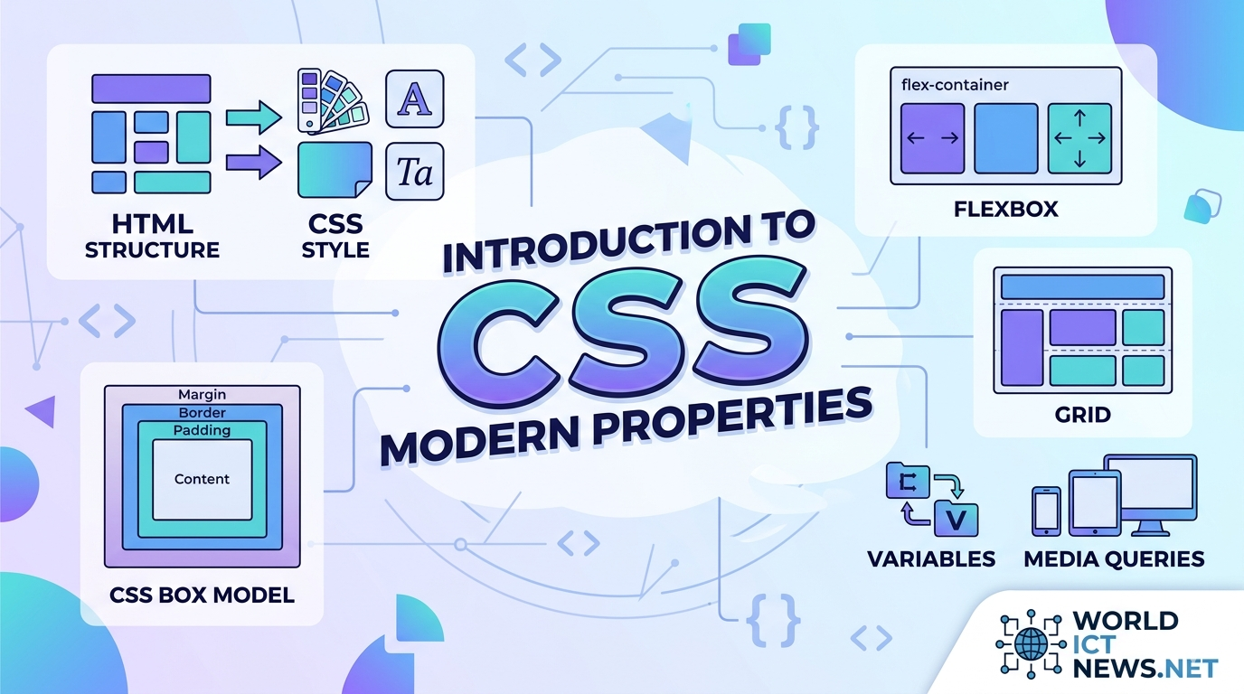
Introduction to CSS and Modern CSS Properties. In the early days of the World Wide Web, web pages were flat, text-heavy documents. HTML was designed strictly to structure content—to denote headings, paragraphs, and lists. However, as the web grew, the demand for visual presentation, layout control, and aesthetic customization skyrocketed.To separate content from presentation, the World Wide Web Consortium (W3C) introduced Cascading Style Sheets (CSS). Today, CSS is a core cornerstone of web development. It transforms raw HTML skeletons into highly engaging, beautiful, responsive, and interactive user interfaces.As the web continues to mature, CSS has evolved from a simple styling syntax into a powerful programmatic layout engine. This article provides a comprehensive introduction to foundational CSS concepts, explores core mechanics like the Box Model and Specificity, and dives deep into the modern layout modules and properties changing web design today.What is CSS? Understanding the Core SyntaxCSS is a rules-based stylesheet language used to describe the presentation of a document written in HTML or XML. It instructs the browser exactly how to render HTML elements on screen, paper, or other media.The Rule Set AnatomyA CSS style sheet consists of a collection of rule sets. Each rule set targets specific HTML elements and applies styles to them.cssselector { property: value; property: value; } Use code with caution.Selector: Points to the HTML element you want to style (e.g., h1, .card, #submit-btn).Declaration Block: Enclosed in curly braces {} and contains one or more declarations separated by semicolons.Property: The aesthetic feature you want to change (e.g., color, font-size, margin).Value: The specific setting assigned to the property (e.g., red, 16px, 2rem).Methods of Applying CSSYou can add CSS to an HTML document using three distinct methods:Inline CSS: Applied directly to an HTML element using the style attribute. Avoid this for large projects as it breaks content/style separation.Internal/Embedded CSS: Defined within a <style> tag inside the HTML <head> section. Useful for single-page applications or quick testing.External CSS: Written in a separate .css file and linked in the HTML document using the <link> tag. This is the industry gold standard for maintainability and caching performance.Foundational Concepts: The Box Model, Cascade, and SpecificityTo write clean, predictable CSS, you must master the fundamental mechanics governing how browsers compute styles and layouts.1. The CSS Box ModelIn CSS, absolutely everything is a box. Every HTML element is represented as a rectangular box consisting of four concentric layers.┌──────┐│ MARGIN ││ ┌───┐ ││ │ BORDER │ ││ │ ┌───┐ │ ││ │ │ PADDING │ │ ││ │ │ ┌──┐ │ │ ││ │ │ │ CONTENT │ │ │ ││ │ │ └──┘ │ │ ││ │ └────┘ │ ││ └─────┘ │└──────┘Content: The core area where text, images, or child elements reside.Padding: The invisible space directly surrounding the content, located inside the border. It cushions the text against its boundaries.Border: The line wrapping around the padding and content.Margin: The outermost clearance space separating the element box from neighboring elements on the page.The box-sizing BreakthroughBy default, an element's total width is calculated as: width + padding + border. This behavior often breaks layouts when padding is added. Modern web developers bypass this issue by applying the following global rule, forcing the browser to include padding and borders within the specified width:css* { box-sizing: border-box; } Use code with caution.2. The Cascade and SpecificityThe "C" in CSS stands for Cascading. When multiple conflicting rules target the same element, the browser applies a cascading algorithm to determine which rule wins. It judges rules based on three criteria:Source Order: Rules written lower down in a stylesheet override rules written above them.Importance: Rules marked with !important bypass normal cascading flow. (Use sparingly, as it damages long-term codebase scaling).Specificity: A mathematical weight calculation based on selector types.The Specificity HierarchyBrowsers calculate a score using four value registers (Inline, ID, Class/Attribute, Element):Inline styles: Highest weight (1, 0, 0, 0)ID Selectors (#header): High weight (0, 1, 0, 0)Class, Attribute, and Pseudo-classes (.card, [type="text"], :hover): Medium weight (0, 0, 1, 0)Element Selectors (div, p, h1): Lowest weight (0, 0, 0, 1)A class selector (.btn) will always override an element selector (button), regardless of where they are written in the file.Modern Structural Layouts: Flexbox and GridFor over a decade, layout construction in CSS relied on hacks using tables, absolute positioning, or float properties. Modern CSS introduced native layout systems that make complex, responsive design incredibly straightforward.1. CSS Flexible Box Layout (Flexbox)Flexbox is a one-dimensional layout system designed to align items smoothly along a single row or single column. It excels at component-level distributions, navigation bars, and aligning elements center-mass.css.flex-container { display: flex; flex-direction: row; /* Layout direction: row or column */ justify-content: space-between; /* Horizontal alignment along main axis */ align-items: center; /* Vertical alignment along cross axis */ gap: 1.5rem; /* Native space spacing between items */}Use code with caution.2. CSS Grid LayoutWhile Flexbox deals with one dimension, CSS Grid is a powerful two-dimensional layout system. It handles columns and rows simultaneously, allowing you to build complex layout structures directly in CSS without relying on wrapper elements.css.grid-container { display: grid; grid-template-columns: repeat(3, 1fr); /* 3 equal-width columns */ grid-template-rows: auto; gap: 20px;}Use code with caution.The 1fr unit stands for Fractional Unit, a modern layout concept that dynamically calculates and allocates slices of available browser space.Deep Dive: Modern CSS Properties Changing Web DevelopmentModern CSS minimizes our reliance on JavaScript code, external libraries, and image editing software. Here are the cutting-edge properties powering modern user interfaces.1. CSS Custom Properties (Variables)Native CSS variables make it easy to manage color themes, typography scales, and global spacing values from a centralized root catalog.css:root { --primary-color: #0f172a; --accent-color: #38bdf8; --base-padding: 1rem;}.card { background-color: var(--primary-color); padding: var(--base-padding); border-bottom: 3px solid var(--accent-color);}Use code with caution.Unlike preprocessor variables (like SASS or LESS), native CSS variables operate live in the browser DOM. They can be updated in real-time using JavaScript or changed on-the-fly inside media queries.2. Clamp, Min, and Max (Fluid Responsive Typography)Traditional responsive typography relies on rigid @media breakpoints to adjust text sizes between desktop and mobile devices. The clamp() function provides fluid typography in a single line of code.cssh1 { font-size: clamp(1.5rem, 5vw, 3rem);}Use code with caution.The clamp() property accepts three parameters: a minimum boundary, a preferred fluid calculation value, and a maximum limit. In this example, the heading shrinks dynamically relative to the viewport (5vw), but never drops below 1.5rem or expands past 3rem.3. Aspect Ratio Control (aspect-ratio)Before this property was introduced, preventing layout shifts while responsive images or video embeds loaded required complex padding-bottom calculations. The native aspect-ratio property fixes this cleanly.css.video-embed { width: 100%; aspect-ratio: 16 / 9; object-fit: cover;}Use code with caution.4. Background and Backdrop Filter Effects (backdrop-filter)The frosted-glass visual effect popular in modern user interfaces used to be incredibly difficult to build. Now, developers can use the backdrop-filter property to apply graphical blurs directly behind transparent components.css.glass-modal { background-color: rgba(255, 255, 255, 0.1); backdrop-filter: blur(12px); border: 1px solid rgba(255, 255, 255, 0.2);}Use code with caution.5. Scroll-Driven Animations and SubgridCSS features continue to expand at a rapid pace:Subgrid (grid-template-columns: subgrid): Allows nested child elements to inherit and align perfectly with columns defined on a parent container.Scroll-Driven Animations: Enables scroll position tracking natively within CSS rules to trigger timeline animations without writing a single line of heavy JavaScript event listeners.ConclusionCSS has evolved far beyond a basic decoration script. It is a robust, performant layout language that gives developers precise control over the visual presentation of web applications. By mastering foundational pillars like the Box Model and cascading specificity, and embracing modern features like Flexbox, Grid, CSS Variables, and fluid logical sizing, you can build production-ready layouts that are resilient, maintainable, and remarkably clean.
Steps to Building a Dynamic JavaScript Countdown Clock
May 29, 2026
8 min read

Steps to Building a Dynamic JavaScript Countdown Clock

Building a Dynamic JavaScript Countdown Clock for Months, Days, Minutes, and Seconds. Event organizers, e-commerce brands, and web developers frequently rely on countdown clocks to drive user engagement and build excitement. Whether you are counting down to a product launch, a music festival, or a holiday sale, an accurate digital timer introduces a psychological element of scarcity and urgency.While basic countdown scripts that calculate only days, hours, minutes, and seconds are widely available, creating a timer that dynamically accounts for months introduces a unique programming challenge. Because months vary in length (28, 29, 30, or 31 days), a standard fixed-millisecond division fails over longer periods.This comprehensive technical guide details how to construct a robust, highly accurate JavaScript countdown clock that calculates shifting calendar months alongside days, hours, minutes, and seconds.The Architectural Challenge of Shifting Month LengthsMost internet countdown tutorials use simple millisecond math to break down time intervals:One second:millisecondsOne minute:millisecondsOne hour:millisecondsOne day:millisecondsThis linear approach collapses when applied to calendar months. A month is not a fixed unit. Dividing a large block of milliseconds by a static number likedays yields compounding precision errors, causing your countdown to display incorrect values as it nears the target date.The Dynamic Calendar Comparison SolutionTo solve this, our JavaScript architecture must abandon raw millisecond division for long-term values. Instead, it will use native Date object methods to compare the structural difference between the current calendar date and the target event date. This calculation accurately accounts for varying month lengths and leap years.Section 1: Structuring the HTML InterfaceA clean web interface requires semantic, organized markup. We will encapsulate the countdown clock inside an explicit container, isolating each time unit into its own modular block for easy manipulation and styling.html<!DOCTYPE html><html lang="en"><head> <meta charset="UTF-8"> <meta name="viewport" content="width=device-width, initial-scale=1.0"> <title>Dynamic Event Countdown Clock</title> <link rel="stylesheet" href="style.css"></head><body> <div class="countdown-container"> <h2 id="event-title">Grand Product Launch Countdown</h2> <div id="countdown-clock"> <div class="time-block"> <span class="time-value" id="months">00</span> <span class="time-label">Months</span> </div> <div class="time-block"> <span class="time-value" id="days">00</span> <span class="time-label">Days</span> </div> <div class="time-block"> <span class="time-value" id="hours">00</span> <span class="time-label">Hours</span> </div> <div class="time-block"> <span class="time-value" id="minutes">00</span> <span class="time-label">Minutes</span> </div> <div class="time-block"> <span class="time-value" id="seconds">00</span> <span class="time-label">Seconds</span> </div> </div> <div id="fallback-message" class="hidden">The event has arrived!</div> </div> <script src="script.js"></script></body></html>Use code with caution.Section 2: Crafting Responsive CSS VisualsTo ensure the layout remains highly readable on mobile devices and large desktop displays, we will apply an optimized modern flexbox layout accompanied by stark, scannable visual anchors.css/* Reset and Base Styles */* { box-sizing: border-box; margin: 0; padding: 0;}body { font-family: -apple-system, BlinkMacSystemFont, "Segoe UI", Roboto, Helvetica, Arial, sans-serif; background-color: #0f172a; color: #f8fafc; display: flex; justify-content: center; align-items: center; min-height: 100vh;}/* Container Card */.countdown-container { background-color: #1e293b; padding: 2.5rem; border-radius: 1rem; box-shadow: 0 20px 25px -5px rgba(0, 0, 0, 0.3), 0 10px 10px -5px rgba(0, 0, 0, 0.04); text-align: center; max-width: 90%; width: 600px;}#event-title { font-size: 1.75rem; margin-bottom: 2rem; font-weight: 700; letter-spacing: -0.025em; color: #38bdf8;}/* Clock Flexbox Layout */#countdown-clock { display: flex; justify-content: space-between; gap: 1rem; flex-wrap: wrap;}.time-block { flex: 1; min-width: 90px; background-color: #0f172a; padding: 1rem 0.5rem; border-radius: 0.5rem; border: 1px solid #334155;}.time-value { display: block; font-size: 2.5rem; font-weight: 800; color: #f43f5e; line-height: 1; margin-bottom: 0.5rem;}.time-label { font-size: 0.75rem; text-transform: uppercase; letter-spacing: 0.1em; color: #94a3b8; font-weight: 600;}/* State Management Styles */.hidden { display: none !important;}#fallback-message { font-size: 1.5rem; font-weight: bold; color: #10b981; margin-top: 1rem;}/* Responsive Adjustments */@media (max-width: 480px) { #countdown-clock { gap: 0.5rem; } .time-block { min-width: 70px; padding: 0.75rem 0.25rem; } .time-value { font-size: 1.75rem; }}Use code with caution.Section 3: The Complete JavaScript ImplementationBelow is the complete, modular production-grade JavaScript script designed to parse calendar logic accurately, safely account for end-of-month boundaries, and automatically scale time units downward.javascript/** * Dynamic JavaScript Event Countdown Clock * Formats time remaining in precise Months, Days, Hours, Minutes, and Seconds */// Define your target event date here (ISO 8601 Format Recommended)const TARGET_DATE_STR = "2026-12-31T23:59:59";const targetDate = new Date(TARGET_DATE_STR);// DOM Elements Selectionconst elMonths = document.getElementById("months");const elDays = document.getElementById("days");const elHours = document.getElementById("hours");const elMinutes = document.getElementById("minutes");const elSeconds = document.getElementById("seconds");const clockContainer = document.getElementById("countdown-clock");const fallbackMessage = document.getElementById("fallback-message");/** * Calculates the complex calendar delta between two timestamps * @param {Date} now - Current time reference * @param {Date} target - Future event time reference * @returns {Object|null} Formatted time components or null if expired */function calculateCalendarTimeRemaining(now, target) { if (target - now <= 0) { return null; } // Step 1: Create iterative calendar date states let currentYear = now.getFullYear(); let currentMonth = now.getMonth(); // 0-indexed (Jan = 0) // Preliminary difference in months let monthDiff = (target.getFullYear() - currentYear) * 12 + (target.getMonth() - currentMonth); // Establish a virtual processing point advanced by the calculated months let testDate = new Date(now.getTime()); testDate.setMonth(testDate.getMonth() + monthDiff); // Step 2: Handle overflow adjustments // If advancing month past target overshoots the absolute timestamp, step back one month if (testDate > target) { monthDiff--; testDate = new Date(now.getTime()); testDate.setMonth(testDate.getMonth() + monthDiff); } // Step 3: Extract the remaining time from the adjusted virtual base date let timeDelta = target.getTime() - testDate.getTime(); // Standard static math breakdown for sub-day components const msInSecond = 1000; const msInMinute = msInSecond * 60; const msInHour = msInMinute * 60; const msInDay = msInHour * 24; let days = Math.floor(timeDelta / msInDay); timeDelta %= msInDay; let hours = Math.floor(timeDelta / msInHour); timeDelta %= msInHour; let minutes = Math.floor(timeDelta / msInMinute); timeDelta %= msInMinute; let seconds = Math.floor(timeDelta / msInSecond); return { months: monthDiff, days: days, hours: hours, minutes: minutes, seconds: seconds };}/** * Prepends a leading zero to single-digit numbers for visual alignment * @param {number} value - The number to pad * @returns {string} Zero-padded string */function padTimeValue(value) { return String(value).padStart(2, "0");}/** * Updates the graphical user interface elements with new time calculations */function updateCountdownDisplay() { const now = new Date(); const remainingTime = calculateCalendarTimeRemaining (now, targetDate); if (remainingTime === null) { // Stop updating, hide clock container, display completion state clearInterval(countdownIntervalId); clockContainer.classList.add("hidden"); fallbackMessage.classList.remove ("hidden"); return; } // Inject calculated components into DOM elMonths.textContent = padTimeValue(remainingTime.months); elDays.textContent = padTimeValue(remainingTime.days); elHours.textContent = padTimeValue(remainingTime.hours); elMinutes.textContent = padTimeValue(remainingTime.minutes); elSeconds.textContent = padTimeValue(remainingTime.seconds);}// Execute initial rendering immediately to prevent visible layout shift on loadupdateCountdownDisplay();// Establish stable 1-second background rendering threadconst countdownIntervalId = setInterval(updateCountdownDisplay, 1000);Use code with caution.Section 4: Deep Dive Code BreakdownTo effectively customize or modify this application, you must understand its underlying algorithmic structure.The Virtual Advance Mechanism (testDate)The core processing innovation happens in lines 22 through 36 of our JavaScript application:javascriptlet monthDiff = (target.getFullYear() - currentYear) * 12 + (target.getMonth() - currentMonth);Use code with caution.This sets up a raw estimation of months remaining. Next, the application dynamically shifts the base current timestamp forward by this calculated number of months.If shifting the date forward overshoots the target timestamp, the script decrements the month count by exactly one. It then re-calculates the remaining fractional time elements using the updated, precise month boundary as its anchor point. This design completely eliminates errors caused by leap years or alternating month lengths.Preventing Initial Content Layout Shifts (CLS)A common problem with naive countdown scripts is a temporary flash of unstyled content (00) on page load. This occurs when the script waits a full second for the first setInterval cycle to fire.Our application explicitly executes updateCountdownDisplay() once globally before initializing the interval framework. This ensures that accurate, parsed data populates the browser DOM instantaneously.Technical Specifications TableReview this feature breakdown to understand how this implementation compares to standard countdown frameworks:Engineering DimensionStandard Linear TimerAdvanced Calendar Timer (This Code)Parsing MethodologyFixed Millisecond DivisionContextual Date Object ComparisonMonth Calculation Error1–3 Days due to variable month lengths0 Days (Always Correct)Leap Year ResilienceFlawed (Fails during February changes)Fully ResilientInitial Page RenderDelayed by 1000msInstantaneous ExecutionLayout Styling StructureMixed HTML Grid RowsComponentized Flexbox LayoutConclusionBy swapping out static mathematical formulas for dynamic calendar tracking, you gain absolute temporal accuracy across long timelines. This script ensures that whether your event is 10 days or 10 months away, the countdown remains perfectly synchronized with actual calendar behavior.
 HTML Elements: Meaning, Anatomy, and Functional Roles
May 27, 2026
9 min read

HTML Elements: Meaning, Anatomy, and Functional Roles

Decoding HTML Elements: Meaning, Anatomy, and Functional Roles. HyperText Markup Language (HTML) is the skeleton of every website on the internet. Without it, web browsers would not know how to display text, render images, or navigate between pages.To build accessible, SEO-friendly, and modern websites, you must understand what HTML elements mean and how they function. This comprehensive guide breaks down the core structural units of the web, moving from basic anatomy to practical application.1. Anatomy of an HTML ElementMany people use the terms "HTML tags" and "HTML elements" interchangeably, but they are technically different. An element is the complete bundle that includes the opening tag, any attributes, the content, and the closing tag.html<p class="intro-text">Hello, World!</p>Use code with caution.Breaking It DownOpening Tag (<p>): Tells the browser where the element begins and what type of content to expect (in this case, a paragraph).Attribute (class="intro-text"): Provides extra information or properties about the element. This is used by CSS for styling and JavaScript for functionality.Content (Hello, World!): The actual data (text, image, or other elements) displayed on the screen.Closing Tag (</p>): Tells the browser where the element ends. It includes a forward slash (/).Empty (Void) ElementsNot all HTML elements need a closing tag or content. These are called void elements. They only contain attributes and self-contain their functionality.<img>: Embeds an image.<br>: Forces a line break.<input>: Creates a data entry field.2. Structural & Metadata ElementsEvery valid HTML document requires a specific foundational structure. These elements do not always show up as visible content, but they give the browser instructions on how to read the page.The Document Wrapper<!DOCTYPE html>: This is a mandatory declaration at the start of the file. It tells the browser to parse the page using the latest HTML5 standard.<html>: The root element. Every single HTML element must live inside this container. It usually carries the lang attribute (e.g., <html lang="en">) to help screen readers identify the page language.The head vs. body SplitAn HTML document is split into two main functional zones:ElementMeaningFunction<head>Document MetadataContains hidden machine-readable information like character encoding, search engine keywords, stylesheets, and the page title.<body>Visible ContentContains everything the user actually sees and interacts with on the web page (text, images, links, videos).Crucial Head Elements<title>: Sets the name of the page shown on the browser tab and in search engine results.<meta>: Configures technical details. For example, <meta charset="UTF-8"> ensures international text characters display correctly, while <meta name="viewport" content="width=device-width, initial-scale=1.0"> makes the page mobile-responsive.3. Structural and Semantic Layout ElementsModern HTML relies heavily on semantic elements. A semantic element clearly describes its meaning to both the browser and the developer. Instead of making an entire webpage out of generic, meaningless <div> blocks, semantic elements create a clear digital outline.+-------------------------------------------------------+| <header> || +---------------------------------------------+ || | <nav> | || +---------------------------------------------+ |+-------------------------------------------------------+| <main> || +-----------------------+ +-------------------+ || | <article> | | <aside> | || | | | | || | +-----------------+ | | | || | | <section> | | | | || | +-----------------+ | | | || +-----------------------+ +-------------------+ |+-------------------------------------------------------+| <footer> |+-------------------------------------------------------+<header>Meaning: The introductory section or container of a page or component.Function: Houses logos, site names, search bars, or author information.<nav>Meaning: Short for navigation.Function: Wraps groups of primary links that allow users to click around the website.<main>Meaning: The dominant, central topic area of the page.Function: Encloses content unique to that specific page. It must not contain content repeated across pages, like sidebars or footers. There should only be one visible <main> element per document.<section>Meaning: A standalone thematic grouping of content.Function: Breaks up a long page into chapters or distinct areas (e.g., "Features", "Pricing", "Contact Us").<article>Meaning: An independent, self-contained piece of content.Function: Encapsulates content that could be copied, pasted, and reused on a completely different website while still making perfect sense (e.g., blog posts, product cards, forum entries).<aside>Meaning: Secondary or tangentially related content.Function: Displays sidebars, callout boxes, or advertising panels next to the primary text.<footer>Meaning: The closing section at the bottom of a page or layout block.Function: Houses copyright notices, privacy policy links, sitemaps, and social media handles.4. Text Content and Typography ElementsText elements structure written content so browsers can apply baseline styles and search engines can index headings appropriately.Headings (<h1> to <h6>)Meaning: Hierarchy indicators for titles and subtitles.Function: Organize information into a clear visual rank. <h1> represents the single most important topic on the page, down to <h6> for deep sub-sub-sections. Never skip heading levels (e.g., jumping from <h1> to <h3>), as it confuses screen readers.Text Formatting Group<p>: The paragraph element. Automatically creates vertical spacing above and below text blocks to optimize reading comfort.<strong>: Indicates that the wrapped text has urgent importance or seriousness. Browsers render this as bold text.<em>: Adds emphasis to a word, shifting the meaning of a sentence. Browsers render this as italics.<blockquote>: Represents a block of text quoted from another source. It naturally indents the content to visually separate it from the main narrative.ListsLists organize data points cleanly:<ul>: Unordered list. Creates a bulleted list format.<ol>: Ordered list. Creates a numbered list format ().<li>: List item. The specific child container holding the actual text inside a <ul> or <ol>.5. Inline Text Semantics and HyperlinksInline elements sit inside block-level elements without forcing a new line on the page.The Hyperlink Element (<a>)The anchor tag (<a>) connects the internet together. It creates a clickable link to another location.html<a href="https://example.com" target="_blank" rel="noopener">Visit Example</a>Use code with caution.href Attribute: Specifies the destination URL.target="_blank" Attribute: Tells the browser to open the link in a completely new tab.rel="noopener" Attribute: A security necessity when opening new tabs. It prevents the newly opened page from hijacking your original page using malicious JavaScript code.Utility Inline Selectors<span>: A generic inline container with no inherent meaning. It is used to target a specific word or phrase for styling via CSS or manipulation with JavaScript.<code>: Formats text using a monospaced font family to display computer programming code strings smoothly.6. Multimedia and Embedded ContentHTML5 introduced native tags to handle rich media natively without requiring outdated, insecure plugins.<img> (Images)html<img src="assets/banner.jpg" alt="A laptop on a clean wooden desk" loading="lazy">Use code with caution.src: Points to the path where the image file is saved.alt: Alternate text. This is a critical accessibility feature. If the image fails to load, or if a visually impaired user relies on a screen reader, this text explains what the image shows.loading="lazy": An optimization property that delays loading the image until the user scrolls near it, improving initial site load speeds.<video> and <audio> (Rich Media)These elements imbed video clips or sound files directly onto a page. By including the controls attribute, the browser automatically builds play, pause, and volume buttons for the end user.html<video src="clip.mp4" controls width="640"> Your browser does not support video playback.</video>Use code with caution.7. Forms and User InputsForms allow web applications to collect information from users, handling tasks like logins, search bars, and checkouts.<form>: The outer container that captures and coordinates the collected inputs, defining where to send the data when submitted.<label>: Links text descriptions to input fields. Clicking a label focuses the user's cursor into the matching input box, which dramatically improves accessibility.<input>: The primary engine for user entry. The data structure changes completely depending on its type attribute:type="text": Standard short text entry box.type="email": Validates that the input contains an @ sign.type="password": Obscures input characters automatically.type="checkbox": Allows selecting multiple options.<textarea>: An expandable multi-line text input field used for comments, messages, or reviews.<button>: A clickable element used to trigger actions or submit data to a server.8. Best Practices for Modern HTMLTo maximize the impact of your markup, follow these industry-standard rules:Always Prioritize Semantics: Do not use a <div> if a <button>, <p>, or <main> exists for your use case. Semantics dramatically improve Search Engine Optimization (SEO) and help screen readers navigate your content.Maintain Attribute Cleanliness: Keep attributes organized uniformly. Always place critical structural attributes like id, class, src, or href first to optimize human readability.Validate Your Closing Tags: Forgetting to close tags can trigger rendering errors, breaking your layout downstream. Use modern code editors with built-in auto-close extensions to prevent syntax bugs.ConclusionHTML elements are much more than simple layout brackets. They define the structural logic, structural meaning, and functional interactions of everything we experience online. By matching the right semantic element to its correct use case, you build web experiences that are structurally stable, accessible to all users, and highly optimized for modern search engines.
Javascript Object Arrays: Core Concepts and Manipulation
May 27, 2026
8 min read

Javascript Object Arrays: Core Concepts and Manipulation

Mastering Javascript Object Arrays: Core Concepts, Manipulation, and Real-World Applications. Arrays of objects are the foundational data structure of modern web development. Whether you are fetching data from a REST API, managing state in a React application, or building a backend service with Node.js, you will constantly interact with this structure.This comprehensive guide explores how to construct, manipulate, and apply object arrays in JavaScript, moving from core fundamentals to advanced data processing.1. Understanding Object ArraysAn object array is a standard JavaScript array where every element is a JavaScript object. This structure combines the ordered, indexed nature of arrays with the descriptive, key-value pairing of objects.The Basic SyntaxHere is a baseline example representing a list of products in an e-commerce inventory:javascriptconst inventory = [ { id: 101, name: "Wireless Mouse", category: "Electronics", price: 29.99, inStock: true }, { id: 102, name: "Office Chair", category: "Furniture", price: 149.50, inStock: false }, { id: 103, name: "Mechanical Keyboard", category: "Electronics", price: 89.99, inStock: true }, { id: 104, name: "Desk Lamp", category: "Furniture", price: 25.00, inStock: true }];Use code with caution.Accessing DataTo access properties within an object array, combine array indexing ([index]) with object dot notation (.property):javascript// Access the name of the first itemconsole.log(inventory[0].name); // Output: Wireless Mouse// Access the price of the third itemconsole.log(inventory[2].price); // Output: 89.99Use code with caution.2. Essential CRUD OperationsManaging collections of data requires performing CRUD (Create, Read, Update, Delete) operations efficiently.Create: Adding New Objectspush(): Adds an object to the end of the array.Spread Operator (...): Creates a new array with the added object, which is ideal for immutable state management.javascriptconst newProduct = { id: 105, name: "Water Bottle", category: "Accessories", price: 15.00, inStock: true };// Mutable approachinventory.push(newProduct);// Immutable approach (Preferred in React)const updatedInventory = [...inventory, newProduct];Use code with caution.Read: Iterating and ViewingThe modern standard for reading or looping through an object array is the forEach() method or the for...of loop.javascriptinventory.forEach(item => { console.log(`${item.name} costs $${item.price}`);});Use code with caution.Update: Modifying Existing ObjectsTo update specific objects, find the item by a unique identifier (like an id) and modify its properties.javascript// Find item 102 and change inStock to trueconst itemToUpdate = inventory.find(item => item.id === 102);if (itemToUpdate) { itemToUpdate.inStock = true;}Use code with caution.Delete: Removing ObjectsThe filter() method is the cleanest way to remove items. It creates a new array excluding the target item.javascript// Remove the item with ID 104const filteredInventory = inventory.filter(item => item.id !== 104);Use code with caution.3. High-Order Array Methods for Data ManipulationJavaScript provides powerful functional methods specifically designed to process arrays without manual, deeply nested loops.Filtering Collections with filter()filter() evaluates each object against a condition and returns a new array containing only the elements that match.javascript// Get only electronics that are in stockconst availableElectronics = inventory.filter(item => item.category === "Electronics" && item.inStock);Use code with caution.Transforming Structures with map()map() iterates through the array and returns a completely new array transformed according to your specifications. It is highly useful for extracting single columns of data or altering object keys.javascript// Create an array of strings detailing price tagsconst priceTags = inventory.map(item => `${item.name} - $${item.price}`);// Output: ["Wireless Mouse - $29.99", ...]// Apply a 10% discount to all itemsconst discountedInventory = inventory.map(item => ({ ...item, price: parseFloat((item.price * 0.9).toFixed(2))}));Use code with caution.Aggregating Data with reduce()reduce() boils down an entire array into a single value, such as a sum, a string, or an entirely different object structure.javascript// Calculate total value of all stockconst totalValue = inventory.reduce((accumulator, item) => { return accumulator + item.price;}, 0); console.log(totalValue); // Output: 294.48Use code with caution.Searching Elements: find() vs. findIndex()find() returns the first actual object that matches a criteria.findIndex() returns the numerical index of that object.javascript// Get the cheap item objectconst cheapItem = inventory.find(item => item.price < 30);// Get the position of the desk lampconst lampIndex = inventory.findIndex(item => item.name === "Desk Lamp");Use code with caution.4. Advanced Manipulation TechniquesReal-world datasets require sorting, grouping, and nesting logic to be useful to end users.Sorting Objects Multi-CriteriaSorting strings and numbers inside objects requires passing a custom comparator function to sort(). Be aware that sort() mutates the original array, so copy it first using the spread operator.javascript// Sort inventory by price (lowest to highest)const sortedByPrice = [...inventory].sort((a, b) => a.price - b.price);// Sort alphabetically by product nameconst sortedByName = [...inventory].sort((a, b) => a.name.localeCompare(b.name));Use code with caution.Grouping Flat ObjectsOften, data needs to be grouped by a category key. We can use reduce() to dynamically build a grouped object.javascriptconst groupedByCategory = inventory.reduce((groups, item) => { const category = item.category; if (!groups[category]) { groups[category] = []; } groups[category].push(item); return groups;}, {});/* Output Structure:{ Electronics: [ {id: 101...}, {id: 103...} ], Furniture: [ {id: 102...}, {id: 104...} ]}*/Use code with caution.5. Real-World ApplicationsTo understand why object arrays are critical, let's look at three practical applications used across front-end and back-end web development.Application 1: E-Commerce Cart LogicAn online shopping cart requires dynamic calculations for totals, item quantities, and tax valuations.javascriptconst shoppingCart = [ { productId: 1, name: "Laptop", price: 999.99, quantity: 1 }, { productId: 2, name: "Mouse Pad", price: 15.50, quantity: 2 }, { productId: 3, name: "HDMI Cable", price: 8.00, quantity: 3 }];class CartManager { static calculateSubtotal(cart) { return cart.reduce((total, item) => total + (item.price * item.quantity), 0); } static addItem(cart, newItem) { const existingItem = cart.find(item => item.productId === newItem.productId); if (existingItem) { existingItem.quantity += newItem.quantity; return cart; } return [...cart, newItem]; }}console.log (` Subtotal: $${ CartManager.calculateSubtotal (shoppingCart)}`);Use code with caution.Application 2: UI Rendering (Dashboard & Tables)Frameworks like React, Vue, and vanilla JavaScript manipulate object arrays to dynamically build HTML elements on dashboards.javascript// Vanilla JS: Rendering a user directory array into an HTML Tableconst users = [ { name: "Alice", role: "Admin", email: "alice@company.com" }, { name: "Bob", role: "Editor", email: "bob@company.com" }];function renderTable(userArray) { const tableBody = document.querySelector ("#user-table-body"); // Clear existing content to prevent duplication tableBody.innerHTML = ""; const rows = userArray.map(user => ` <tr> <td>${user.name}</td> <td><strong>${user.role}</strong></td> <td>${user.email}</td> </tr> `).join(""); // Converts array of strings into one single HTML string tableBody.innerHTML = rows;}Use code with caution.Application 3: REST API Data NormalizationWhen consuming raw data from external APIs, the data payload often contains unnecessary bloat. You can use object arrays to sanitize and format the incoming data stream before saving it to a database or serving it to a client UI.javascript// Raw bloated data from a third-party server APIconst rawApiPayload = [ { user_id: "usr_99", first_name: "John", last_name: "Doe", internal_sys_code: "XYZ123", active_flag: 1 }, { user_id: "usr_100", first_name: "Jane", last_name: "Smith", internal_sys_code: "ABC789", active_flag: 0 }];// Cleaned data mapped for internal app usageconst sanitizedUsers = rawApiPayload.map(rawUser => ({ id: rawUser.user_id, fullName: `${rawUser.first_name} ${rawUser.last_name}`, isActive: Boolean(rawUser.active_flag)}));console.log(sanitizedUsers);// Output: [ { id: 'usr_99', fullName: 'John Doe', isActive: true }, ... ]Use code with caution.6. Performance Best PracticesWhen handling arrays containing thousands or millions of objects, minor optimization issues can cause memory leaks or UI freezes. Keep these performance strategies in mind:Avoid Excessive Chaining: Chaining .filter().map().filter() causes JavaScript to loop over your arrays entirely multiple times. If your dataset is large, combine these steps into a single .reduce() or a traditional for loop to scan the array only once.Beware of Deep Mutability: Methods like sort(), reverse(), and splice() change your original array. Always create a shallow copy first ([...array].sort()) to prevent unintended side effects across your app state.Utilize Indexes for Lookups: If you have to find an item repeatedly within an array of 50,000 objects, running .find() every time will kill performance. Instead, convert your object array into a single Lookup Object (Map) where the keys are the unique IDs:javascriptconst inventoryMap = new Map(inventory.map(item => [item.id, item]));// Fast O(1) instant lookup timeconst mouse = inventoryMap.get(101); Use code with caution.ConclusionMastering object arrays is a core milestone in your journey as a JavaScript developer. By combining declarative utility methods like map(), filter(), and reduce(), you can transform and manipulate complex datasets using minimal, clean code. Experiment with these patterns in your next data-driven application to build scalable architectures.

Stay Ahead in Tech

Get the latest ICT tutorials, DevOps guides, and AI news delivered directly to your inbox.