The Latest in

ICT Articles & Tutorials

World ICT News is a professional platform dedicated to Artificial Intelligence, Cloud Computing, DevOps, and Cybersecurity. Empowering the next generation of ICT specialists. Our exclusive tutorials and articles are designed to serve as a stepping stone for you into the world of ICT industry...

Machine Learning and Predictive Modeling Frameworks in Modern Data Science
Jul 31, 2026
11 min read

Machine Learning and Predictive Modeling Frameworks in Modern Data Science

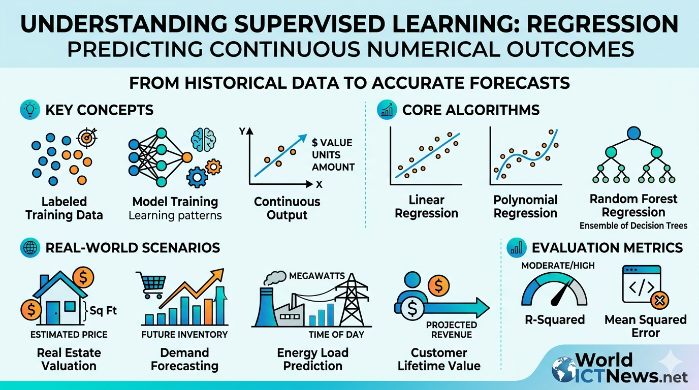
Engines of Prediction: Machine Learning and Predictive Modeling Frameworks in Modern Data ScienceAt its core, data science transitions from an analytical discipline to an engineering powerhouse when it stops merely reporting the past and begins forecasting the future. Predictive modeling leverages structural patterns within historical data to build mathematical algorithms that can automatically classify categories or predict continuous trends. Rather than manually writing hardcoded business rules, engineers train machines to dynamically map complex features to real-world target variables.This comprehensive guide serves as an operational manual for constructing, executing, and evaluating modern machine learning pipelines. Using Scikit-Learn, the industry standard for production-grade modeling in Python, we will break down supervised regression and classification frameworks, map unsupervised clustering and dimensionality reduction paradigms, and establish the validation metrics required to keep production systems stable under changing market regimes.1. The Scikit-Learn Framework: Building Robust, Production-Grade Data PipelinesIn production data science ecosystems, models fail not because of mathematical flaws, but due to architectural gaps. Issues like data leakage—where information from the future testing set accidentally bleeds into the training set—can invalidate an enterprise deployment. Scikit-Learn addresses this by providing a unified, object-oriented API built around three core design patterns:Transformers: Objects that clean, scale, or modify data features (e.g., StandardScaler, OneHotEncoder). They implement a .fit() method to learn parameters from training data and a .transform() method to apply those changes.Estimators: The core machine learning models themselves (e.g., LinearRegression, RandomForestClassifier). They use .fit(X, y) to train on the data and find optimal internal parameters.Predictors: Trained estimators capable of generating inferences on unseen data through the .predict(X) method.The Anatomy of an End-to-End PipelineA production-grade machine learning lifecycle begins by isolating structural features from target vectors, followed immediately by a strict data split. ┌──────────────────────────────┐ │ Raw Dataset (X, y) │ └──────────────┬───────────────┘ │ (train_test_split) ┌──────────────┴──────────────┐ ▼ ▼ [Training Set] [Testing Set] (X_train, y_train) (X_test, y_test) │ │ ▼ │ Pipeline .fit() │ ┌────────────────────────┐ │ │ 1. Impute Missing │ │ │ 2. Standard Scale │ │ │ 3. Train Model Weights │ │ └────────────────────────┘ │ │ ▼ └─────────────────────> Pipeline .predict() │ ▼ [Evaluation Metrics]pythonimport numpy as npimport pandas as pdfrom sklearn.model_selection import train_test_splitfrom sklearn.preprocessing import StandardScalerfrom sklearn.impute import SimpleImputerfrom sklearn.pipeline import Pipelinefrom sklearn.compose import ColumnTransformer# Create simulated enterprise operations datanp.random.seed(42)n_records = 1000data = { 'Operational_Age': np.random.randint(1, 15, n_records), 'Throughput_Rate': np.random.uniform(100.0, 500.0, n_records), 'Error_Count': np.random.poisson(lam=2, size=n_records), 'System_Failure': np.random.choice([0, 1], size=n_records, p=[0.85, 0.15])}df = pd.DataFrame(data)# Introduce a few artificial missing values to simulate real-world data issuesdf.iloc[np.random.choice(n_records, 20), 1] = np.nan# Isolate features (X) from the target classification vector (y)X = df.drop(columns=['System_Failure'])y = df['System_Failure']# Apply train_test_split immediately to prevent data leakageX_train, X_test, y_train, y_test = train_test_split(X, y, test_size=0.2, random_state=42, stratify=y)# Construct a preprocessing pipeline for continuous numeric featuresnumeric_features = ['Operational_Age', 'Throughput_Rate', 'Error_Count']numeric_transformer = Pipeline(steps=[ ('imputer', SimpleImputer(strategy='median')), # Replace missing NaNs safely ('scaler', StandardScaler()) # Scale features to zero mean and unit variance])# Combine transformers into a comprehensive column preprocessorpreprocessor = ColumnTransformer( transformers=[('num', numeric_transformer, numeric_features)])print(f"Training Features Shape: {X_train.shape}")print(f"Testing Target Baseline Distribution:\n{y_test.value_counts(normalize=True)}")Use code with caution.2. Supervised Learning (Regression): Forecasting Continuous MetricsSupervised learning applies when your target variable is fully labeled. When that target variable is a continuous quantitative value (such as a stock price, real estate valuation, or corporate revenue forecast), the problem is classified as a Regression task. [Simple Linear Regression] [Multiple Linear Regression] Target (y) Target (y) ▲ ▲ │ / │ / / │ / │ / / │ / │ / / └──────────────► └──────────────► Feature (X1) Features (X1, X2, X3) Single Predictor Variable Multiple Predictor Features Linear RegressionLinear regression models the relationship between a single predictor variable (X) and a continuous dependent variable (y) by fitting a linear equation to observed data. The equation is represented as:\(y=\beta {0}+\beta {1}X+\epsilon \)Where β₀ is the intercept, β₁ is the slope coefficient, and ε represents the residual error.Multiple Linear RegressionIn complex datasets, a target variable is rarely driven by a single feature. Multiple Linear Regression expands this formulation to include n distinct predictive dimensions:\(y=\beta {0}+\beta {1}X_{1}+\beta {2}X{2}+\dots +\beta {n}X{n}+\epsilon \)The algorithm uses Ordinary Least Squares (OLS) to minimize the sum of squared differences between actual data points and the predicted plane of best fit.Data Science Context:Regression models form the backbone of automated valuation platforms, asset depreciation tracking systems, and long-term demand planning modules.pythonfrom sklearn.linear_model import LinearRegressionfrom sklearn.metrics import mean_squared_error, r2_score# Simulate real estate asset valuation parametersnp.random.seed(42)square_footage = np.random.uniform(1200, 4500, 500)num_bedrooms = np.random.randint(2, 6, 500)distance_to_core_km = np.random.uniform(2, 35, 500)# Generate a continuous target variable (Asset Price in USD) with random noiseasset_price_usd = (square_footage * 175) + (num_bedrooms * 25000) - (distance_to_core_km * 3200) + np.random.normal(0, 15000, 500)df_housing = pd.DataFrame({ 'Sq_Footage': square_footage, 'Bedrooms': num_bedrooms, 'Distance_Km': distance_to_core_km, 'Price_USD': asset_price_usd})# Separate into features and target matrixX_reg = df_housing.drop(columns=['Price_USD'])y_reg = df_housing['Price_USD']X_train_r, X_test_r, y_train_r, y_test_r = train_test_split(X_reg, y_reg, test_size=0.2, random_state=42)# Build a multiple linear regression workflow pipelinereg_pipeline = Pipeline(steps=[ ('scaler', StandardScaler()), ('regressor', LinearRegression())])# Train the OLS model weightsreg_pipeline.fit(X_train_r, y_train_r)# Generate predictions on unseen datay_pred_r = reg_pipeline.predict(X_test_r)# Extract learned slope coefficientscoefficients = reg_pipeline.named_steps['regressor'].coef_print("--- Supervised Multiple Regression Results ---")for feat, coef in zip(X_reg.columns, coefficients): print(f"Feature: {feat:<12} | Learned Weight Coefficient: {coef:>10.2f}")Use code with caution.3. Supervised Learning (Classification): Predicting Distinct Categorical TargetsWhen the target variable is categorical rather than continuous, the task shifts to Classification. The objective here is to assign observations to distinct, mutually exclusive buckets (e.g., flagging whether a loan application is a "default" vs. "non-default").1. Logistic RegressionDespite its name, Logistic Regression is used for classification, not regression. Instead of drawing a straight line through points, it fits an S-shaped Sigmoid function that maps any continuous value to a probability between 0 and 1:\(P(y=1|X)=\sigma (Z)=\frac{1}{1+e^{-Z}}\)Where \(Z = \beta_0 + \beta_1 X_1 + \dots + \beta_n X_n\). If the probability passes a chosen threshold (usually 0.50), the system assigns the item to the positive class.2. Decision TreesDecision Trees segment data by sequentially splitting features based on criteria like Gini Impurity or Information Gain. The algorithm creates an intuitive tree structure of recursive conditional statements (e.g., “If Credit Score > 700 and Debt-to-Income Ratio < 0.35, then Approve”). While highly interpretable, individual decision trees are prone to overfitting—learning training noise so perfectly that they fail to generalize to new data.3. Random ForestsTo address the overfitting limitations of a single decision tree, Random Forests use an ensemble method called Bootstrap Aggregating (Bagging). The algorithm trains hundreds of independent decision trees in parallel, with each tree built on a random subset of the training data and features. The final classification is determined by a majority vote across all the individual trees. This ensemble approach cancels out individual errors, making Random Forests highly resilient models.pythonfrom sklearn.linear_model import LogisticRegressionfrom sklearn.tree import DecisionTreeClassifierfrom sklearn.ensemble import RandomForestClassifier# Construct a dictionary containing diverse classification architecturesclassification_models = { 'Logistic_Regression': LogisticRegression(random_state=42), 'Decision_Tree': DecisionTreeClassifier(max_depth=5, random_state=42), 'Random_Forest': RandomForestClassifier(n_estimators=100, max_depth=8, random_state=42)}print("--- Initializing Classification Models Pipeline ---")for model_name, model_obj in classification_models.items(): # Build a combined pipeline for each model using the preprocessor defined in Section 1 clf_pipeline = Pipeline(steps=[ ('preprocessor', preprocessor), ('classifier', model_obj) ]) # Train the respective classifier clf_pipeline.fit(X_train, y_train) print(f"Successfully trained: {model_name}")Use code with caution.4. Unsupervised Learning: Clustering Unlabeled PatternsIn many real-world scenarios, datasets do not come with pre-labeled target variables. Unsupervised Learning algorithms analyze unlabelled data matrices to uncover hidden structures, group similar observations, or simplify complex features without human intervention. [ K-Means Clustering ] [ Principal Component Analysis ] ▲ ▲ │ ● ● │ ☼ ☼ │ ○ ○ │ ☼ \ ☼ │ ◌ ◌ │ ☼ \ ☼ └──────────────► └──────────────► Groups data profiles into Projects high-dimensional space K distinct distance clusters onto principal orthogonal vectors K-Means ClusteringK-Means groups data into K distinct clusters based on feature similarity. The algorithm operates through an iterative process:It randomly places K centroids throughout the feature space.It assigns each data point to its closest centroid using Euclidean distance.It updates the centroid positions by calculating the mean coordinates of all assigned points.It repeats this process until the centroids stabilize.Principal Component Analysis (PCA)High-dimensional datasets can overwhelm algorithms and obscure patterns—a challenge often referred to as the curse of dimensionality. PCA is a dimensionality reduction technique that transforms a large set of correlated variables into a smaller set of uncorrelated variables called Principal Components. It achieves this by projecting the data onto new orthogonal axes that capture the maximum possible variance, allowing you to compress features while retaining most of the underlying information.pythonfrom sklearn.cluster import KMeansfrom sklearn.decomposition import PCA# Generate unlabelled operational profiles for clustering evaluationnp.random.seed(42)customer_spend = np.random.normal(200, 50, 300)visit_frequency = np.random.normal(12, 4, 300)support_tickets = np.random.normal(2, 1, 300)X_unsupervised = pd.DataFrame({ 'Spend': customer_spend, 'Frequency': visit_frequency, 'Tickets': support_tickets})# Standardize features before applying distance-based metricsscaler = StandardScaler()X_scaled = scaler.fit_transform(X_unsupervised)# 1. Apply K-Means Clustering to segment customers into 3 behavioral profileskmeans = KMeans(n_clusters=3, random_state=42, n_init='auto')X_unsupervised['Cluster_ID'] = kmeans.fit_predict(X_scaled)# 2. Apply PCA to project 3-dimensional data down into a 2-dimensional planepca = PCA(n_components=2)X_pca = pca.fit_transform(X_scaled)print("--- Unsupervised Learning Output Profiles ---")print(f"Total Explained Variance Ratio across top 2 PCA Components: {np.sum(pca.explained_variance_ratio_):.4f}")print(X_unsupervised.groupby('Cluster_ID').mean())Use code with caution.5. Model Evaluation Metrics: Quantifying Performance AccuracyA model is only as reliable as its validation framework. Evaluating performance requires selecting appropriate metrics that align with your specific business goals, rather than relying blindly on basic accuracy score readouts.Regression MetricsMean Squared Error (MSE): Calculates the average of the squared differences between actual and predicted values. By squaring the errors, it heavily penalizes large outliers.R-Squared (R²): Measures the proportion of variance in the dependent variable that can be explained by the independent features. An R² score of 1.0 indicates a perfect fit.Classification MetricsConfusion Matrix: A tabular layout that breaks down predictions into four cross-classified quadrants: True Positives (TP), False Positives (FP), True Negatives (TN), and False Negatives (FN).Precision: Measures out of all positive predictions, how many were actually positive. It is the core metric to track when the cost of a false positive is exceptionally high (e.g., falsely accusing a legitimate transaction of fraud).\(\text{Precision}=\frac{\text{TP}}{\text{TP}+\text{FP}}\)Recall (Sensitivity): Measures out of all actual positive cases, how many the model successfully captured. This is the critical metric when false negatives carry severe consequences (e.g., failing to diagnose an illness or missing a critical system failure).\(\text{Recall}=\frac{\text{TP}}{\text{TP}+\text{FN}}\)pythonfrom sklearn.metrics import classification_report, confusion_matrix# Build, train, and validate a production-ready Random Forest Pipelineprod_pipeline = Pipeline(steps=[ ('preprocessor', preprocessor), ('rf_classifier', RandomForestClassifier(n_estimators=100, random_state=42))])prod_pipeline.fit(X_train, y_train)y_pred = prod_pipeline.predict(X_test)# Compute performance diagnosticsmatrix_output = confusion_matrix(y_test, y_pred)report_output = classification_report(y_test, y_pred, target_names=['Normal', 'Failure'])print("--- Production Model Evaluation Diagnostic Metrics ---")print("Confusion Matrix Layout Matrix:")print(matrix_output)print("\nComprehensive Classification Validation Ledger:")print(report_output)Use code with caution.6. End-to-End Operational Validation ChecklistTo consistently scale machine learning architectures across disparate business environments, use this engineering checklist:Operational PhaseCritical Validation QuestionsScikit-Learn Module ComponentCommon Warning FlagsPipeline SplitsIs your testing data securely isolated from training data before preprocessing?model_selection.train_test_split()Unusually high performance metricsFeature ScalingHave feature scales been normalized so distance calculations remain balanced?preprocessing.StandardScaler()K-Means models tracking a single featureImputation SafetyAre missing values handled safely using localized training parameters?impute.SimpleImputer()Data leakage across validation boundsSupervised ChoiceAre continuous metrics routed to regression models and categories to classifiers?linear_model vs. ensembleClassification metrics on floatsMetric AlignmentDoes your evaluation strategy prioritize Precision or Recall based on business risk?metrics.classification_report()Maximizing accuracy while ignoring high false negatives7. ConclusionBuilding a successful machine learning pipeline requires balancing theoretical statistical principles with clean, repeatable software architecture. Scikit-Learn simplifies this process by allowing engineers to bundle missing data handling, feature scaling, and predictive modeling into a single, cohesive workflow object.Whether you are building multiple regression models to project financial assets, deploying random forest ensembles to catch system anomalies, or using PCA to compress complex datasets, success ultimately hinges on rigorous validation. Clear metrics—such as precision, recall, and explained variance—transform abstract algorithms into reliable data assets for the modern enterprise.
Mathematical and Statistical Foundations of Data Science
Jul 22, 2026
11 min read

Mathematical and Statistical Foundations of Data Science

Architectural Columns: Mathematical and Statistical Foundations of Data Science. The difference between a predictive model that successfully captures market alpha and a brittle algorithm that collapses during a structural regime shift lies in its underlying mathematics. Machine learning and artificial intelligence are not magical black boxes; they are algorithmic wrappers built around core principles of mathematical optimization and statistical inference. Without a foundational understanding of probability theory, sampling mechanics, and experimental hypothesis validation, data science collapses into a series of guesswork operations.This article provides an in-house blueprint covering the core mathematical and statistical pillars necessary to build and validate rigorous data science models. Using Python’s powerful scientific computing library, SciPy, we will break down probability distributions, code essential parametric and non-parametric hypothesis tests, and map the inferential metrics used to validate experimental results in production environments.1. Probability Distributions: The Framework of Modern Data PipelinesEvery machine learning model assumes that the underlying data follows a specific structure, or data-generating process. A probability distribution is a mathematical function that models the likelihood of obtaining possible values for a given variable. In modern data science, identifying the correct distribution shapes your data preprocessing strategy, feature scaling methodology, and choice of loss functions.We will focus on three fundamental distributions: the Normal, Binomial, and Uniform distributions. [Uniform] [Normal / Gaussian] [Binomial] ┌───────────────┐ ▲ █ █ │ │ ┌─┴─┐ █ █ █ █ █ │ │ ┌─┘ └─┐ █ █ █ █ █ █ █ ──┴───────────────┴── ──┴───────┴── ──┴───────────┴── Equal Likelihood Bell Curve Discrete Trials The Normal (Gaussian) DistributionThe Normal distribution is the foundation of modern statistical analysis. Characterized by its classic symmetrical bell curve, it is defined entirely by two parameters: its mean (\(\mu \)), which dictates the peak's location, and its standard deviation (\(\sigma \)), which governs the curve's spread or dispersion.Data Science Context:The Normal distribution assumes critical importance because of the Central Limit Theorem (CLT). The CLT states that if you take sufficiently large random samples from any underlying population distribution, the distribution of the sample means will converge toward a normal distribution as the sample size grows. This justifies why model residuals (errors) in linear regressions are assumed to be normally distributed.pythonimport numpy as npfrom scipy import stats# Model parameters for a simulated data science engineering exam score datasetmu = 75 # Mean scoresigma = 8.5 # Standard deviation# Generate a continuous random variable object for a normal distributionnorm_dist = stats.norm(loc=mu, scale=sigma)# 1. Probability Density Function (PDF): Height of the curve at a specific valuepdf_at_80 = norm_dist.pdf(80)print(f"Normal PDF at score 80: {pdf_at_80:.4f}")# 2. Cumulative Distribution Function (CDF): Probability of a value being <= X# Find the probability that a randomly chosen data engineer scored 65 or lessprob_less_65 = norm_dist.cdf(65)print(f"Probability of score <= 65: {prob_less_65:.4f}")# 3. Percent Point Function (PPF): Inverse of the CDF (Quantiles)# Find the exact score cutoff needed to be in the top 5% (95th percentile)score_95th = norm_dist.ppf(0.95)print(f"95th Percentile Score Cutoff: {score_95th:.2f}")Use code with caution.The Binomial DistributionUnlike the continuous nature of the Gaussian curve, the Binomial distribution models discrete outcomes. It tracks the probability of achieving exactly \(k\) successes across \(n\) independent trials, where each trial has a fixed probability (\(p\)) of success. It represents the mathematical expansion of a coin-flip scenario.Data Science Context:The Binomial distribution forms the mathematical framework behind conversion rate analytics, A/B testing frameworks, digital click-through rates (CTR), and user churn predictions.python# Model parameters for a marketing ad campaign deploymentn_trials = 50 # Number of independent ad displays (impressions)p_success = 0.08 # Known baseline Click-Through Rate (8% success probability)binom_dist = stats.binom(n=n_trials, p=p_success)# Probability Mass Function (PMF): Probability of getting exactly k successful outcomes# What is the probability that exactly 5 out of 50 users click the ad banner?pmf_exactly_5 = binom_dist.pmf(5)print(f"Binomial PMF for exactly 5 clicks: {pmf_exactly_5:.4f}")# Cumulative Distribution Function (CDF): Probability of getting 5 or fewer clickscdf_max_5 = binom_dist.cdf(5)print(f"Binomial CDF for 5 or fewer clicks: {cdf_max_5:.4f}")Use code with caution.The Uniform DistributionThe Uniform distribution defines an experiment where every possible outcome within a set range \([a, b]\) is equally likely to occur. It represents complete uncertainty regarding variations inside the boundaries.Data Science Context:Uniform distributions are used heavily in stochastic simulations, random initialization states for machine learning neural network weights, and hyperparameter optimization architectures during random grid searches.python# Model boundaries for an algorithmic processing timeout windowlower_bound = 10 # Minimum processing time in millisecondsupper_bound = 50 # Maximum processing time in millisecondsuniform_dist = stats.uniform(loc=lower_bound, scale=upper_bound - lower_bound)# Probability of an operation finishing in 30 milliseconds or lessprob_under_30 = uniform_dist.cdf(30)print(f"Uniform CDF for latency <= 30ms: {prob_under_30:.4f}")Use code with caution.2. Hypothesis Testing: Implementing Parametric and Non-Parametric DiagnosticsData-driven enterprises cannot afford to rely on intuition. If an update to a machine learning system shows a higher classification rate, we must prove that this improvement isn't just a fluke caused by random testing data. Hypothesis testing provides a structured framework to make these decisions under uncertainty. ┌───────────────────────┐ │ Evaluate the Problem │ └───────────┬───────────┘ ▼ Is your data continuous or categorical? / \ [Continuous] [Categorical] │ │ How many groups? Run Chi-Square / \ Test of Independence [2 Groups] [3+ Groups] │ │ │ ▼Run T-Test Run ANOVA Evaluate P-Value1. Student’s T-Tests: Comparing Two MeansThe T-test evaluates whether the means of two distinct data groups are truly different from each other.Independent T-Test: Compares the means of two completely separate groups (e.g., control users vs. variant users in an experiment).Paired T-Test: Compares the same group at two different points in time (e.g., model scoring performance before and after a optimization update).Scenario:A data science team tests two distinct optimization setups on a deep learning model to compare training speeds (in seconds).python# Sample processing time data from two separate server compute instancesgroup_control = [120, 115, 122, 118, 121, 119, 116, 123, 117, 120]group_variant = [112, 114, 110, 115, 113, 111, 116, 109, 112, 114]# Null Hypothesis (H0): Both server optimization tracks require identical average execution times.# Alternative Hypothesis (H1): The variant track reduces average execution times.t_stat, p_val = stats.ttest_ind(group_control, group_variant, equal_var=True)print("--- Independent Samples T-Test Results ---")print(f"Calculated T-Statistic: {t_stat:.4f}")print(f"Calculated P-Value: {p_val:.6f}")Use code with caution.2. ANOVA (Analysis of Variance): Multi-Group DiagnosticsWhen expanding comparisons to three or more independent groups, using multiple pairwise T-tests inflates the overall Type I error rate (false positives). One-Way ANOVA evaluates the variation between groups against the variation within groups to run an omnibus comparison without compounding errors.Scenario:An e-commerce company tracks average checkout basket values across three marketing pathways: Social Media, Organic Search, and Paid Email Campaigns.python# E-commerce spend totals mapped to three different traffic acquisitionssocial_traffic = [45, 52, 49, 60, 47, 55]organic_traffic = [38, 42, 40, 39, 45, 36]email_traffic = [58, 62, 55, 64, 59, 61]# Null Hypothesis (H0): Mean revenue is uniform across all marketing channels.# Alternative Hypothesis (H1): At least one marketing channel yields distinct mean revenues.f_stat, p_val_anova = stats.f_oneway(social_traffic, organic_traffic, email_traffic)print("\n--- One-Way ANOVA Test Results ---")print(f"Calculated F-Statistic: {f_stat:.4f}")print(f"Calculated P-Value: {p_val_anova:.6f}")Use code with caution.3. The Chi-Square Test of Independence: Categorical AnalysisWhen tracking categorical outcomes rather than continuous numeric metrics, parametric options like T-tests cannot be used. The Chi-Square Test of Independence evaluates whether a significant relationship exists between two nominal categorical variables by comparing observed frequencies against an expected frequency matrix.Scenario:A product team tracks whether a user’s subscription tier choice (Free, Premium, Enterprise) is dependent on their primary operating system (iOS, Android).python# Construct an observed frequency contingency matrix table# Structure rows as OS [iOS, Android] and columns as Tier [Free, Premium, Enterprise]observed_matrix = np.array([, # iOS User Actions [190, 60, 10] # Android User Actions])# Null Hypothesis (H0): Subscription tier selection is entirely independent of operating system.# Alternative Hypothesis (H1): Device choices display structural ties to subscription tier trends.chi2_stat, p_val_chi2, dof, expected_matrix = stats.chi2_contingency(observed_matrix)print("\n--- Chi-Square Test of Independence Results ---")print(f"Calculated Chi2 Statistic: {chi2_stat:.4f}")print(f"Calculated P-Value: {p_val_chi2:.6f}")print(f"Degrees of Freedom: {dof}")Use code with caution.3. Inferential Statistics: Validating Experimental ResultsEvery dataset evaluated by a data scientist is a subset, or sample, extracted from an unobservable larger population. Inferential statistics provides the mathematical framework to generalize these sample findings back to the broader population with known levels of certainty. [ Unobservable Population Source ] │ ┌───────┴───────┐ (Random Sampling) ▼ ▼ [ Sample A ] [ Sample B ] │ │ └───────┬───────┘ ▼ [ Standard Error Formulas ] │ ┌────────────┴────────────┐ ▼ ▼ [Confidence Intervals] [P-Value Thresholds] Defines Target Ranges Quantifies Random NoiseConfidence IntervalsA point estimate (such as a simple sample mean) provides a single value as an estimate of a population parameter. However, because of sampling error, the sample mean rarely matches the true population mean exactly. A Confidence Interval (CI) provides an estimated range of values that is likely to contain the true population parameter, accompanied by a specific probability or confidence level (typically 95%).A \(95\%\) confidence interval does not mean there is a \(95\%\) probability that the true population parameter lies between those specific bounds. Rather, it means that if you repeat the sampling process 100 times and construct intervals from each sample, approximately 95 of those intervals will contain the true population parameter.The standard margin of error calculation formula for a population mean using a normal distribution is:\(CI=\={X}\pm Z_{\alpha /2}\left(\frac{\sigma }{\sqrt{n}}\right)\)Where:\(\={X}\) = Sample Mean\(Z_{\alpha /2}\) = Standard Normal Distribution Critical Value Cutoff\(\sigma \) = Population Standard Deviation\(n\) = Sample Size Countpython# Sample metric evaluations from a new machine learning algorithm releaselatency_readings = [12.4, 14.2, 11.8, 13.1, 12.9, 15.0, 13.5, 12.1, 14.4, 13.3]sample_mean = np.mean(latency_readings)sample_size = len(latency_readings)# Calculate standard error of the mean (SEM) using sample degrees of freedomsem = stats.sem(latency_readings)# Construct a 95% confidence interval using the Student's T distribution distribution modelconfidence_level = 0.95ci_lower, ci_upper = stats.t.interval(confidence_level, df=sample_size-1, loc=sample_mean, scale=sem)print("--- Inferential Estimation Calculations ---")print(f"Sample Metric Mean Value: {sample_mean:.3f}")print(f"95% Confidence Bounds: ({ci_lower:.3f}, {ci_upper:.3f})")Use code with caution.P-Values and the Mechanics of Alpha ThresholdsThe p-value is the probability of obtaining test results at least as extreme as the observed results, assuming that the null hypothesis is true. It measures how compatible your sample data is with the assumption that no real change or effect occurred.A low p-value (\(\le 0.05\)): Indicates strong evidence against the null hypothesis. The observed difference is unlikely to be the result of random sampling noise alone, leading us to reject the null hypothesis.A high p-value (\(>0.05\)): Indicates that the observed variation could easily be a byproduct of random chance, meaning we fail to reject the null hypothesis.The Error Matrix Risk:When interpreting p-values, data scientists must balance two critical risks:Type I Error (\(\alpha \)): Rejecting the null hypothesis when it is actually true (a false positive). Setting a strict alpha limit of \(0.05\) ensures this risk is capped at 5%.Type II Error (\(\beta \)): Failing to reject the null hypothesis when it is actually false (a false negative). The inverse of this risk (\(1 - \beta\)) defines the Statistical Power of your test—the model's ability to detect a real effect when one exists.4. Operational Comparison MatrixTo guide your selection of diagnostic tools during structural pipeline engineering, use this reference ledger:Analysis ObjectiveTarget Variable TypeInput Data Group ScaleCore SciPy Function ModulePrimary Metric CheckedModel Shape ProfilingContinuous Values1 Monitored Vectorstats.norm.pdf() / cdf()Density Skewness and Curve TrapsDiscrete Event ConversionBinary / Discrete CountsFixed Vector Trialsstats.binom.pmf() / cdf()Direct Success Volume LayoutsA/B Variation DiagnosticsContinuous Averages2 Separate Group Tranchesstats.ttest_ind()Means Delta vs. Standard ErrorMulti-Channel AuditsContinuous Averages3+ Unique Group Tranchesstats.f_oneway()Variance Between vs. Within GroupsUser Preference TrackingNominal Categories2D Array Matrix Cellsstats.chi2_contingency()Deviation of Observed from ExpectedProduction Scale EstimationsContinuous Metrics1 Sample Matrix Groupstats.t.interval()Range Bounds Around the True Mean5. ConclusionA data scientist who relies solely on automated machine learning libraries without understanding the underlying math risks building flawed models. Misidentifying data distributions can lead to inappropriate feature engineering, while ignoring the assumptions behind hypothesis tests can result in misleading patterns being mistaken for genuine insights.By grounding your feature engineering pipelines in correct probability distribution models, verifying systemic changes with parametric or non-parametric hypothesis tests, and quantifying uncertainty using confidence intervals and p-values, you ensure your models remain reliable and statistically sound in production.
Science of Exploratory Data Analysis (EDA) and Visualization in Python
Jul 10, 2026
9 min read

Science of Exploratory Data Analysis (EDA) and Visualization in Python

The Art and Science of Exploratory Data Analysis (EDA) and Visualization in PythonData in its raw form is a riddle. Unstructured rows, missing data points, and hidden anomalies lie masked beneath spreadsheet walls or database tables. Before launching complex machine learning architectures or deploying statistical models, a data scientist must converse with the data. This foundational conversation is Exploratory Data Analysis (EDA).Coined by statistician John Tukey in his seminal 1977 book, EDA is an open-ended philosophical approach to data analysis. Rather than testing rigid, pre-conceived hypotheses, EDA encourages looking at data to discover patterns, spot anomalies, check assumptions, and uncover underlying structural designs.Python has emerged as the premier ecosystem for this task. It offers a powerful, intuitive combination of data manipulation engines and graphical rendering libraries. This comprehensive guide details the programmatic steps, mathematical principles, and functional code implementations required to master EDA and data visualization using Python.1. The Core Philosophy of EDAEDA is iterative. It operates as a continuous loop of questioning, cleaning, transforming, and visualizing. Analysts use it to achieve four primary outcomes:[ Formulate Questions ] ──> [ Visualize & Profile ] ──> [ Clean & Transform ] ▲ │ └── [ Refine Insights ] ──┘Data Maximization: Extracting structural insights to maximize information yields.Anomaly Hunting: Spotting outliers, human input errors, or data corruption.Feature Selection: Identifying which features correlate with a target outcome.Assumption Testing: Checking if distributions match requirements for linear models, variance tracking, or neural inputs.2. Setting Up the EcosystemThe Python data engineering workspace relies on four cornerstone modules:Pandas: The core data manipulation framework built around high-performance DataFrame structures.NumPy: The engine for fast vectorized mathematical operations on multidimensional arrays.Matplotlib: The foundational object-oriented graphic layout rendering library.Seaborn: A statistical visualization package built on top of Matplotlib, offering high-level wrappers and elegant default aesthetics.pythonimport pandas as pdimport numpy as npimport matplotlib.pyplot as pltimport seaborn as sns# Set aesthetics for clean visualization outputsns.set_theme(style="whitegrid")plt.rcParams["figure.figsize"] = (10, 6)Use code with caution.3. The EDA Workflow: A Step-by-Step Practical ImplementationTo understand EDA, we will explore a real-world scenario analyzing a marketing and customer behavior dataset (customer_data.csv). This process covers everything from initial ingestion to advanced multivariate charting.Step 3.1: Data Ingestion and Structural AuditingThe first step is determining the structural shape, column types, and integrity of the dataset.python# Load the datasetdf = pd.read_csv("customer_data.csv")# Audit structural dimensionsprint(f"Dataset Shape: {df.shape[0]} rows, {df.shape[1]} columns\n")# Review schema blueprints and missing value indicatorsdf.info()Use code with caution.The output of .info() reveals column names, memory allocation, and data storage types (e.g., int64, float64, object). It also surfaces mismatched column types, such as date strings parsed as raw categorical objects.python# Display a sample preview of top entries df.head(5) Use code with caution.Step 3.2: Descriptive and Structural SummarizationDescriptive statistics provide a quick look at the central tendency, dispersion, and overall shape of numerical variables.python# Statistical summary of numerical variables df.describe().T Use code with caution.By transposing the describe matrix (.T), you can easily check the following metrics for each feature:Mean vs. Median (50%): A mean significantly higher than the median flags a heavy right skew.Spread (min to max): Drastic jumps from the 75th percentile to the maximum value reveal potential outlier distortion.For text or categorical variables, check value groupings:python# Categorical distribution audit df.describe(include=['O']).T Use code with caution.Step 3.3: Handling Missing Values and Data ImpuritiesMissing values can skew charts and trigger runtime crashes in machine learning pipelines. We must find where they are and address them.python# Calculate absolute and relative missing valuesmissing_summary = pd.DataFrame({ 'Missing Values': df.isnull().sum(), 'Percentage (%)': (df.isnull().sum() / len(df)) * 100}).sort_values(by='Missing Values', ascending=False)print(missing_summary)Use code with caution.Remediation StrategiesDrop: Use df.dropna(subset=['Critical_Column']) if missing rows make up less than 2% of the dataset.Impute (Median/Mean): Fill numerical gaps using the median to limit outlier distortion.Impute (Mode/Constant): Fill categorical gaps with the most frequent value or an explicit "Unknown" label.python# Example: Smart median imputation based on grouped categoriesdf['Annual_Income'] = df['Annual_Income'].fillna( df.groupby('Education_Level')['Annual_Income'].transform('median'))Use code with caution.4. Univariate Analysis: Understanding Individual FeaturesUnivariate analysis inspects variables one at a time. It focuses on understanding distribution shape, central tendencies, and the spread of values.Numerical Features: Shape and SkewnessHistograms and Kernel Density Estimates (KDE) show whether your data follows a normal bell curve, a uniform pattern, or a skewed distribution.pythonfig, axes = plt.subplots(1, 2, figsize=(14, 5))# Histogram with KDE overlaysns.histplot(data=df, x='Age', kde=True, ax=axes[0], color='skyblue')axes[0].set_title('Age Distribution and Density Curve')# Box Plot to isolate geometric outlierssns.boxplot(data=df, x='Age', ax=axes[1], color='lightsalmon')axes[1].set_title('Box Plot Analysis of Age Spread')plt.tight_layout()plt.show()Use code with caution.Box Plot InterpretationThe Box: Represents the Interquartile Range (IQR), tracking the middle 50% of your data from the 25th percentile (Q₁) to the 75th percentile (Q₃).The Median Line: The vertical line slicing through the box interior.Whiskers: Extend to 1.5 × IQR past the box borders. Data points plotted beyond these whiskers are flagged as mathematical outliers.python# Calculate outliers explicitly via the IQR MethodQ1 = df['Annual_Income'].quantile(0.25)Q3 = df['Annual_Income'].quantile(0.75)IQR = Q3 - Q1lower_bound = Q1 - 1.5 * IQRupper_bound = Q3 + 1.5 * IQRoutliers = df[(df['Annual_Income'] < lower_bound) | (df['Annual_Income'] > upper_bound)]print(f"Identified Outlier Rows: {len(outliers)}")Use code with caution.Categorical Features: Frequency MapsFor non-numerical data, count plots show how frequently different categories appear.python# Horizontal Count Plot for readable labelsorder_sequence = df['Customer_Segment'].value_counts().indexsns.countplot(data=df, y='Customer_Segment', order=order_sequence, palette='viridis')plt.title('Distribution of Customer Segments')plt.xlabel('Total Transaction Count')plt.ylabel('Segment Class')plt.show()Use code with caution.5. Bivariate Analysis: Investigating Component RelationshipsBivariate analysis studies two variables simultaneously to check for correlations, dependencies, or patterns between them.Numerical vs. Numerical: Scatter PlotsScatter plots show structural patterns, directions, and the strength of relationships between two continuous variables.python# Scatter plot tracking Income vs. Total Spendingsns.scatterplot(data=df, x='Annual_Income', y='Total_Spending', hue='Customer_Segment', alpha=0.7)plt.title('Income vs. Spending Velocity across Segments')plt.xlabel('Annual Gross Income ($)')plt.ylabel('Total Annual Store Spending ($)')plt.show()Use code with caution.Categorical vs. Numerical: Segment AnalysisTo find out how a numeric metric changes across different categorical groups, use box plots or violin plots. Violin plots combine a box plot with a kernel density chart, showing the distribution's shape clearly.python# Violin plot tracking Spending across Education Levelssns.violinplot(data=df, x='Education_Level', y='Total_Spending', palette='muted', inner='quartile')plt.title('Spending Density Distribution Across Education Brackets')plt.xticks(rotation=15)plt.show()Use code with caution.6. Multivariate Analysis: Uncovering Deep System DynamicsMultivariate analysis looks at three or more features at once to uncover complex, hidden patterns in your data.Correlation Matrices and HeatmapsA correlation matrix calculates Pearson’s r coefficient between all numeric values, measuring the strength of linear relationships from -1 to +1.python# Filter down to numeric columns onlynumeric_df = df.select_dtypes(include=[np.number])# Compute correlation matrixcorr_matrix = numeric_df.corr()# Render a clean, masked heatmap matrixmask = np.triu(np.ones_like(corr_matrix, dtype=bool)) # Mask upper trianglesns.heatmap(corr_matrix, mask=mask, annot=True, fmt=".2f", cmap="coolwarm", center=0, square=True, linewidths=.5)plt.title('Triangular Feature Correlation Architecture')plt.show()Use code with caution.Automated Multi-Variable Distribution MapsSeaborn’s pairplot builds a grid of scatter plots and histograms across all numeric columns, making it an excellent tool for quick pattern discovery.python# Pairplot colored by target segment featuresns.pairplot(data=df, vars=['Age', 'Annual_Income', 'Total_Spending'], hue='Customer_Segment', diag_kind='kde', palette='magma')plt.suptitle('Global Multi-Variable Feature Interface Grid', y=1.02)plt.show()Use code with caution.7. Advanced Visualization EngineeringStandard plots are great for routine checks, but advanced adjustments turn raw charts into presentation-ready reports.Facet Grids: Split-Screen ViewportsFacet grids split your visualization into a grid of subplots based on categorical conditions, making it easier to compare subgroups.python# Create independent multi-panel views based on gender and locationg = sns.FacetGrid(df, col="Region", row="Gender", margin_titles=True, height=3.5, aspect=1.2)g.map(sns.histplot, "Total_Spending", color="teal", kde=True)g.set_axis_labels("Total Spending ($)", "Count Density")g.fig.subplots_adjust(wspace=0.1, hspace=0.15)plt.show()Use code with caution.Dual-Axis EngineeringWhen comparing two features with completely different scales over the same index, a dual y-axis layout keeps both trends visible without losing scale detail.python# Group data by time progressionmonthly_trends = df.groupby('Registration_Month')[['Signups', 'Revenue']].sum().reset_index()fig, ax1 = plt.subplots()# Primary Axis: Volume Countcolor = 'tab:blue'ax1.set_xlabel('Month Grid')ax1.set_ylabel('Total Brand Signups', color=color)sns.lineplot(data=monthly_trends, x='Registration_Month', y='Signups', ax=ax1, color=color, marker='o')ax1.tick_params(axis='y', labelcolor=color)# Secondary Axis: Dollar Currencyax2 = ax1.twinx() color = 'tab:green'ax2.set_ylabel('Gross Income Cashflows ($)', color=color)sns.barplot(data=monthly_trends, x='Registration_Month', y='Revenue', ax=ax2, color=color, alpha=0.3)ax2.tick_params(axis='y', labelcolor=color)plt.title('Signup Velocity Against Invoiced Revenue Trends')fig.tight_layout()plt.show()Use code with caution.8. Summary Checklist for Python Exploratory Data AnalysisTo ensure consistency in your analysis pipelines, use this structured diagnostic checklist:PhaseCore ObjectivePython Commands1. Structure InspectionFind dimensions, view columns, and check storage types.df.shape, df.info(), df.head()2. Quality EvaluationLocate null inputs, find missing values, and check data entry health.df.isnull().sum(), df.duplicated().sum()3. Central MetricsReview means, medians, spreads, and percentiles.df.describe().T, df['col'].value_counts()4. Shape MappingCheck distribution asymmetry, skewness, and look for outliers.sns.histplot(kde=True), sns.boxplot()5. Core ConnectionsTrack relationships between pairs of variables.sns.scatterplot(), sns.violinplot()6. System RelationshipsAudit correlations across all variables.df.corr(), sns.heatmap(), sns.pairplot()ConclusionExploratory Data Analysis is more than just generating charts or writing Python code; it is a critical process for understanding your data. By combining the data manipulation power of Pandas with the visualization capabilities of Matplotlib and Seaborn, you can turn raw, messy data into clear, actionable insights.A thorough EDA process protects downstream machine learning models from unexpected errors and ensures your data-driven decisions are built on a solid, verified foundation.
Mastering Data Manipulation and Aggregation in Data Science
Jul 01, 2026
7 min read

Mastering Data Manipulation and Aggregation in Data Science

Foundations of Data Science: Mastering Data Manipulation and AggregationIn the era of big data, information is often described as the new oil. However, just like crude oil, raw data is rarely useful in its extracted state. It is frequently messy, unstructured, incomplete, and scattered across disparate systems. To transform this raw resource into actionable intelligence, data scientists rely on two fundamental processes: data manipulation and data aggregation.Together, these techniques form the bedrock of data preprocessing—a phase that experts estimate consumes up to 80% of a data scientist's time. This article explores the core concepts, methodologies, tools, and real-world applications of data manipulation and aggregation, demonstrating how they turn chaotic datasets into structural foundations for machine learning and business intelligence.1. Understanding Data Manipulation: The Art of Cleaning and ShapingData manipulation involves modifying, structuring, and cleaning data to make it more readable, accurate, and optimized for analysis. It is not about altering the truth within the data, but rather about organizing it so that analytical models can interpret it correctly.Handling Missing DataReal-world data is plagued by missing values, often represented as NaN (Not a Number) or Null. Ignoring these gaps can skew statistical analyses or cause machine learning algorithms to fail. Data manipulation provides two primary strategies:Deletion: Removing rows or columns with missing values. This is acceptable if the missing data is minimal, but risks losing valuable information if the gaps are widespread.Imputation: Filling in missing values using statistical metrics (such as the mean, median, or mode) or predictive algorithms (like K-Nearest Neighbors). For instance, a missing stock price might be imputed using the average price of that asset over the trailing 30 days.Type Conversion and StandardizationData often arrives in incompatible formats. A date column might be read as text strings, or numerical values might include currency symbols (e.g., "$150"). Data manipulation ensures structural uniformity:Casting Data Types: Converting text strings into proper datetime objects or floats to enable mathematical operations.String Cleaning: Stripping whitespace, converting text to lowercase, and removing punctuation to ensure consistency (e.g., matching "Apple ", "apple", and "APPLE" into a single entity).Filtering and SortingAnalyses are rarely performed on entire monolithic datasets simultaneously. Filtering allows data scientists to isolate specific subsets based on logical conditions—such as extracting transactions that occurred only within the last fiscal quarter. Sorting arranges this filtered data logically, surface-leveling outliers or top-performing assets.2. The Power of Data Aggregation: Summarizing ComplexityWhile data manipulation refines individual data points, data aggregation steps back to view the macro picture. Aggregation is the process of gathering raw data from multiple sources or rows and summarizing it into a unified, statistical format.The Split-Apply-Combine StrategyThe foundational paradigm of data aggregation is the "Split-Apply-Combine" strategy, popularized by data scientist Hadley Wickham.[Raw Data] ---> Split by Category ---> Apply Function (Sum/Avg) ---> Combine ResultsSplit: The dataset is divided into distinct groups based on a specific variable (e.g., grouping a retail dataset by "Store Location").Apply: A statistical function is executed on each group independently (e.g., calculating the average sales revenue for each location).Combine: The individual summaries are merged back into a new, highly condensed dataset.Core Aggregation FunctionsAggregation condenses thousands of rows into critical key performance indicators (KPIs) using functions such as:Sum: Totaling values (e.g., total quarterly revenue).Mean/Median: Finding central tendencies (e.g., average customer lifespan value).Count: Measuring frequency (e.g., number of transactions per day).Min/Max: Identifying boundaries (e.g., lowest and highest stock prices during a trading session).3. Essential Tools of the TradeThe modern data science ecosystem features robust libraries designed to handle manipulation and aggregation efficiently, scaling from local machines to massive cloud clusters.Pandas (Python)Pandas is the industry standard for tabular data manipulation in Python. Built on top of NumPy, it introduces the DataFrame structure.Key Operations: Functions like .fillna() handle missing data, .astype() manages type conversion, and the incredibly powerful .groupby() method executes the Split-Apply-Combine workflow seamlessly.Tidyverse / dplyr (R)For statisticians and researchers using R, the dplyr package (part of the Tidyverse collection) offers an intuitive, readable syntax based on verbs.Key Operations: It utilizes functions like filter(), mutate() (to create new columns), group_by(), and summarize() connected via the pipe operator (%>%), making code highly legible.SQL (Structured Query Language)When data resides in relational databases, manipulating it at the database level before exporting it to Python or R is highly efficient.Key Operations: SQL utilizes clauses like WHERE to filter, CASE WHEN to manipulate values conditionally, and GROUP BY paired with aggregate functions (SUM, AVG) to condense data directly within the server engine.4. Advanced Manipulation TechniquesAs datasets grow in complexity, advanced structural manipulations become necessary to prepare data for predictive modeling.Pivoting and ReshapingDatasets are typically structured in one of two ways:Wide Format: Each variable has its own column (e.g., columns for Jan_Sales, Feb_Sales, Mar_Sales).Long Format: Variables are stacked vertically, with one column defining the metric and another defining the value.Data manipulation allows seamless transitions between these formats using "melt" (wide to long) and "pivot" (long to wide) operations, which is crucial for time-series analysis and visualization formatting.Merging and Joining DatasetsData rarely lives in a single file. Data scientists must frequently combine information from multiple tables using shared identifier keys:Inner Join: Retains only rows with matching keys in both datasets.Left Join: Retains all rows from the primary dataset and appends matching data from the secondary dataset.5. Real-World Case Study: E-Commerce AnalyticsTo visualize these concepts in action, consider a global e-commerce platform processing millions of raw transaction logs daily. The raw data contains user IDs, timestamps, item categories, purchase amounts, and shipping addresses.Without manipulation and aggregation, this data is an unreadable wall of text logs. Here is how a data scientist extracts value from it:Manipulation Stage:The scientist filters out canceled or fraudulent transactions.Missing values in the "Shipping Address" column are flagged or removed.Timestamps are converted into dedicated "Hour", "Day", and "Month" columns.Aggregation Stage:The scientist groups the data by "Customer ID" and aggregates using SUM(Purchase_Amount) and COUNT(Transaction_ID) to calculate the lifetime value and purchase frequency of every customer.The data is grouped by "Month" and "Item Category" using AVG(Purchase_Amount) to track seasonal buying trends.The result transforms millions of messy rows into a concise summary table, directly identifying VIP customers and trending products for the marketing team.Conclusion: The Backbone of Data IntelligenceData manipulation and aggregation are not merely administrative tasks; they are creative, analytical processes that dictate the success of any data science initiative. A machine learning model is only as good as the data fed into it—a reality summarized by the classic computer science adage: "Garbage in, garbage out."By mastering the art of cleaning, reshaping, grouping, and summarizing data, data scientists unlock the narratives hidden within raw numbers. Whether utilizing Python, R, or SQL, these core competencies bridge the gap between incomprehensible raw data engineering and high-level predictive intelligence.
Guide to ANOVA Calculations Using PSPP in the Financial and Investment Sectors
Jun 30, 2026
12 min read

Guide to ANOVA Calculations Using PSPP in the Financial and Investment Sectors

Optimizing Portfolio Performance: A Step-by-Step Guide to ANOVA Calculations Using PSPP in the Financial and Investment SectorsIn the fast-paced realms of corporate finance and investment management, professionals are constantly tasked with making data-driven decisions under conditions of market uncertainty. A recurring question faced by portfolio managers, equity research analysts, and risk officers is whether the differences observed in performance metrics—such as asset returns, price-to-earnings (P/E) ratios, or dividend yields—across various categories are statistically significant or merely the result of random market volatility.When comparing performance metrics across three or more distinct groups, the Analysis of Variance (ANOVA) is one of the most powerful statistical tools available. This article provides a comprehensive, end-to-end guide on executing and interpreting a One-Way ANOVA using PSPP—the free, open-source alternative to IBM SPSS. To anchor these concepts in practical application, we will analyze a realistic scenario within the investment sector: testing whether average annualized investment returns vary significantly across three distinct asset classes: Large-Cap Equities, Corporate Bonds, and Real Estate Investment Trusts (REITs).1. Understanding ANOVA in a Financial ContextBefore diving into the software mechanics, it is essential to understand what ANOVA calculates and why it is indispensable for financial analysts.Why Not Multiple t-Tests?If an analyst wants to compare the average returns of three asset classes, a common mistake is to run multiple independent-sample t-tests (e.g., Equities vs. Bonds, Equities vs. REITs, and Bonds vs. REITs). Doing so dramatically inflates the Type I error rate (the probability of falsely detecting a significant difference when none exists).The formula for the accumulated Type I error rate (\(\alpha _{f}\)) across multiple comparisons is:\(\alpha _{f}=1-(1-\alpha )^{c}\)Where:\(\alpha \) is the significance level for an individual test (typically \(0.05\)).\(c\) is the number of pairwise comparisons.For three groups, there are \(c = \frac{3 \times (3 - 1)}{2} = 3\) comparisons. The inflated error rate becomes:\(\alpha _{f}=1-(1-0.05)^{3}=1-0.8574=0.1426\text{\ or\ }14.26\%\)Running three separate t-tests raises the risk of a false positive from \(5\%\) to over \(14\%\). ANOVA solves this problem by performing an omnibus test, evaluating all group means simultaneously while keeping the overall Type I error rate strictly at \(5\%\).Financial Applications of ANOVAANOVA is widely utilized across capital markets and corporate finance to validate strategies:Portfolio Management: Testing if different fund managers or investment styles (Growth, Value, Blend) yield significantly different alpha.Risk Management: Assessing whether credit risk scores vary significantly across distinct geographical regions or industry sectors.Corporate Finance: Evaluating if the Return on Invested Capital (ROIC) differs systematically across various corporate divisions or capital allocation frameworks.2. Core Statistical Formulas and AssumptionsANOVA evaluates the ratio of variance between the different group means to the variance within the groups. This ratio forms the F-statistic.The Mathematical FrameworkThe total variation in a financial dataset is broken down into two primary components:\(\text{Total\ Sum\ of\ Squares\ (SST)}=\text{Sum\ of\ Squares\ Between\ Groups\ (SSB)}+\text{Sum\ of\ Squares\ Within\ Groups\ (SSW)}\)1. Sum of Squares Between Groups (SSB)Measures how much the individual group means (\(\={X}_{j}\)) deviate from the overall grand mean (\(\={X}_{G}\)). This represents the variation driven by the different investment categories.\(\text{SSB}=\sum {j=1}^{k}n{j}(\={X}_{j}-\={X}_{G})^{2}\)Where \(n_{j}\) is the sample size of group \(j\), and \(k\) is the total number of groups.2. Sum of Squares Within Groups (SSW)Measures the internal volatility or random noise within each specific asset class. It reflects how much individual fund returns (\(X_{ij}\)) deviate from their respective group mean (\(\={X}_{j}\)). [1]\(\text{SSW}=\sum {j=1}^{k}\sum {i=1}^{n_{j}}(X_{ij}-\={X}_{j})^{2}\)3. Mean Squares (MS) and the F-RatioTo convert these sums of squares into variances, they are divided by their respective degrees of freedom (\(df\)): [1]\(\text{MSB}=\frac{\text{SSB}}{k-1}\)\(\text{MSW}=\frac{\text{SSW}}{N-k}\)Where \(N\) is the total number of observations across all groups combined. The final F-statistic is calculated as:\(F=\frac{\text{MSB}}{\text{MSW}}\)If the variance between groups (\(\text{MSB}\)) is substantially larger than the internal market noise within groups (\(\text{MSW}\)), the F-ratio will be significantly greater than \(1\), indicating that asset class categorization heavily influences performance.Critical Statistical AssumptionsFor the F-test to yield valid financial insights, four core assumptions must be met:Continuous Dependent Variable: The performance metric must be measured on an interval or ratio scale (e.g., percentage returns, Sharpe ratios).Categorical Independent Variable: The factor must consist of three or more mutually exclusive groups (e.g., specific asset classes).Independence of Observations: The data points cannot influence one another. In finance, this requires that mutual fund returns in the sample are distinct and do not feature overlapping underlying assets. [1]Normal Distribution: The returns within each asset class should be approximately normally distributed. While financial returns often exhibit fat tails (kurtosis), ANOVA is remarkably robust to minor deviations from normality when sample sizes are uniform. [1]Homogeneity of Variance (Homoscedasticity): The volatility (variance) of returns within each asset class must be roughly equal. If one asset class is hyper-volatile while another is completely stable, the standard ANOVA model breaks down. PSPP tests this using Levene's Test. [1]3. The Investment Scenario and DatasetLet us establish a concrete, simulated investment dataset. Suppose an institutional endowment wants to optimize its strategic asset allocation. The research team gathers historical annualized returns (expressed as percentages) from 15 independent funds across three distinct asset classes:Group 1: Large-Cap EquitiesGroup 2: Corporate BondsGroup 3: Real Estate Investment Trusts (REITs)The Hypothesis FrameworkBefore running calculations, the statistical hypotheses must be defined: [1]Null Hypothesis (\(H_{0}\)): \(\mu_{\text{Equities}} = \mu_{\text{Bonds}} = \mu_{\text{REITs}}\) (The true mean historical returns across all three asset classes are identical; any observed difference is random noise).Alternative Hypothesis (\(H_{1}\)): At least one asset class has a true mean return that differs from the others. [1, 2]Raw Financial Data TableObservation IDAsset Class (Independent Variable)Annualized Return (%) (Dependent Variable)1Large-Cap Equities (1)12.52Large-Cap Equities (1)14.23Large-Cap Equities (1)11.84Large-Cap Equities (1)15.15Large-Cap Equities (1)13.46Corporate Bonds (2)5.27Corporate Bonds (2)6.18Corporate Bonds (2)4.89Corporate Bonds (2)5.510Corporate Bonds (2)5.911REITs (3)9.112REITs (3)10.513REITs (3)8.814REITs (3)11.215REITs (3)9.94. Step-by-Step Data Entry in PSPPTo begin the analysis, open PSPP. The interface consists of two primary tabs at the bottom-left corner of the screen: Data View and Variable View.Step 1: Define Variables in Variable ViewClick on the Variable View tab to set up the data architecture.Row 1 (Independent Variable):Name: Type Asset_Class.Type: Select Numeric.Width: Leave as default (8).Decimals: Set to 0 (since we are using numeric codes: 1, 2, and 3).Label: Type Asset Class Category.Value Labels: Click the ellipsis (...) button. In the dialog box:Value: 1 \(\rightarrow \) Value Label: Large-Cap Equities \(\rightarrow \) Click Add.Value: 2 \(\rightarrow \) Value Label: Corporate Bonds \(\rightarrow \) Click Add.Value: 3 \(\rightarrow \) Value Label: REITs \(\rightarrow \) Click Add.Click OK.Measure: Change to Nominal (representing categorical groups). [1]Row 2 (Dependent Variable):Name: Type Returns.Type: Select Numeric.Decimals: Set to 1 or 2.Label: Type Annualized Performance Return (%).Value Labels: Leave as None.Measure: Change to Scale (representing continuous quantitative data).+---------------------------------------------------------------------------------------+| VARIABLE VIEW |+-------------+---------+----------+-----------------------------+----------------------+| Name | Type | Decimals | Label | Measure |+-------------+---------+----------+-----------------------------+----------------------+| Asset_Class | Numeric | 0 | Asset Class Category | Nominal (Values: 1-3)|| Returns | Numeric | 1 | Annualized Performance (%) | Scale |+-------------+---------+----------+-----------------------------+----------------------+Step 2: Input Raw Values in Data ViewSwitch to the Data View tab. Input the 15 records systematically down the rows.For the first 5 rows, input 1 under Asset_Class and their respective returns under Returns.For rows 6 through 10, input 2 under Asset_Class alongside the bond returns.For rows 11 through 15, input 3 under Asset_Class alongside the REIT returns.Tip: You can toggle the label visibility by clicking the Value Labels icon on the top toolbar to confirm your groupings match the assigned definitions.5. Running the One-Way ANOVA OutputWith the dataset structurally organized and fully populated, you can execute the calculation commands.Step 1: Navigate the Analysis MenusGo to the top main menu bar and click on Analyze.Hover over Compare Means from the drop-down options.Select One-Way ANOVA... from the sub-menu.[Analyze] ──> [Compare Means] ──> [One-Way ANOVA...]Step 2: Assign Variables and Configure SettingsA configuration dialog window will pop up:Select Annualized Performance Return (%) [Returns] from the left variable inventory pool and click the top arrow button to push it into the Dependent Variable(s): window block.Select Asset Class Category [Asset_Class] from the left pool and click the bottom arrow button to push it into the Factor: window block.Step 3: Select Descriptives, Homogeneity, and Post-Hoc OptionsTo secure a comprehensive output that satisfies all rigorous statistical criteria:Look to the right side of the dialog window and locate the Statistics options checkboxes. Check both Descriptive and Homogeneity (this instructs PSPP to compute sample means, standard deviations, and Levene's Test).Click the Post Hoc... button within the dialog window. Check the box labeled Tukey (or Tukey-HSD). This allows us to safely look at pairwise differences later if the main omnibus test proves significant. Click Continue.Click OK at the bottom of the main One-Way ANOVA window. The PSPP Output Viewer window will instantly generate the analytical tables.6. Comprehensive Interpretation of ResultsThe PSPP output window populates three primary sections required for corporate evaluation: Descriptors, Test of Homogeneity of Variances, and the principal ANOVA matrix. Let us break down how an investment professional interprets each block of data. [1]Table A: Descriptive Statistics BreakdownThis table outlines the essential parameters of the data distributions.Asset Class CategoryNMean (%)Std. Deviation (%)Std. Error (%)95% Confidence Interval Minimum95% Confidence Interval MaximumLarge-Cap Equities513.401.3060.58411.7815.02Corporate Bonds55.500.5240.2344.856.15REITs59.900.9670.4328.7011.10Total Dataset159.603.4470.8907.6911.51Financial Analysis:Large-Cap Equities generated the highest performance profile (\(\bar{X}_1 = 13.4\%\)).Corporate Bonds exhibited the lowest average performance profile (\(\bar{X}_2 = 5.5\%\)).REITs landed precisely in the middle tier (\(\bar{X}_3 = 9.9\%\)).The Standard Deviation columns illustrate underlying asset risks: Equities displayed the highest absolute internal volatility (\(1.306\%\)), while Bonds maintained tight, predictable clustering (\(0.524\%\)).Table B: Checking the Homoscedasticity GuardrailBefore trusting the main F-statistic, we must verify the Homogeneity of Variance assumption using Levene’s Statistic.Test of Homogeneity of Variances Returns Annualized Performance (%) +-------------------+-----+-----+-------+ | Levene Statistic | df1 | df2 | Sig. | +-------------------+-----+-----+-------+ | 1.378 | 2 | 12 | 0.289 | +-------------------+-----+-----+-------+ Statistical Rule:The crucial metric to inspect here is Sig. (which represents the exact p-value of Levene's Test).If the Levene p-value is greater than \(0.05\), we fail to reject the null hypothesis of equal variances. This confirms that the internal variances are sufficiently uniform, giving us the green light to proceed with standard ANOVA.Our Result: The Sig. value is \(0.289\). Since \(0.289 > 0.05\), the homoscedasticity assumption safely holds. [1]Table C: Evaluating the Main ANOVA MatrixThis is the core ledger containing our calculated sums of squares, degrees of freedom, mean squares, and the calculated F-statistic. [1] ANOVA Returns Annualized Performance (%) +----------------+----------------+----+-------------+--------+-------+ | | Sum of Squares | df | Mean Square | F | Sig. | +----------------+----------------+----+-------------+--------+-------+ | Between Groups | 156.100 | 2 | 78.050 | 79.949 | 0.000 | | Within Groups | 11.715 | 12 | 0.976 | | | | Total | 167.815 | 14 | | | | +----------------+----------------+----+-------------+--------+-------+ Final Step-by-Step Mathematical Validation:Let us check the software calculations using our financial equations:Degrees of Freedom (\(df\)):\(df_{\text{Between}} = k - 1 = 3 - 1 = \mathbf{2}\)\(df_{\text{Within}} = N - k = 15 - 3 = \mathbf{12}\)\(df_{\text{Total}} = N - 1 = 15 - 1 = \mathbf{14}\)Mean Squares (\(MS\)):\(\text{MSB} = \frac{\text{SSB}}{df_{\text{Between}}} = \frac{156.100}{2} = \mathbf{78.050}\)\(\text{MSW} = \frac{\text{SSW}}{df_{\text{Within}}} = \frac{11.715}{12} = \mathbf{0.976}\) [1, 2]The F-Ratio:\(F = \frac{\text{MSB}}{\text{MSW}} = \frac{78.050}{0.976} = \mathbf{79.949}\) [1]The Decision Rule:Look directly at the Sig. column (p-value) of the ANOVA output block. [1]If \(\text{Sig.} \le 0.05\), we reject the Null Hypothesis (\(H_{0}\)) and conclude that asset class choice significantly impacts investment performance.Our Result: The Sig. output displays \(0.000\) (which mathematically reads as \(p < 0.001\)).Because the p-value is well below our significance threshold (\(0.05\)), we reject the null hypothesis. The empirical data proves that the average annualized historical returns across Large-Cap Equities, Corporate Bonds, and REITs are not equal.7. Deep-Dive Post-Hoc AnalysisWhile the primary ANOVA omnibus test tells us that at least one asset class performs differently, it does not specify which pairs are driving the difference. To pinpoint where the significant outperformance lies, we turn to the Tukey Honestly Significant Difference (HSD) table generated by PSPP. [1] Multiple Comparisons Dependent Variable: Annualized Performance Return (%) Tukey HSD +--------------------+--------------------+-----------------+------------+-------+ | (I) Asset Class | (J) Asset Class | Mean Difference | Std. Error | Sig. | | Category | Category | (I-J) | | | +--------------------+--------------------+-----------------+------------+-------+ | Large-Cap Equities | Corporate Bonds | 7.900* | 0.625 | 0.000 | | | REITs | 3.500* | 0.625 | 0.000 | +--------------------+--------------------+-----------------+------------+-------+ | Corporate Bonds | Large-Cap Equities | -7.900* | 0.625 | 0.000 | | | REITs | -4.400* | 0.625 | 0.000 | +--------------------+--------------------+-----------------+------------+-------+ | REITs | Large-Cap Equities | -3.500* | 0.625 | 0.000 | | | Corporate Bonds | 4.400* | 0.625 | 0.000 | +--------------------+--------------------+-----------------+------------+-------+ * The mean difference is significant at the 0.05 level. Interpretation of Pairwise Comparisons:Large-Cap Equities vs. Corporate Bonds: The mean difference is \(+7.9\%\). The p-value (Sig.) is \(0.000\). Large-Cap Equities significantly outperform Corporate Bonds.Large-Cap Equities vs. REITs: The mean difference is \(+3.5\%\). The p-value is \(0.000\). Large-Cap Equities significantly outperform REITs.REITs vs. Corporate Bonds: The mean difference is \(+4.4\%\). The p-value is \(0.000\). REITs significantly outperform Corporate Bonds. [1]Strategic Investment TakeawayEvery single asset class pair shows statistically significant performance boundaries. For the institutional endowment, this means that shifting capital between these three buckets will result in fundamentally distinct portfolio performance, rather than variance that could be erased by everyday market fluctuations.8. Summary Checklist for Portfolio AnalystsTo reliably scale this workflow for other financial datasets, keep this actionable summary checklist on hand: ┌────────────────────────────────────────────────────────┐ │ FINANCIAL ANOVA CHECKLIST │ ├────────────────────────────────────────────────────────┤ │ 1. VERIFY DATA STRUCTURE │ │ - Dependent variable is continuous (e.g. Return) │ │ - Factor variable has 3+ groups (e.g. Sectors) │ │ │ │ 2. RUN EXPLORATORY DESCRIPTIVES │ │ - Check for data anomalies or entry typos │ │ │ │ 3. ASSESS LEVENE'S TEST OUTPUT │ │ - Is Sig. > 0.05? │ │ - YES: Proceed to standard ANOVA │ │ - NO: Stop; use Welch adjustment instead │ │ │ │ 4. EVALUATE OMNIBUS F-TEST │ │ - Is Sig. <= 0.05? │ │ - YES: Reject Null; proceed to Post-Hoc │ │ - NO: Accept Null; no significant differences │ │ │ │ 5. EXECUTE TUKEY HSD PAIRWISE │ │ - Map out specific outperforming pairs │ │ - Inform final asset allocation strategy │ └────────────────────────────────────────────────────────┘ By substituting your own internal operational figures—such as risk-adjusted metrics, Sharpe ratios, or valuation multiples—into this PSPP workflow, you can back up your investment committees' asset allocation choices with clean, unassailable statistical proof.9. ConclusionANOVA provides financial analysts and investment professionals with a robust framework to test hypotheses across multiple categories without inflating statistical error rates. By leveraging open-source tools like PSPP, teams can seamlessly run these advanced diagnostic workflows—from checking homoscedasticity via Levene's test to identifying outperformance using Tukey's HSD—without the overhead of proprietary software. Ultimately, integrating rigorous statistical verification into your analytical workflow transforms raw financial data into defensible, high-conviction investment strategies
Confidence Intervals: Applications, Methodology & Practical Examples
Jun 20, 2026
10 min read

Confidence Intervals: Applications, Methodology & Practical Examples

Calculating Confidence Intervals in PSPP: Statistical Applications, Methodology, and Practical Examples. In quantitative research, data analysis rarely stops at descriptive statistics. Reporting a sample mean or proportion provides a point estimate, but it fails to communicate the precision of that estimate or the uncertainty inherent in sampling. To bridge this gap, statisticians rely on inferential statistics, specifically Confidence Intervals (CIs).While commercial software like IBM SPSS Statistics is widely used for these calculations, its licensing costs can be prohibitive for students, independent researchers, and institutions in developing regions. PSPP, the free and open-source alternative maintained by the GNU Project, provides an identical syntax structure and user interface for calculating confidence intervals across various statistical test designs.This comprehensive article explains the statistical theory behind confidence intervals, walks through the step-by-step mechanics of calculating them within PSPP using both the Graphical User Interface (GUI) and syntax files, and provides practical interpretation examples.1. The Statistical Foundation of Confidence IntervalsA confidence interval is a range of values, derived from sample statistics, that is likely to contain the true, unknown population parameter. Rather than claiming a single definitive value for a population (such as the exact average income of an entire nation), a confidence interval defines an upper and lower boundary that accounts for sampling error.The Standard FormulaFor a normally distributed population mean, a confidence interval is calculated using the following formula:\(\text{CI}=\={x}\pm (z^{*}\times \text{SE})\)Where:\(\={x}\) is the sample mean (the point estimate).\(z^{*}\) is the critical value from the standard normal distribution (determined by your confidence level, such as \(1.96\) for a \(95\%\) confidence level). When the population standard deviation is unknown and sample sizes are small, the \(t\)-distribution critical value (\(t^{*}\)) is used instead.\(\text{SE}\) is the Standard Error of the mean, calculated as \(\frac{s}{\sqrt{n}}\), where \(s\) is the sample standard deviation and \(n\) is the sample size.The portion of the formula following the \(\pm \) sign (\(z^* \times \text{SE}\)) is known as the Margin of Error (MoE).Understanding the Confidence Level (e.g., 95%)A common misconception is that a \(95\%\) confidence interval means there is a \(95\%\) probability that the true population mean lies between the calculated lower and upper bounds of that specific sample. This is technically incorrect in frequentist statistics.Instead, the \(95\%\) confidence level refers to the long-run success rate of the estimation procedure. If an investigator drew \(100\) independent random samples from the same population and calculated a \(95\%\) confidence interval for each sample, approximately \(95\) of those intervals would successfully capture the true population parameter, while about \(5\) would miss it.True Population Parameter (μ) ──||──Sample 1 Interval: [==========*=========] (Captured)Sample 2 Interval: [=====*=====] (Captured)Sample 3 Interval: [================*================] (Captured)Sample 4 Interval: [====*====] (Missed)Key Factors Influencing Interval WidthConfidence Level: Higher confidence levels (e.g., \(99\%\)) require wider intervals to ensure a higher long-run capture rate.Sample Size (\(n\)): As sample size increases, the standard error decreases (\(\frac{s}{\sqrt{n}}\)). This narrows the margin of error, yielding a more precise interval.Data Variability (\(s\)): A population with high internal variance results in larger standard deviations, which widens the confidence interval.2. Setting Up the Dataset in PSPPTo practice calculating confidence intervals, let us consider a practical educational psychology research scenario. Suppose a university wants to evaluate a new intensive data-science seminar. They measure the final assessment scores (scaled from \(0\) to \(100\)) of a sample of \(15\) students. The university also records whether the students attended a preparatory mathematics bootcamp before the semester started (\(0 = \text{No}\), \(1 = \text{Yes}\)).To follow along in PSPP, open the application, switch to the Variable View tab at the bottom left, and define the following variables:StudentID: Type = Numeric, Width = 4, Decimals = 0, Label = "Student Identification Number".ExamScore: Type = Numeric, Width = 3, Decimals = 1, Label = "Final Data Science Exam Score".Bootcamp: Type = Numeric, Width = 1, Decimals = 0, Label = "Attended Math Bootcamp". Under Value Labels, assign 0 = "No" and 1 = "Yes".Next, click the Data View tab and enter the following \(15\) rows of empirical data:StudentIDExamScoreBootcamp178.51282.01391.01464.00571.50688.01769.00874.00985.511060.501179.011273.001394.511467.001581.01Save this file locally as seminar_evaluation.sav.3. Step-by-Step Confidence Interval Calculations in PSPPPSPP provides multiple analytical pathways to generate confidence intervals depending on the research question. We will walk through the three most common procedures: exploring a single continuous variable, comparing a sample mean to a fixed target, and comparing two independent groups.Procedure A: The Explore Command (For Single Variable Parameter Estimation)When your goal is simply to estimate the population mean of a single variable with its corresponding confidence interval, the Explore command is the most effective tool.Using the Graphical User Interface (GUI):Navigate to the top menu bar and select Analyze \(\rightarrow \) Descriptive Statistics \(\rightarrow \) Explore...In the pop-up window, select your continuous variable (Final Data Science Exam Score [ExamScore]) and click the arrow button to move it into the Dependent List box.Click the Statistics... button on the right side of the window.Ensure that Descriptives is checked. In the Confidence Interval for Mean text input box, type 95 (this is the default value). Click Continue.Click OK to execute the command.Using PSPP Syntax:Purists and reproducible research advocates prefer using syntax. Open a new syntax window (File \(\rightarrow \) New \(\rightarrow \) Syntax) and run the following command:spsEXPlORE ExamScore /STATISTICS=DESCRIPTIVES /CINTERVAL 95. Use code with caution.Interpreting the Output:The output viewer will display a comprehensive "Descriptives" table. Look specifically for the rows labeled 95% Confidence Interval for Mean:Mean: The calculated sample point estimate (e.g., \(77.27\)).Lower Bound: The lower floor limit of the interval estimate (e.g., \(71.64\)).Upper Bound: The upper ceiling limit of the interval estimate (e.g., \(82.90\)).Statistical Reporting Example: "The average final exam score for students participating in the data science seminar was 77.27 points. Based on our sample, we are 95% confident that the true population mean exam score lies between 71.64 and 82.90 points."Procedure B: One-Sample T-Test (Comparing a Mean to a Fixed Baseline)Researchers often need to determine whether a sample mean significantly deviates from an established baseline or standard value. For example, suppose historical university records indicate that the traditional average score on this assessment is \(72.0\) points. We want to calculate a confidence interval for the difference between our new seminar cohort and this historical standard.Using the Graphical User Interface (GUI):Navigate to the top menu and click Analyze \(\rightarrow \) Compare Means \(\rightarrow \) One-Sample T Test...Select Final Data Science Exam Score [ExamScore] and move it into the Test Variable(s) list.Go to the Test Value input box at the bottom and enter the baseline number: 72.0.Click the Options... button. Here you can adjust the Confidence Interval percentage if required (e.g., change 95% to 99% if you need higher stringency). Click Continue.Click OK.Using PSPP Syntax:spsT-TEST /TESTVAL = 72.0 /VARIABLES = ExamScore /CRITERIA = CI(0.95). Use code with caution.Interpreting the Output:The output generates two primary tables. The second table, titled One-Sample Test, contains the inferential metrics. Look for the columns on the far right labeled 95% Confidence Interval of the Difference:Mean Difference: The sample mean minus the test value (\(77.27 - 72.0 = 5.27\)).Lower Bound: The lowest estimated difference from the baseline.Upper Bound: The highest estimated difference from the baseline.If the confidence interval range includes the value 0, it means that zero difference is a plausible scenario, indicating the change is not statistically significant at that alpha level. If the interval excludes 0 (e.g., the interval spans from \(+0.84\) to \(+9.70\)), you can conclude that the sample mean is significantly different from the baseline.Procedure C: Independent-Samples T-Test (Comparing Two Groups)Our final scenario evaluates whether attending the pre-semester mathematics bootcamp made a measurable difference in exam outcomes. We need to calculate the confidence interval for the difference between two independent population means (\(\mu_1 - \mu_2\)).Using the Graphical User Interface (GUI):Go to the menu bar and select Analyze \(\rightarrow \) Compare Means \(\rightarrow \) Independent-Samples T Test...Select Final Data Science Exam Score [ExamScore] and move it into the Test Variable(s) slot.Select the binary variable Attended Math Bootcamp [Bootcamp] and move it down into the Grouping Variable slot.Click the Define Groups... button immediately below. Enter 1 for Group 1 and 0 for Group 2. Click Continue.Click OK.Using PSPP Syntax:spsT-TEST /GROUPS = Bootcamp(1, 0) /VARIABLES = ExamScore /CRITERIA = CI(0.95). Use code with caution.Interpreting the Output:The output displays an Independent Samples Test table split across two conceptual assumptions: "Equal variances assumed" and "Equal variances not assumed" (based on Levene's Test for Equality of Variances).Once you determine the appropriate row to read, navigate to the final columns labeled 95% Confidence Interval of the Difference:Lower Bound: The lower limit of the performance gap between the groups.Upper Bound: The upper limit of the performance gap between the groups.If the interval ranges entirely above zero (e.g., Lower Bound = \(+6.21\), Upper Bound = \(+21.34\)), it indicates that bootcamp attendees score significantly higher than non-attendees. If the interval contains zero, you cannot rule out the possibility that the bootcamp had no effect.4. Practical Statistical Applications of CIsIntegrating confidence intervals into your research analysis offers several distinct statistical advantages over relying solely on \(p\)-values:Beyond Null Hypothesis Significance Testing (NHST)A traditional \(p\)-value only answers a binary question: "Is there a statistically significant effect?" It does not tell you the scale or magnitude of that effect.A confidence interval, by contrast, provides both significance information and magnitude simultaneously. If a \(95\%\) confidence interval for an effect size excludes zero, the result is automatically statistically significant at the \(p < 0.05\) level. Furthermore, the boundaries of the interval show you exactly how large or small the real-world impact might be.Clinical and Practical vs. Statistical SignificanceLarge sample sizes can make trivial differences statistically significant. For example, an analysis of \(10,000\) users might show that a website redesign increases time spent on a page by a statistically significant \(1.2\) seconds (\(p < 0.01\)).However, looking at the \(95\%\) confidence interval (\(0.1\text{s}\) to \(2.3\text{s}\)) reveals that the real-world benefit is very minor. This helps decision-makers determine whether implementing the change justifies the financial cost.Equivalency and Non-Inferiority TestingIn fields like clinical medicine or software optimization, researchers often want to prove that a cheaper, new intervention is just as effective as the current standard. Confidence intervals are essential for this task. By checking if the entire calculated interval falls within a pre-defined range of acceptable equivalence, analysts can confirm non-inferiority in ways a standard \(p\)-value cannot.5. Troubleshooting and Methodological PitfallsTo ensure your analysis remains accurate, avoid these common mistakes when working with confidence intervals in PSPP:Misinterpreting Outliers: The sample mean (\(\={x}\)) and standard deviation (\(s\)) are highly sensitive to extreme outliers. A single incorrect entry can artificially widen your confidence interval. Always screen your data using standard frequency histograms before running inferential statistics.Violating Normality Assumptions: The mathematics underlying \(t\)-test confidence intervals assume the dependent metric is relatively normally distributed within the population. For small sample sizes (\(n < 30\)) with severe skewness, consider using a non-parametric alternative or applying a logarithmic transformation to the data before generating intervals.Conflating Standard Deviation (SD) with Standard Error (SE):Standard Deviation describes the spread of individual scores around the sample mean.Standard Error measures the precision of the sample mean relative to the true population mean.PSPP automatically uses the Standard Error to construct confidence intervals. Do not mistake the "Std. Deviation" column in the output text blocks for the "Std. Error Mean" column.ConclusionCalculating confidence intervals is an essential skill for modern data analysts. Using PSPP to generate these intervals ensures your research remains mathematically rigorous, transparent, and reproducible without relying on expensive software licenses. Whether you use the Explore command to examine a single dataset profile or T-TEST comparisons to evaluate different experimental groups, confidence intervals provide the context needed to transform raw numbers into meaningful insights.
Step-by-Step Calculation of One-Way ANOVA Using PSPP
Jun 10, 2026
7 min read

Step-by-Step Calculation of One-Way ANOVA Using PSPP

Step-by-Step Calculation of One-Way ANOVA Using PSPP. When analyzing experimental data or marketing campaigns, data scientists and researchers frequently need to determine if different groups yield statistically distinct outcomes. While a standard t-test works perfectly for comparing two groups, analyzing three or more groups simultaneously requires a more robust approach. This is the exact domain of the Analysis of Variance (ANOVA).To conduct these analyses without paying for expensive, proprietary software licenses like IBM SPSS, the global research community increasingly relies on PSPP. PSPP is a free, open-source, lightweight alternative that mirrors the layout, syntax, and analytical capabilities of SPSS.This comprehensive guide provides a complete, step-by-step walkthrough for calculating a One-Way ANOVA using PSPP—covering everything from data entry and option selection to interpreting the raw statistical output tables.Part I: Understanding the One-Way ANOVA FrameworkBefore clicking buttons inside PSPP, it is vital to understand the structural logic of an ANOVA test. A One-Way ANOVA evaluates the impact of a single categorical independent variable (with three or more levels) on a continuous numerical dependent variable. ONE-WAY ANOVA STRUCTURE │ ┌───┴───┐ ▼ ▼[INDEPENDENT VARIABLE] [DEPENDENT VARIABLE] • Categorical (Factor) • Continuous (Scale) • Must have 3+ distinct groups • Metric being measured • Example: Type of Ad Design • Example: Total Sales Amount (Design A vs. B vs. C)The HypothesesANOVA tests a specific set of assumptions regarding your group means:Null Hypothesis (H₀): \(\mu_1 = \mu_2 = \mu_3 = \dots = \mu_k\). The means of all groups are completely equal. Any observed variation is pure random chance.Alternative Hypothesis (H₁): At least one group mean is significantly different from the others.The Core Mechanics: The F-RatioANOVA works by breaking down the total variance found within your entire dataset into two distinct mathematical segments:Between-Group Variance: How much the individual group averages differ from the overall dataset average.Within-Group Variance (Error): How much individual data points vary inside their own respective groups.The test computes an F-Statistic by dividing the Between-Group Variance by the Within-Group Variance. A high F-statistic indicates that the differences between the groups are much larger than the natural random variation inside the groups, suggesting the null hypothesis should be rejected.Part II: The Step-by-Step PSPP GuideStep 1: Open PSPP and Define Your VariablesWhen you launch PSPP, you are presented with a blank spreadsheet. Look at the bottom-left corner of the window and switch from Data View to Variable View to define your data structure.Variable View Setup Grid:┌──┬─┬───┬──┐│ Name │ Type │ Measure │ Values │├─┼─┼─┼──┤│ Group │ Numeric │ Nominal │ {1='Design A', 2='Design B'} ││ Sales │ Numeric │ Scale │ None │└──┴───┴──┴──┘The Independent Variable (Factor):In the first row under the Name column, type Group.Under the Measure column, click the drop-down and select Nominal.Go to the Values column and click the small ellipsis (...) button. In the pop-up menu, assign numerical codes to your groups:Value: 1 → Value Label: Design A (Click Add)Value: 2 → Value Label: Design B (Click Add)Value: 3 → Value Label: Design C (Click Add)Click OK to close the window.The Dependent Variable (Scale):In the second row under the Name column, type Sales.Under the Measure column, select Scale (this tells PSPP that the data consists of continuous, measurable values).Step 2: Input Your DatasetSwitch back to Data View by clicking the tab in the bottom-left corner. Input your raw experimental measurements into the columns. Each row represents a single unique observation.Your grid should look like this: Row | Group | Sales ───┼────┼──── 1 | 1 │ 450 2 | 1 │ 480 3 | 2 │ 610 4 | 2 │ 590 5 | 3 │ 310 6 | 3 │ 340(Note: If you have configured your Value Labels correctly, you can toggle the "Value Labels" icon in the top toolbar to instantly switch between displaying the raw number 1 or the text string Design A).Step 3: Launch the One-Way ANOVA Command SequenceWith your data fully entered and checked, execute the following menu navigation:Click on Analyze in the top main menu bar.Hover your cursor over Compare Means.Click on One-Way ANOVA... from the sub-menu.[Analyze] ──► [Compare Means] ──► [One-Way ANOVA...]Step 4: Configure Your Variable FieldsA configuration dialog window will pop up on your screen. You must move your variables into their correct computational boxes:Select your continuous variable (Sales) from the left-hand asset list and click the top arrow button to push it into the Dependent Variable(s): window.Select your categorical variable (Group) from the left list and click the bottom arrow button to push it into the Factor: window.┌───┐│ ONE-WAY ANOVA CONFIGURATION │├────┤│ Dependent Variable(s): [ Sales ] ││ Factor: [ Group ] │└───┘Step 5: Enable Descriptive Statistics and Homogeneity TestsBefore running the calculation, you need to verify the mathematical assumptions required for a valid ANOVA. Click on the Options... button on the right side of the dialog window.Check the following boxes:Descriptive: Instructs PSPP to output basic summary details (means, standard deviations, and standard errors) for every single group.Homogeneity: Tells PSPP to run Levene’s Test for Homogeneity of Variances. This confirms that the variance across your groups is statistically equal, which is a core requirement for a standard ANOVA.Click Continue.Step 6: Configure Post-Hoc Tests (Highly Recommended)An ANOVA test is a global, omnibus test. If it uncovers a significant result, it only tells you that at least one group differs from the rest. It does not specify which specific pairs differ. To locate the exact differences, you must configure a Post-Hoc test.Click the Post Hoc... button.Check the Tukey box (Tukey's Honestly Significant Difference test is the gold standard configuration when your groups have equal sample sizes).Click Continue, then click OK in the main window to execute the calculation.Part III: Interpreting the PSPP Output ResultsPSPP will immediately open an independent Output Viewer window containing three essential text and numerical grids.1. The Homogeneity of Variances Table (Levene’s Test)Look at this box first to check your structural assumptions before reading the main ANOVA results.Test of Homogeneity of Variances┌──┬───┬──┬─┐│ Levene Stat │ df1 │ df2 │ Sig. │├──┼──┼──┼──┤│ 1.425 │ 2 │ 27 │ .258 │└──┴──┴─┴──┘How to Interpret: Look at the Sig. (Significance / p-value) column. You want this value to be greater than 0.05 (p > 0.05). A value of .258 means the variation across your groups is statistically similar, confirming that the data meets the homogeneity assumption. You can safely proceed to read the main ANOVA table.2. The Main ANOVA TableThis table displays the core calculation matrix of the Analysis of Variance sequence.ANOVA Table┌──┬──┬──┬──┬┬─┐│ │ Sum of Squares │ df │ Mean Square │ F │ Sig. │├─┼─┼─┼─┼─┼─┤│ Between Groups │ 45120.50 │ 2 │ 22560.25 │8.450 │ .001 ││ Within Groups │ 72100.10 │ 27 │ 2670.37 │ │ ││ Total │ 117220.60 │ 29 │ │ │ │└──┴──┴─┴──┴─┴─┘Sum of Squares & df: Represents the variance measurements and degrees of freedom for your calculations.Mean Square: The Sum of Squares divided by the respective degrees of freedom (45120.50 / 2 = 22560.25).F: The raw calculated F-Ratio (22560.25 / 2670.37 = 8.450).Sig.: This is your critical p-value.The Decision Rule: If Sig. is less than or equal to 0.05 (p ≤ 0.05), you reject the null hypothesis. In this sample table, the value is .001, which is highly significant. This indicates that the different ad designs resulted in statistically distinct sales performance.3. The Tukey Post-Hoc Multiple Comparisons TableBecause your main ANOVA table proved significant, review the Tukey Post-Hoc table to identify which specific designs drove that performance spike.Multiple Comparisons (Tukey HSD)┌──┬──┬──┬─┐│ (I) Group │ (J) Group │ Mean Diff (I - J) │ Sig. │├─┼──┼─┼─┤│ Design A │ Design B │ -140.20* │ .002 ││ │ Design C │ 25.10 │ .420 │└─┴─┴─┴─┘Mean Difference (I - J): The raw numeric difference between the averages of the two compared groups. An asterisk (*) indicates that the specific pairing is statistically meaningful.Interpretation: The comparison between Design A and Design B has a significance of .002 (p < 0.05), meaning Design B performed significantly better than Design A. However, comparing Design A to Design C shows a significance of .420 (p > 0.05), indicating no meaningful statistical difference between those two options.Conclusion: Data Reliability in Open-Source EnvironmentsBy utilizing PSPP to run an ANOVA, you can compute complex variance matrices and post-hoc diagnostics without relying on proprietary software platforms. Following this structured process—from checking Levene's variance symmetry to interpreting the Tukey comparison array—ensures your data conclusions are mathematically sound, highly repeatable, and ready for publication or corporate strategic planning.
Descriptive Statistics: The Art and Math of Data Summarization
Jun 10, 2026
8 min read

Descriptive Statistics: The Art and Math of Data Summarization

Descriptive Statistics for Data Science: The Art and Math of Data Summarization. In an era where organizations capture billions of data points daily, raw data is paradoxically both a massive asset and an unmanageable burden. A database filled with millions of customer transactions, sensor readings, or website clicks is functionally useless to a human analyst in its raw, unaggregated form. Before you can deploy complex predictive algorithms or train neural networks, you must first understand the fundamental shape, center, and spread of your data.This is the exact domain of Descriptive Statistics.Descriptive statistics is the branch of mathematics dedicated to objectively summarizing, organizing, and describing the structural features of a specific dataset. Unlike inferential statistics—which uses sample data to make probabilistic guesses about an unmeasured, larger population—descriptive statistics deals strictly with the data you have in hand. It forms the core engine of Exploratory Data Analysis (EDA), providing the essential metrics and visualizations that prevent data scientists from building models on top of flawed, misunderstood, or heavily biased information.The Structural Framework of Descriptive Data AnalysisTo comprehensively describe a dataset, data scientists view information through three distinct mechanical lenses: where the data centers itself, how far it scatters from that center, and the structural shape it takes when plotted. ┌──┐ │ DESCRIPTIVE STATISTICS │ └──┘ │ ┌──┼──┐ ▼ ▼ ▼┌────┐ ┌───┐ ┌───┐│ CENTRAL TENDENCY │ │ DISPERSION │ │ SHAPE & DISTRIBUTION│├──┤ ├─┤ ├─┤│ • Mean (μ) │ │ • Range │ │ • Normal / Skewed││ • Median │ │ • Variance (σ²) │ │ • Skewness ││ • Mode │ │ • Std Dev (σ) │ │ • Kurtosis ││ │ │ • IQR │ │ │└──┘ └───┘ └───┘Part I: Measures of Central Tendency (Finding the Core)Measures of central tendency provide a single, representative value that aims to identify the "center" or the typical anchor point of a data distribution.1. The Arithmetic MeanThe mean is the most common metric used to describe an average. It is computed by summing every individual value in a feature column and dividing that sum by the total number of data points (\(n\)).\(\text{Population\ Mean\ }(\mu )=\frac{\sum {i=1}^{N}X{i}}{N}\)Data Science Application: Calculating the average order value (AOV) on an e-commerce platform or the average response latency of an API server.The Vulnerability: The mean is highly sensitive to extreme values (outliers). For instance, if nine people earning $30,000 sit in a room with one billionaire, the mean income of the room spikes to $100 million. This metric tells an inaccurate story about the "typical" person in that dataset.2. The MedianThe median represents the exact physical midpoint of a dataset when the values are sorted in ascending or descending order. If the dataset has an odd number of observations, the median is the middle number. If it has an even number, it is the average of the two middle numbers.Data Science Application: Analyzing real estate prices or household income.The Strength: The median is highly robust against outliers. In the billionaire example above, the median income remains exactly $30,000, perfectly reflecting the reality of the room's majority.3. The ModeThe mode is the value that appears with the highest frequency in a dataset. A distribution can have one mode (unimodal), two modes (bimodal), or multiple modes (multimodal).Data Science Application: The mode is primarily used for categorical or non-numerical data where calculating a mean or median is mathematically impossible. For example, finding the most popular clothing item size sold, or identifying the most common error code flagged in server logs.Part II: Measures of Dispersion (Quantifying the Spread)Knowing the center of your data only provides half the picture. Two separate groups of users can have an average screen time of exactly 4 hours per day. However, Group A might consistently use the app for 3.5 to 4.5 hours, while Group B might include users who drop off after 5 minutes alongside power users who stay active for 18 hours. Measures of dispersion quantify this variability. Low Variance Distribution High Variance Distribution _|_ ___|___ . | . . | . . | . . | .___________.___.___.___________ ___________.___.___.___________ Spread Spread1. RangeThe simplest measure of spread, calculated by subtracting the minimum value from the maximum value in a dataset. While quick to calculate, it relies entirely on two data points, making it highly unstable if those points happen to be anomalies.2. Variance (\(\sigma ^{2}\))Variance measures the average squared distance of each data point from the dataset's mean. By squaring the differences, variance ensures that negative and positive deviations do not cancel each other out, while simultaneously penalizing larger deviations.\(\text{Sample\ Variance\ }(s^{2})=\frac{\sum {i=1}^{n}(X{i}-\={X})^{2}}{n-1}\)3. Standard Deviation (\(\sigma \))Because variance squashes numbers into squared units (e.g., "squared dollars" or "squared kilometers"), it can be highly unintuitive to interpret. Taking the square root of the variance yields the Standard Deviation, converting the metric back into the data's original unit of measurement.Data Science Application: Setting threshold baselines for anomaly detection. If a metric scales past three standard deviations from the historical mean, a data pipeline can flag it automatically as an abnormal system event.4. Interquartile Range (IQR) and PercentilesPercentiles divide a sorted dataset into 100 equal parts. The 25th percentile is the First Quartile (\(Q_{1}\)), the 50th percentile is the Median (\(Q_{2}\)), and the 75th percentile is the Third Quartile (\(Q_{3}\)).The Interquartile Range is calculated as:\(\text{IQR}=Q_{3}-Q_{1}\)The IQR encapsulates the middle 50% of your data. Data scientists use the IQR to systematically prune datasets of noise via the 1.5 \(\times \) IQR Rule. Any data point that sits below \(Q_1 - 1.5(\text{IQR})\) or above \(Q_3 + 1.5(\text{IQR})\) is statistically defined as an outlier and isolated for closer inspection.Part III: Measures of Distribution ShapeOnce central tendency and dispersion are mapped, a data scientist must look at the overall morphology of the distribution curve.┌───┐│ DISTRIBUTION MORPHOLOGY │├───┬───┬───┤│ LEFT (NEGATIVE) SKEW │ SYMMETRIC (NORMAL) │ RIGHT (POSITIVE) │├──┼──┼───┤│ • Tail extends left │ • Perfectly balanced │ • Tail extends ││ • Mean < Median < Mode │ • Mean = Median = Mode │ • Mode < Median < │└───┴────┴──┘1. SkewnessSkewness quantifies the asymmetry of a data distribution around its mean.Right (Positive) Skew: The distribution tail extends further toward higher values on the right side. The mean is pulled out by these high values, resulting in a mathematical relationship where \(\text{Mode} < \text{Median} < \text{Mean}\). (e.g., Wealth distribution, app download counts).Left (Negative) Skew: The tail extends further toward lower values on the left side. Here, the mean is pulled down, creating a pattern where \(\text{Mean} < \text{Median} < \text{Mode}\). (e.g., Age of retirement, student test scores on an easy exam).2. KurtosisKurtosis measures the "tailedness" of a distribution, indicating how much of the dataset's variance is driven by extreme, infrequent outliers versus routine data points.Leptokurtic (High Kurtosis): A sharp, skinny peak with fat tails. This indicates a high concentration of data around the center, but an increased likelihood of extreme outlier anomalies.Platykurtic (Low Kurtosis): A flat, broad peak with thin tails. This indicates that values are distributed more uniformly across the range with fewer sudden spikes.The Visual Translators of Descriptive StatisticsRaw metrics gain clear, actionable business context when paired with exploratory data visualization assets. Data science pipelines rely heavily on three specific plot archetypes to communicate descriptive statistics:Histograms: Continuous data columns are split into discrete "bins" along the X-axis, with the height of each bar representing the density or count of data points. Histograms instantly reveal the skewness and modality of a dataset.Box Plots (Whisker Plots): A visual representation of the five-number summary: Minimum, \(Q_{1}\), Median, \(Q_{3}\), and Maximum. Box plots highlight the exact boundaries of the IQR and place visual dots beyond the "whiskers" to explicitly mark outliers.Scatter Plots: Used when comparing two distinct numerical fields simultaneously. By mapping one variable to the X-axis and another to the Y-axis, scatter plots map the correlation direction, density clusters, and relational strength between variables.Why Machine Learning Fails Without Descriptive StatisticsSkipping descriptive statistical analysis during the early stages of a project often introduces silent, systemic errors into machine learning pipelines.1. The Hazard of Data Leakage and Missing ValuesIf a column contains missing data points (NaN), many algorithms will crash or ignore the entire row. Data scientists handle this through an engineering phase called Imputation, where missing blocks are filled with statistical substitutes. If the distribution of that column is perfectly symmetric, you can safely impute missing boxes with the Mean. However, if the distribution has a heavy right-hand skew, imputing with the mean will introduce an artificial upward bias into the data. In that scenario, the Median must be used instead.2. Feature Scaling RequirementsAlgorithms like Support Vector Machines (SVM), K-Means Clustering, and Principal Component Analysis (PCA) rely on calculating spatial distances between coordinates. If one feature column tracks passenger age (ranging from 1 to 80) and another tracks annual income (ranging from $20,000 to $5,000,000), the income column’s massive variance will completely overwhelm the model.[Raw Features: Age (1-80), Income (20k-5M)] ──► [Descriptive Summary (μ, σ)] ──► [Z-Score Standardization] ──► [Balanced Model Training]By computing the descriptive mean (\(\mu \)) and standard deviation (\(\sigma \)) of each feature during EDA, engineers can execute Z-Score Standardization:\(Z=\frac{X-\mu }{\sigma }\)This mathematical transformation rescales every variable onto a standardized scale centered at 0 with a standard deviation of 1, allowing the model to weigh both features with equal algorithmic importance.Conclusion: The Base of the Analytical PyramidDescriptive statistics is far more than a collection of elementary math formulas; it is the vital translator that converts confusing raw inputs into a clean, logical narrative structure. By mapping central tendency, evaluating the dispersion of values, and visualizing distribution vectors, data scientists can identify recording anomalies, clean messy features, and validate structural assumptions.Mastering the metrics of descriptive summarization ensures your data products are built on a clear, mathematically sound foundation before moving toward advanced predictive modeling.
Introduction to Statistics for Data Science
Jun 10, 2026
7 min read

Introduction to Statistics for Data Science

Introduction to Statistics for Data Science: The Foundational Language of Data. In the modern technological landscape, data science is often romanticized through the lens of complex machine learning architectures, deep neural networks, and generative artificial intelligence. However, stripping away the algorithmic layers reveals that the core operating engine of data science is built entirely on statistics.Data science is the practice of extracting actionable insights from data, and statistics is the formal language that allows us to do so accurately. Without a solid understanding of statistics, data scientists run the risk of mistaking random noise for meaningful patterns, building biased predictive models, and drawing flawed conclusions.This comprehensive guide serves as an entry point into statistics for data science, mapping out the fundamental concepts—from basic summary metrics to advanced probabilistic frameworks—needed to turn raw variables into strategic assets.Part I: The Two Pillars of StatisticsStatistical analysis is broadly divided into two primary disciplines: Descriptive Statistics and Inferential Statistics. A data scientist must master both to move from simply describing what has happened to predicting what will happen next. ┌────┐ │ STATISTICS FOR DATA SCIENCE │ └─┬──┘ │ ┌──┴──┐ ▼ ▼┌───┐ ┌───┐│ DESCRIPTIVE STATISTICS │ │ INFERENTIAL STATISTICS │├─┤ ├─┤│ • Central Tendency │ │ • Hypothesis Testing ││ • Dispersion / Variance │ │ • Confidence Intervals ││ • Shape of Distribution │ │ • Regression Modeling │└───┘ └──┘1. Descriptive StatisticsDescriptive statistics focus on summarizing and organizing a dataset so its core characteristics are immediately apparent. It acts as the initial step in Exploratory Data Analysis (EDA).Measures of Central TendencyThese metrics help identify the "center" or typical value of a data distribution:Mean: The arithmetic average of all data points. It is highly sensitive to outliers.Median: The exact middle value when data points are sorted in ascending order. It is highly robust against skewed data.Mode: The most frequently occurring value in the dataset, which is useful for categorical variables.Measures of Dispersion (Spread)Understanding the spread of your data is just as vital as finding its center. Two datasets can have the exact same mean but entirely different distributions.Range: The difference between the highest and lowest values in a dataset.Variance (\(\sigma ^{2}\)): The average of the squared differences from the mean. It quantifies how much the data points drift from the center.Standard Deviation (\(\sigma \)): The square root of the variance. It translates the dispersion metric back into the original unit of measurement, making it highly interpretable.Interquartile Range (IQR): The distance between the 25th percentile (Q1) and the 75th percentile (Q3). Data scientists use IQR heavily to identify and isolate anomalies and outliers via boxplots.Part II: Probability and Data DistributionsData is rarely uniform. It takes on various shapes when plotted, and these shapes—known as distributions—dictate the mathematical assumptions a data scientist can make about their models. Standard Normal Distribution (68-95-99.7 Rule) | . | . . | . . | . . | . _______.___.___.___.___________.___.___.___._______ -3σ -2σ -1σ μ 1σ 2σ 3σ |___________|___________| 68% |___________________| 95% |_______________________________| 99.7%1. The Normal (Gaussian) DistributionThe Normal Distribution is the cornerstone of classical statistics. It forms a perfectly symmetrical "bell curve" where the mean, median, and mode are all equal.Data scientists rely on the Empirical Rule (68-95-99.7 Rule) to understand variables that follow this distribution:68% of all data points fall within one standard deviation (\(\pm1\sigma\)) of the mean.95% of all data points fall within two standard deviations (\(\pm2\sigma\)) of the mean.99.7% of all data points fall within three standard deviations (\(\pm3\sigma\)) of the mean.Many real-world phenomena—such as human heights, standardized test scores, and even the errors generated by machine learning models—naturally follow a normal distribution.2. Other Key Distributions in Data ScienceBinomial Distribution: Measures the probability of a binary outcome (success/failure) across a fixed number of independent trials. It is used to analyze conversions, like whether a user will click an ad or close the tab.Poisson Distribution: Calculates the probability of a given number of events occurring within a fixed interval of time or space. It helps optimize systems like server traffic or customer queue lengths.Uniform Distribution: Occurs when all outcomes have an equal probability of happening, such as rolling a fair die or generating a random number within a specific range.Part III: Inferential Statistics and Hypothesis TestingInferential statistics allows data scientists to take a small sample of data and draw conclusions about a much larger population. This is where business experimentation, such as A/B testing, derives its legitimacy.1. The Central Limit Theorem (CLT)The Central Limit Theorem is the foundational bridge between descriptive and inferential statistics. It states that if you take sufficiently large samples from any population, the distribution of the sample means will approach a normal distribution, regardless of the shape of the original population.This theorem allows data scientists to make confident inferences about highly skewed population data using parametric models, provided the sample size is large enough (typically \(n \ge 30\)).2. The Architecture of Hypothesis TestingHypothesis testing is a structured framework used to determine whether a specific data pattern occurred due to an actual cause or simply by random chance.┌─────┐│ HYPOTHESIS TESTING FRAMEWORK │├───┬─────┤│ NULL ($H_0$) │ ALTERNATIVE ($H_1$) │├───┼──┤│ • Status quo │ • The effect is real ││ • No change or effect │ • Statistically meaningful ││ • Observed by pure chance │ • Target of the experiment │└──┴───┘Null Hypothesis (\(H_{0}\)): The default assumption that there is no significant difference or effect. Any observed change is due to random variance.Alternative Hypothesis (\(H_{1}\)): The statement you want to prove. It asserts that the observed difference is real and caused by a specific variable.3. P-Values and Significance Levels (\(\alpha \))To choose between the Null and Alternative hypotheses, data scientists look at the p-value:Significance Level (\(\alpha \)): The threshold for risk, typically set at \(0.05\) (\(5\%\)). It represents the probability of rejecting the null hypothesis when it was actually true (a Type I error).The Decision Rule: If the computed p-value is less than or equal to \(\alpha \) (\(p \le 0.05\)), the result is considered statistically significant. You reject the Null Hypothesis and accept the Alternative. If the p-value is higher, you fail to reject the null hypothesis.Part IV: Quantifying Relationships (Correlation vs. Causation)A significant portion of predictive modeling involves understanding how different variables interact with one another.1. Correlation Coefficient (\(r\))Pearson’s correlation coefficient measures the linear strength and direction of the relationship between two continuous variables. The metric ranges strictly between \(-1\) and \(+1\):\(+1\): A perfect positive linear relationship (as \(X\) increases, \(Y\) increases proportionally).\(0\): Absolute zero linear relationship between the variables.\(-1\): A perfect negative linear relationship (as \(X\) increases, \(Y\) decreases proportionally). Positive Correlation (+1) Negative Correlation (-1) * * * * * * * * * * * * * *2. The Causation FallacyOne of the most vital rules in data science is that correlation does not imply causation. Two variables can follow identical mathematical trends due to an unmeasured third factor (a confounding variable) or pure coincidence.For example, ice cream sales and sunburn rates are highly correlated, but buying ice cream does not cause a sunburn. Both are driven by a third variable: hot summer weather. Data scientists must use randomized controlled experiments to prove actual causality.Part V: Statistics in Practical Machine LearningStatistical principles directly govern how machine learning models learn, make predictions, and handle errors.1. The Bias-Variance TradeoffWhen training a predictive model, statistics helps us balance two types of errors:Bias: Errors caused by oversimplified assumptions in the model. High bias leads to underfitting, where the model fails to capture the underlying patterns in the training data.Variance: Errors caused by overcomplicating the model. High variance leads to overfitting, where the model learns the training data's random noise so perfectly that it fails to generalize to fresh, unseen data.┌──────┐│ THE MODEL FIT SPECTRUM │├──┬──┬──┤│ UNDERFITTING │ GOOD FIT │ OVERFITTING │├──┼───┼──┤│ • High Bias │ • Optimal Balance │ • High Variance││ • Low Variance │ • Low Total Error │ • Low Bias ││ • Missing trends │ • Generalizes well│ • Learns noise │└───┴───┴───┘2. Feature Selection and DimensionalityIn big data environments, datasets often contain hundreds of columns (features). Data scientists use statistical techniques like Variance Inflation Factors (VIF), Chi-Square tests, and Principal Component Analysis (PCA) to eliminate redundant features. This process streamlines datasets, speeds up model training times, and prevents errors associated with multicollinearity.Conclusion: Elevating Data Science Beyond AlgorithmsAlgorithms provide machine learning models with their muscle, but statistics provides them with their sight. No matter how advanced your programming pipelines become, the validity of your data products relies on foundational statistics.By understanding how data distributions behave, implementing rigorous hypothesis tests, and recognizing the spread and limitations of your metrics, you ensure that your data science conclusions are mathematically sound, highly repeatable, and reliable in production environments.

Stay Ahead in Tech

Get the latest ICT tutorials, DevOps guides, and AI news delivered directly to your inbox.